If you’re running the same ad across every platform, you’re doing it wrong. TikTok, Instagram, YouTube, and Reddit aren’t interchangeable—they each have their own audience behaviors, content styles, and rules of engagement. A video that crushes it on Instagram might flop on TikTok. A Reddit post that sparks discussion might fall flat on YouTube.
One-size-fits-all doesn’t work anymore. If you want better results without burning through your ad budget, you need to tailor your creative, format, and messaging to match each platform’s ecosystem.
In this guide, we’ll break down what works (and what doesn’t) across TikTok, Instagram, YouTube, and Reddit—so your ads get seen, clicked, and convert.
What Happens When You Copy-Paste Your Ads
Here’s what actually happens when you copy-paste creative across platforms:
- Your click-through rate (CTR) tanks—often dropping by 30–60% compared to platform-native creatives.
- Cost-per-click (CPC) rises, as algorithms deprioritize low-engagement content.
- Engagement rates plummet, especially when users recognize your ad as “out of place.”
- And worst of all, your return on ad spend (ROAS) drops, because you’re paying more to reach users who don’t care.
One-size-fits-all ads don’t convert. TikTok users expect authenticity and fast hooks. Instagram rewards polish and visual storytelling. YouTube gives you room to dive deep, but only if you earn attention in the first six seconds. Reddit? If your ad feels like an ad, you’re done.
Today, we’re going platform by platform to show you how to tailor your ads for real results.
TikTok: Speed, Authenticity, And Native Energy
TikTok isn’t built for polished, overproduced ads. It’s a platform built on trends, sounds, fast scrolls, and realness. Your creative needs to feel like content, not a commercial.
Here’s how to win on TikTok:
- Hook within the first 1–2 seconds. TikTok users scroll fast. If your ad doesn’t immediately capture attention with movement, text, or intrigue, it’s getting skipped.
- Use platform-native editing styles. Vertical video. On-screen captions. Green screen. Jump cuts. Trendy audio. TikTok has its own language—speak it or get ignored.
- Keep it short and tight. Even though TikTok allows up to 60 seconds, the sweet spot is 9–15 seconds. Get in, get your point across, and get out.
- It looks like UGC. User-generated content outperforms polished brand spots. Use real people, phone-shot content, and unscripted energy.
- Trending audio is your friend. Use popular sounds strategically. TikTok’s algorithm rewards content that feels like it belongs on the For You Page.
- Don’t forget your CTA. Even casual TikTok users respond well to direct calls-to-action, especially if it feels native: “Check this out,” “Tap the link,” “You have to try this.”
Formats like “POV” videos and comment box replies are some of the most native, scroll-stopping tools you can use on TikTok. They instantly make your ad feel like part of the feed instead of an interruption.
Comment boxes are simple and native, and will keep users engaged (because yes, they drive attention not only to the creative itself, but also to the comment section, so your video view time will increase). Let’s check some examples:

Instagram: Storytelling That Sells
Instagram might live under the same Meta roof as Facebook, but the way users interact with content here is totally different. It’s a place where people expect aesthetics, storytelling, and a curated vibe. That doesn’t mean your ad has to be high-budget, but it does need to look intentional.
Unlike TikTok, where raw and messy can win, Instagram rewards a little more visual polish and narrative structure. If your creative doesn’t look good or feel like it belongs in someone’s feed or stories, it’s getting scrolled past.
It’s about ✨being aesthetic✨ at some point. Your ad doesn’t have to look like an ad, but it has to match a certain aesthetic.
How to make your ads work on Instagram:
- Prioritize high-quality visuals. Bright, clean, well-composed images and videos consistently perform better. Even UGC should be thoughtfully framed.
- Use Reels and Stories—don’t just rely on static feed posts. Reels are Instagram’s fastest-growing format, and Stories allow you to stay top-of-mind without overwhelming.
- Text matters. Many users scroll with sound off, so use captions, subtitles, or short on-screen text to deliver your message quickly.
- Lean into narrative. Instagram loves mini-stories—before & after transformations, problem/solution setups, and “here’s what happened” formats.
- Add interactive elements in Stories. Polls, sliders, and questions increase engagement and help lower CPM.
Instagram is less about shock-and-scroll and more about stopping users with beauty, relatability, or emotion. You want your ad to feel like something someone would save, share, or screenshot—not just swipe past.
Bonus: Instagram is also a testing playground.
Because Instagram’s feed, Reels, and Stories all offer different placements, you can test creative formats without leaving the platform. Use this to your advantage—sometimes the same message just needs a new layout to land.
This example features high-quality footage paired with testimonials. The use of emojis is key to making the ad feel native.
YouTube: Storytelling, Credibility, And The Power of The First 5 Seconds
YouTube is where people go to watch, not scroll. That gives you more time to tell a story, explain a product, or build trust. But there’s a catch: you have 6 seconds before viewers can hit “Skip.” If you don’t hook them immediately, everything that comes after doesn’t matter.
Unlike TikTok or Instagram, YouTube users are more open to longer content, as long as it’s relevant, informative, or entertaining. This makes it a great fit for brands that need a little more room to explain what they do, especially in science, health, tech, or education.
YouTube ad tips that actually work:
- Open strong. Lead with tension, a bold statement, a surprising visual, or a question that makes the viewer want to stick around.
- Tell a story. Structure matters. Start with the problem, then build toward your solution. Even product-focused ads can feel like mini-documentaries or testimonials.
- Educate or entertain. Don’t just sell, teach. If you’re in a technical field, simplify the message and deliver value fast. Remember that DIY and tutorials are still the number one content on YouTube.
- Use subtitles. Not everyone watches with sound, especially on mobile. Clean, easy-to-read captions keep people engaged. Bonus points if your subtitles are engaging with the use of memes or emojis.
- YouTube Shorts? Different game. If you’re using Shorts, go back to a TikTok-style strategy: fast hooks, trends, and native vibes.
On YouTube, people give you their attention only if you earn it. That means no fluff, no generic hooks, and no trying to “go viral.” Focus on clarity, story, and trust and you’ll convert more than just views.
Here is an example:

Keep in mind that the ideal length for YouTube ads is between 30 seconds and 1 minute. This video runs just under a minute and presents three common myths about supplements in an engaging way. It’s informative and holds attention, positioning a specific supplement as the solution that challenges each of the myths mentioned.
This one example, although it’s very fast-paced, is great for YouTube since it seems pretty native by showing a tutorial.
Reddit: TIL, AMA and More.
Reddit is a different beast. It’s not about flashy visuals or viral sounds—it’s about value, honesty, and context. Users here are highly skeptical of anything that smells like a traditional ad, and they won’t hesitate to call it out. If your content feels out of place, it’ll get downvoted, ignored, or torn apart in the comments.
But when it’s done right? Reddit ads can spark real conversations, drive thoughtful engagement, and generate qualified traffic, especially if you’re targeting niche communities.
Hear us out: if you’re not advertising on Reddit yet, you’re leaving a serious opportunity on the table. Cost-per-click (CPC) is often significantly lower than Meta and TikTok, and the platform is a goldmine for brands in tech, gaming, wellness, finance, and other passion-driven niches. Reddit isn’t for everyone, but if your audience is there, the potential ROI is huge.
How to survive (and thrive) with Reddit ads:
- Look like a post, not an ad. The most effective Reddit ads mimic organic posts; longer copy, casual tone, no hard sell. Think of it as joining a discussion, not making a pitch.
- Use subreddit targeting. Don’t just blast your ad sitewide—zero in on specific communities where your product solves a relevant problem.
- Add value first. Lead with insights, tips, or a personal story. Then introduce your product as the natural solution.
- Be transparent. It’s okay to say “I work with this brand” or “We made this”—Redditors appreciate honesty over slick marketing.
- Test with text-based ads. Visuals can work, but long-form text posts that read like genuine contributions often perform better.
- Use Reddit formats. From free-form ads to AMA (ask me anything), there are plenty of things you can do to make your ad look native. Try starting with AMA or TIL (Today I learned) in your ads to catch attention from the beginning.

Let’s check out this example: although it’s originally Twitter-native, the format translates well to Reddit. Why? Because it leans on the same strengths—text-driven storytelling, a casual tone, and content that sparks discussion. It doesn’t feel like an ad, it feels like someone sharing an insight or starting a conversation—and that’s exactly the kind of content Reddit users engage with.
Final Thoughts: Tailor or Tank
Spraying the same ad across every platform isn’t just lazy—it’s expensive. Audiences on TikTok, Instagram, YouTube, and Reddit don’t just want different content—they expect it. And when your ads don’t meet those expectations, you lose clicks, waste budget, and miss real opportunities to connect.
The fix? Tailor your creative to the platform.
- On TikTok, be quick, raw, and trend-savvy.
- On Instagram, lead with visuals and narrative polish.
- On YouTube, earn attention with storytelling and depth.
- On Reddit, ditch the pitch and speak like a real person.
The truth is, you don’t need bigger budgets or viral stunts. You just need to respect the format, the culture, and the audience. Once you do that, performance improves, and wasted ad spend disappears.
Tailor Your Ads With Primer
We now offer an on-demand service that helps you concept, plan, source, and produce UGC video ads that resonate with your audience and drive results. Let us bring your brand’s vision to life with authentic, high-performing content.
Your Growth Marketing Team: Partnering with Primer means we take care of everything—strategy and planning, production, reporting, and optional media buying—to achieve your growth objectives. You can focus on your business while we deliver the results.
Creative On-Demand: Access a subscription-based marketing creative platform to request UGC, videos, images, and landing pages crafted by top marketing creative strategists and designers who understand what drives conversions.
Every second, countless ads compete for attention on social feeds—but most never get noticed. People scroll fast, skipping anything that doesn’t instantly catch their eye. That’s why a strong visual hook is essential. It’s the first thing your audience sees, and in just a few seconds, it determines whether they stay or scroll away.
Today, we’ll dive into some of the most effective visual hooks that are driving sales like crazy. From search bar animations to sensory hooks that make you feel the product, these techniques are trending for a reason. Get ready to discover simple but powerful ways to make your ads impossible to ignore.
What’s a Visual Hook?
A visual hook is the first thing people notice in your ad.
Whether it’s a bold animation, a close-up of something satisfying, or a question that sparks curiosity, your hook has to be immediate, engaging, and irresistible.
Why? Because attention spans are shorter than ever. You have less than three seconds to stop someone from scrolling—so your hook needs to deliver instant impact.
Some visual hooks have been trending because they’re simply too good to ignore. Think about it—when you see a search bar pop up with a question you’ve asked before, or a slow-motion shot of melted chocolate dripping, your brain locks in. That’s what a great hook does: it creates curiosity, emotion, or desire in just seconds.
And here’s the secret: the best hooks don’t just grab attention—they set the tone for the entire ad. A strong hook makes people want to keep watching, which means more engagement, better retention, and ultimately, higher conversions.
Now, let’s get deeper into these hooks.
Hook #1: Post-It Notes
Simple, easy, and incredibly effective. This hook is trending right now—and for good reason.
With just a Post-It note, you can instantly grab attention and create curiosity. Whether it’s revealing a surprising message, covering and uncovering text, or using it as a creative transition, this low-effort hook delivers high-impact results. It works especially well for product reveals, quick tips, and “before and after” transformations.
The best part? It feels organic, making it perfect for platforms like TikTok and Instagram Reels, where native-style content performs best.
Here are two ideas for you to implement this hook—but the good news is, there are endless ways to use Post-It notes to improve engagement.
- The Reveal Trick – Write a question or statement on a Post-It (e.g., “The secret to clear skin?”). Then peel it away to reveal the answer underneath—your product, a surprising fact, or a call to action.
- The Step-by-Step Guide – Use multiple Post-Its to break down a process or highlight key benefits of your product. This works great for educational content, testimonials, or product comparisons.
As said before, there are endless ways to use this hook. Now it’s time to use your imagination.
Hook #2: Search Bar
If you want to tap into instant curiosity, then this is for you.
This hook works by showing a search bar with a common problem or question, like “Best supplements for energy?” or “How to get rid of acne fast”—then revealing your product as the answer. It’s a simple yet powerful way to position your brand as the solution people are already looking for.
It’s effective because it mirrors how people naturally seek information. When they see a search query that reflects their own concerns, they’re more likely to stop, watch, and engage with the ad. It also works across multiple platforms, from TikTok and Instagram to YouTube Shorts.
💡 PRO TIP: We highly recommend checking out real Google searches to find actual questions people are asking. You can also explore Reddit and Quora to see what topics are trending in your industry. Using real, popular search terms will make your hook even more relatable and effective.

Hook #3: Sensory Hook
This kind of hook goes beyond just visual appeal; it engages multiple senses to create a more immersive experience for the viewer.
It works because high-quality, close-up visuals trigger a sensory reaction. Think of melting chocolate, a juicy burger, or a slow-motion pour of syrup—these visuals are irresistible because they engage the senses, making viewers almost “taste” the experience through the screen. It’s all about the feeling.
This technique is widely used in food, beverage, and even beauty ads (like glossy lipstick swatches or creamy skincare textures). The key is lighting, slow motion, and ultra-close-up details that make the product look as desirable as possible.
Let’s check this example. The hook is as simple as pouring hot chocolate into a mug and capturing a close-up. As you watch the video, you can almost feel the warmth and richness of the chocolate, instantly creating the desire to have that product in your own home.
Hook #4: Jump Cut
A Jump Cut is a rapid editing technique where scenes change abruptly to keep the viewer engaged. This style works because it eliminates pauses, making the content feel fast, energetic, and dynamic—which is perfect for grabbing attention in a crowded feed.
This hook is commonly used in fitness, energy drinks, and high-performance brands because it conveys speed, intensity, and action. Instead of a slow buildup, jump cuts throw you straight into the action, keeping viewers locked in.
Here is how to use it:
- Fast Scene Changes: cut between different angles or actions quickly. Example: someone opening a can, taking a sip, and instantly jumping into an intense workout.
- Text + Sound Effects: pair jump cuts with punchy text overlays or sound effects to enhance impact.
- Before & After Contrast: show a tired person -> cut to them drinking the product -> cut to them crushing a workout.
🎶 PRO TIP: Music matters! It should mirror the visual pace, with sharp, impactful transitions that align with each cut. Make it fast, energizing, and impactful.
Hook #5: Curiosity Hook
A Curiosity hook plays on our natural desire to uncover hidden information. It teases something intriguing—whether it’s a secret, a shocking truth, or an unexpected insight—compelling the viewer to keep watching. This hook works because it creates an open loop, meaning the brain feels the need to fill in the missing information. The only way to do that? Keep watching.
This technique is especially effective in finance, beauty, fitness, and e-commerce ads—any industry where a “secret” or insider tip can shift buyer perception. By leading with curiosity and backing it up with a compelling reveal, you create an ad that not only grabs attention but also drives engagement, shares, and conversions.
Want to know how it works? Check it out:
One example of this hook in action is the phrase: “I know something big companies don’t want you to know.” This immediately sparks interest because it suggests exclusive, insider knowledge that the viewer doesn’t have yet.
In terms of visuals, imagine a black-and-white close-up of a sneaker, with a big red “X” over it. The contrast instantly signals something is wrong, making viewers stop and question what’s happening. The mystery keeps people watching, waiting for the reveal.

Hook #6: Shock Factor
Have you ever seen an ad and thought “What are they doing?”. And you kept watching because you were too intrigued and wanted to know what happened next.
Well, that’s exactly how the Shock Factor hook works. It utilizes an unexpected visual or statement that captures attention and provokes an emotional response from the audience. Its primary goal is to surprise or intrigue viewers, prompting them to reconsider their perceptions and engage more deeply with the content.
This type of hook shows something unexpected or seemingly impossible—like stepping on a bed while holding a full glass of wine without spilling it. It immediately makes people think, “Wait… how is that possible?”, keeping them engaged to see the result.
Why does this hook work?
First, because it generates instant curiosity: viewers want to see if the demo succeeds or fails. And it proves a key benefit by showing it. Plus, if the hook is extremely good, it makes the creative highly shareable –yes, people want to share something surprising to their peers.
Here is it in action:
Hook #7: Comment Box
This is the most native hook of all.
Using a Comment Box is one of the most natural and effective ways to make your ad blend seamlessly into social media feeds.
This hook works by mimicking the look and feel of an actual social media comment, making the ad feel like a real conversation rather than a promotional post. Instead of immediately realizing they’re watching an ad, viewers instinctively read the comment—just like they would on a regular post. This reduces resistance and increases the likelihood of them staying engaged.
This method is particularly effective for UGC-style ads, testimonials, and problem-solving content. Because it mirrors native user behavior, it boosts credibility and social proof while keeping your ad format fresh and engaging.
✨PRO TIP: We highly recommend using real users’ questions since they build trust and help brand reputation.

Hook #8: Green Screen
Who hasn’t used the Green Screen effect at least once in their ads?
If you haven’t, you’re missing out.
This hook is simple, highly effective, and easy to produce. All you need is UGC with a plain background, overlay an image or video behind it, and voilà—your ad is practically done. (Well, almost—you still need the right VO, footage, and storytelling to make it truly convert.)
The Green Screen hook works because it feels organic and native to platforms like TikTok and Instagram Reels. It imitates the way creators react to content, explain concepts, or compare products—making it ideal for storytelling, social proof, and problem/solution setups.
Who can use it? Absolutely anyone. From gaming apps to fitness and fashion, this is one of the most versatile hooks.

Hook #9: Cinematic Shot
Want to make your ad look high-budget, cinematic, and instantly eye-catching? The Cinematic Wide-Angle hook—often captured with drones or ultra-wide lenses—is a powerful way to create scale, movement, and excitement in just a few seconds.
This hook works by starting with an impressive wide shot, pulling the viewer into the scene before zooming in or transitioning to the product. The movement makes it impossible to ignore, and the high-end aesthetic gives your brand a premium feel.
Here is how to use this hook:
- Start big: use a drone shot, ultra-wide lens, or dynamic pan to capture a stunning scene.
- Create movement: follow a subject, zoom into the product, or transition smoothly to the next shot.
- Reveal the product or action: close in on a key feature or show the product in use.
PRO TIP: If you’re in the travel industry, use this immediately. This is great for transportation, hotels, activities and more. But it can be used for other verticals related to outdoor activities.
In this example, we see how a fertilizer brand uses wide angles as its hook.
Hook #10: Chat Conversation
People are curious. If they see a conversation, they will most likely keep reading –even if they are not that interested, they will just read to know what the people in the conversation are talking about.
That’s when the Chat hook comes in. This is a highly engaging and native-feeling visual technique where your ad mimics a text message conversation. This hook feels personal and real, just like chatting with a friend on your phone, which is exactly why it works so well. It’s especially effective in showing quick exchanges or addressing objections in a fun, low-pressure way.
Here are three simple steps to make it work:
- Create a simulated chat: mimic an iOS or Android interface with text messages. We recommend checking on demographics to see which device is more used in your target audience.
- Use simple, direct language: keep it casual and relatable to your target audience.
- Add humor or personality: make it feel like a fun, informal conversation (or even throw in emojis for extra relatability!).
This hook works great for service-based businesses, DTC brands, and tech products, where you want to make the audience feel like they’re having an insider conversation or learning about something exciting in an easy, relatable way.
Time To Boost Your Creatives With These Hooks
Visual hooks are powerful tools that can make your ads stand out and instantly grab attention in a crowded feed. Whether you’re using Post-It Notes, a Green Screen, or a Chat Hook, these simple yet effective techniques help you connect with your audience, spark curiosity, and drive engagement.
Remember, the best hooks aren’t just about cool visuals—they’re about using the right storytelling, tone, and pacing to match the platform and the audience you’re targeting. So, experiment with these hooks, test what works best for your brand, and let your creativity lead the way.
If you’re ready to take your ad creative to the next level, start incorporating some of these high-impact visual hooks today. And if you need help, just give us a call.
Drive Sales With Primer
Primer works to help our partners, like Sunday and Jocko Fuel develop winning ads and scale by handling the process for you, including creative strategy, design, production, reporting, and media buying. So, if you need an extra hand, give us a call.
Your Growth Marketing Team: Partnering with Primer means we take care of everything—strategy and planning, production, reporting, and optional media buying—to achieve your growth objectives. You can focus on your business while we deliver the results.
Creative On-Demand: Access a subscription-based marketing creative platform to request UGC, videos, images, and landing pages crafted by top marketing creative strategists and designers who understand what drives conversions.
Gone are the days when polished studio shoots and celebrity endorsements were the only way to build brand credibility. Today, customers want to see real people wearing real clothes and accessories in real-life scenarios. That’s where user-generated content (UGC) comes in.
UGC is far from dead. In fact, it’s more influential than ever. From reviews and styling videos to unboxings with everyday people showcasing products in real life, UGC comes in many forms. In fashion, it’s more than just marketing—it’s social proof. It helps shoppers see how a product fits, moves, and looks on different body types and skin tones, giving them the confidence to buy.
A well-crafted UGC strategy helps fashion brands tap into authentic storytelling, creating social proof, and reaching new audiences without the hefty ad spend. But simply asking customers to post about your brand isn’t enough. To make UGC work, you need the right creators, frameworks, and distribution strategies.
In this guide, we’ll break down how to find the perfect creators for your brand, and share 11 expert tips to maximize the impact of user-generated content.
Finding The Right Creator
Some say UGC is dead because the content starts to feel the same. But the key to differentiating is actually finding the right UGC creator for your brand.
This can feel like an overwhelming task—but once you nail sourcing, everything becomes much easier. We’ve already covered how to find a content creator that aligns with your brand. Now, let’s dive deeper into what makes the perfect UGC creator for the fashion industry.
Not all creators are a good fit for every fashion brand. Their content should align with your product, their audience should match your target customers, and their style should feel authentic to your brand.
Here are a few things to keep in mind when looking for a UGC creator in fashion:
- Content Style: Does their aesthetic match your brand? A creator who focuses on edgy streetwear might not be the best choice for a timeless, elegant brand. This may seem obvious, but sometimes we like the creator so much that we forget that they need to align to your brand.
- Audience Fit: Are their followers the same type of customers you’re targeting? Check engagement, demographics, and the kinds of brands they’ve worked with before. A huge number of followers doesn’t mean they are actively engaged.
- Product Integration: Have they successfully showcased fashion products before? Look for creators who know how to highlight fit, movement, and styling versatility.
- Authenticity: Do they genuinely connect with their audience? Overly scripted content can feel forced—look for creators whose videos feel natural and engaging. 💡PRO TIP: Provide a script, but always let the creator use it as an inspiration to guide them. You don’t want them to come off sounding inauthentic by sounding unnatural.
- Platform Strength: Where do they perform best? If your brand relies on TikTok virality, find creators who thrive on short-form, trend-driven content.
Choosing the right creator isn’t just about reach—it’s about alignment. If you’re too busy and need someone with expertise to handle UGC sourcing, we can do the work for you. Give us a call!
How to Structure UGC for Maximum Impact
Now that you’ve found the perfect creator for your brand, how are you going to structure your UGC campaigns? A great creator is only as effective as the content framework they follow. Without a clear structure, even the best videos can get lost in the scroll.
The most successful UGC follows a formula: a strong hook to grab attention, a clear value proposition to highlight the product’s benefits, and a compelling call to action to drive conversions. Simple, right? Now, let’s add a little spice with these 11 tips to nail your UGC strategy. 🔥
- Start with a strong visual hook
The first 3 seconds of your video ad determines if someone keeps watching. Use bold text overlays, quick transitions, or an eye-catching shot (like a close-up of the fabric or an outfit change) to grab attention instantly.
Note for brands, always request at least two different hooks when working with a creator. Why? You can A/B test which one performs better and then iterate on that hook with other creators.
- Tap into trends, but make them your own
Social media trends come and go, but using them strategically can skyrocket engagement. Whether it’s a viral challenge, a popular editing style, or a trending transition, integrate trends in a way that feels natural to your brand.
Not every trend will fit your aesthetic, but adapting them to highlight your product can make your content feel fresh and relevant. Keep an eye on TikTok’s Trending Tab and Instagram Reels’ Explore Page for inspiration.

- Make your audience the main character (storytelling matters!)
People don’t just buy a product—they buy the story and feeling that comes with it. Instead of a generic product showcase, structure UGC with a relatable or aspirational scenario.
Here are some ideas for your storytelling:
✅ The Struggle → The Solution (e.g., “I could never find leggings that stay up… until now!”)
✅ A Day In The Life featuring your product naturally. (e.g., “A day in the life: Vacation Edition, this is what I packed on my holidays”)
✅ Before & After Transformations (perfect for styling videos)
✅Get Ready With Me (show products while getting ready for an event, a trip, or special occasion).
Good storytelling makes viewers imagine themselves wearing your product, which builds an emotional connection and increases conversions.
- Leverage trending sounds & music
Audio plays a huge role in content performance. Use trending songs, voiceovers, or upbeat, fashion-forward tracks to make your videos feel current and algorithm-friendly.
📌 Pro Tip: Choose music that matches your brand’s vibe—chill and aesthetic for minimalist brands, high-energy for streetwear, or nostalgic sounds for vintage-inspired fashion.
🔥 Bonus: TikTok prioritizes content that uses new trending sounds early, so staying ahead of the curve can help boost reach.

- Make it feel natural (but intentional)
The best UGC feels like a recommendation from a friend, not a sales pitch. Encourage creators to use casual, authentic language—no stiff scripts. Instead of saying, “This dress is so stylish,” a more engaging alternative would be, “I was NOT expecting this to fit this good—obsessed!” Natural reactions make content more relatable and trustworthy.
As we’ve mentioned before, if you provide a script, make it clear that it’s just a guideline. Give creators the flexibility to put it in their own words, so the delivery feels natural. The more genuine the content, the more it resonates with the audience.
- Honest reactions
User-generated content is not just talking in front of a camera. It takes more than that to create a successful UGC video ad.
People connect with real emotions. A big smile, a surprised reaction, or a “WOW” face after trying on an outfit can make a video 10x more engaging.
- Style the product
There’s a big difference between telling and showing. Twirl in a dress, stretch leggings, snap a jewelry clasp—demonstrate key product features visually.
A try-on haul or an unboxing with a try-on are great ways to apply this tactic, letting viewers see the fit, movement, and quality in real time. The more they can visualize themselves wearing it, the more likely they are to buy.
- Keep it short, but loop-worthy
Shorter videos (7-15 seconds) tend to perform best, but making them seamlessly loop can increase watch time and boost algorithm performance.
How?
- Start and end with the same shot (e.g., a mirror selfie)
- Keep the final frame open-ended so viewers naturally rewatch
- Use snappy edits to create a fast, engaging flow
The more replays, the better the algorithm boost!
- Be native
Every social platform has its own style—and UGC should blend right in. TikTok thrives on fast cuts and trending sounds, Instagram leans into aesthetic visuals, and Pinterest favors longer, more informative fashion content.
Instead of forcing an ad into a feed, make it feel like organic content. Use text overlays, casual voiceovers, and popular editing styles that match what’s already trending. When your UGC looks like something a friend would post, it’s far more likely to grab attention and drive conversions.
- One-size-fits-all doesn’t work here
Not all platforms favor the same content style. To maximize reach, tailor your UGC videos based on where they’ll be posted:
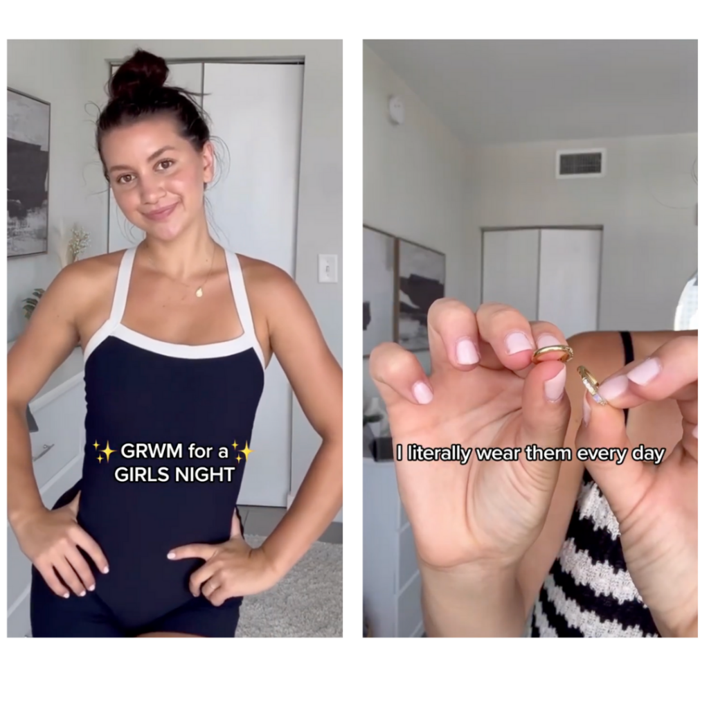
- TikTok & IG Reels: Short, snappy edits (7-15 seconds), fast cuts, bold text overlays, trending sounds. Think quick outfit changes, fast-paced styling clips, or “GRWM” (Get Ready With Me) videos.
- YouTube Shorts & Pinterest: Slightly longer, more detailed videos (15-60 seconds) with slower cuts and voiceovers. Perfect for fashion hauls, unboxings, or styling tutorials where viewers want more product details.
- Facebook & Instagram Feed Ads: Mix text + visuals with a clear product focus. Comparison-style UGC (e.g., “Why this dress is my go-to for every occasion”) works well.
- End with a strong CTA
Never assume viewers know what to do next. Spell it out:
- Verbal CTA: Have the creator say, “This is selling out fast—grab yours now!” or “Use my code for 15% off!”
- Text Overlay CTA: Reinforce it visually with phrases like “Shop Now”, “Limited Stock!”, or “Link in Bio”.
- Engagement CTA: If it’s organic content, prompt interaction: “Which one should I keep? Comment below!” Higher engagement boosts visibility.
Not sure which CTA is perfect for your video? Don’t worry, we got you. Here’s a list with 25 CTAs that are proven to help your ads convert.
Nail Your UGC With Our Tips
Fashion is all about self-expression, and so is UGC. Today’s shoppers don’t just want to see your product—they want to see it in action, on real people, in real moments. That’s why the most successful brands go beyond polished campaigns and embrace the power of user-generated content.
By working with the right creators, testing multiple UGC frameworks, and optimizing content for each paid media platform, you can create engaging, high-converting content that feels natural, not forced. A well-structured UGC ad strategy turns social proof into sales, helping your brand build trust and stay relevant in a competitive industry.
Now’s the time to invest in UGC, experiment with formats, and let your audience see (and feel) why your brand belongs in their wardrobe. 🚀
Style Your Ads With Primer
At Primer, we’ve worked with top fashion brands like Savage X Fenty, Wantable and Rent The Runway. We now offer an on-demand service that helps you concept, plan, source, and produce UGC video ads that resonate with your audience and drive results. Let us bring your brand’s vision to life with authentic, high-performing content.
Your Growth Marketing Team: Partnering with Primer means we take care of everything—strategy and planning, production, reporting, and optional media buying—to achieve your growth objectives. You can focus on your business while we deliver the results.
Creative On-Demand: Access a subscription-based marketing creative platform to request UGC, videos, images, and landing pages crafted by top marketing creative strategists and designers who understand what drives conversions.
Your ad campaign starts strong, delivering impressive engagement and a steady stream of conversions. Then, performance starts to dip. Costs rise, click-through rates drop, and conversions stall. What’s happening? Creative fatigue is likely the issue.
Creative fatigue silently drains your ad budget. When users see your ad repeatedly, they lose interest, which affects critical metrics.
If your ads aren’t delivering the results they once did, don’t panic. Read on to discover how you can stay ahead of fatigue and keep your campaigns converting.
What’s Creative Fatigue?
Creative fatigue occurs when audiences repeatedly see the same ad, leading to declining interest and engagement. Facebook defines it as a performance decrease caused by ad repetition. When fatigue sets in, metrics like CPM and CPC increase, while CTR and conversions plummet.
Although it shares similarities with banner blindness, they aren’t the same. Banner blindness happens when users ignore ads that visually blend in, regardless of repetition. Creative fatigue results specifically from overexposure. Both hurt performance, but fatigue directly impacts metrics, making it easier to track.
Key signs of creative fatigue include:
- Increased CPM: Costs rise as your audience tires of the ad.
- Lower CTR: Fewer people click, signaling reduced interest.
- Higher Frequency: Ads are shown too often, annoying users.
- Falling Conversion Rates: Even those who click are less likely to act.
How To Avoid Creative Fatigue By Testing Smarter
The best way to avoid creative fatigue is to actively test both big ideas and scaling iterations. This ensures your audience stays engaged while helping you identify what resonates most. At Primer, we use a proven approach called the Outlier Method.
The Outlier Method focuses on analyzing your best-performing ads to understand why they work. Instead of starting from scratch, you refine and build on winning elements like hooks, visuals, and messaging.
This method has four simple steps:
- LAUNCH: Ideate and launch “big idea” ads based on key questions buyers have. (Get our step by step guide on ad testing here.)
- PAUSE: Pause underperforming ads quickly and determine the ads that beat the account average and become top performers — the “wins”.
- SCALE: Scale the budget for the “wins” and make creative iterations on them for your next test.
- REPEAT: Periodically start a new “big idea” process and repeat steps 1-3.
To avoid creative fatigue, it’s important to move fast with iterations. Delaying changes can lead to declining engagement and increased ad costs, as fatigued ads drive CPMs higher and CTRs lower. By consistently testing new ideas and refining your winners, you can sustain high performance, extend the life of your campaigns, and maximize ROI.

Top Iterations to Refresh Your Winner Video Ads
To keep your creative fresh and audiences engaged, you don’t need to start from scratch. By making strategic updates to your winning ads, you can extend their lifespan and maintain performance. Here are six proven iterations to revive your creatives and keep them converting:
1. Revamp the Hook
The first three seconds are crucial. Replace visuals or text, or ask an unexpected question to capture attention immediately.
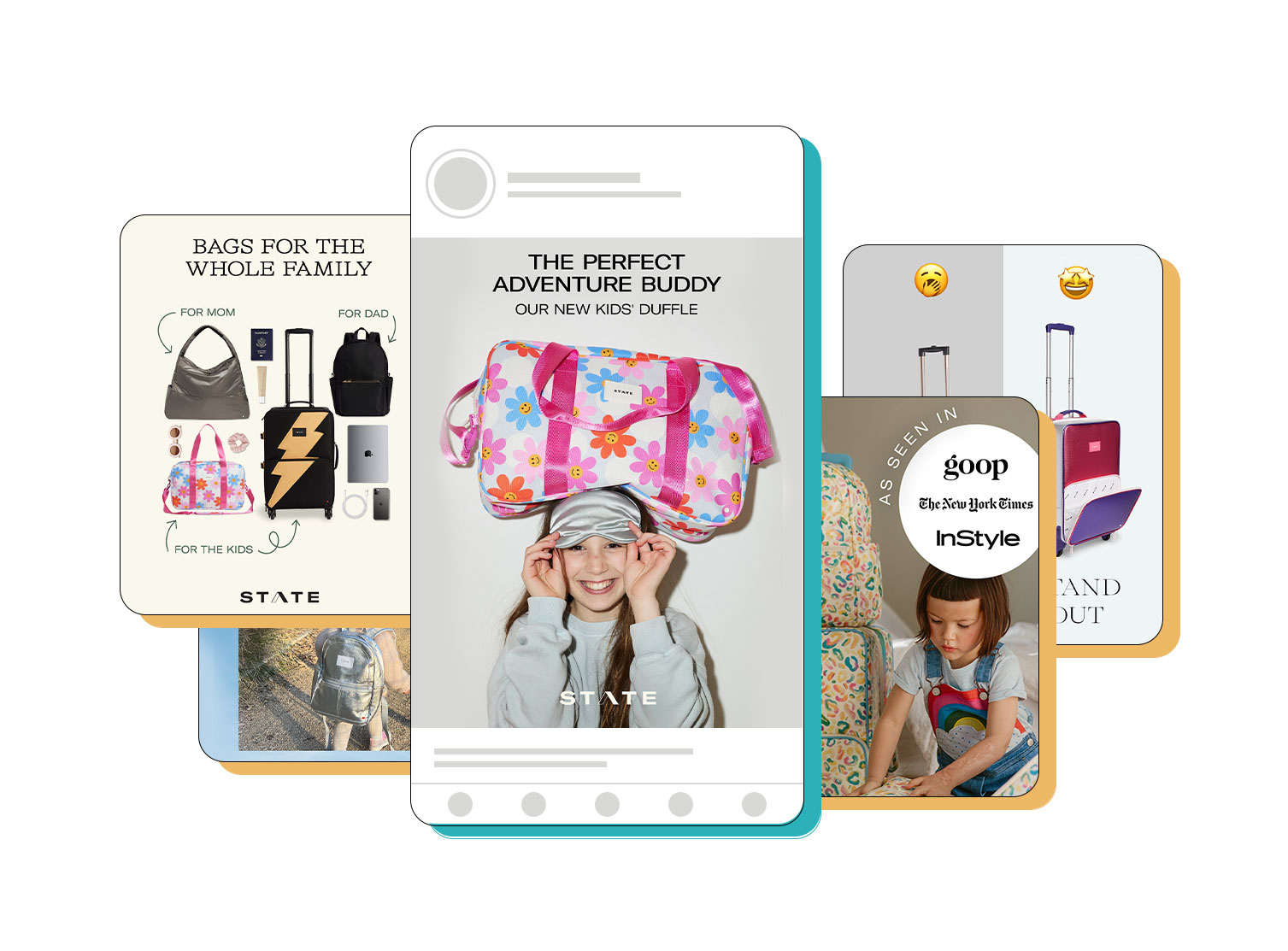
Check out this example from Rocksbox. Although the rest of the video remains the same, the hook completely changes. The first one is simple and straightforward, while the second one has a more TikTok-style vibe by adding comment boxes.
2. Include Fresh Testimonials or Reviews
Add updated reviews, testimonials, or UGC. Real stories from customers build trust and give your ad renewed credibility.

This image ad uses the same structure but changes the testimonials, image, and color.
3. Incorporate Seasonal Themes
Adapting your creative winners to a specific holiday can breathe new life into your ads and drive conversions with customers looking for seasonal relevance. Using what works best will save you time and money, as well as bring immediate results.
Tailor your ads with timely elements—such as holiday visuals, colors, or phrases—for added relevance.
Look at this hook and how it was adapted for a New Year Sale. The copy and voiceover update was simple yet effective, and keeping the initial video the same, it ensures that we’re limiting our variables as we scale.
Now, check this image ad. This image was a winner and was adapted in a holiday style using colors and a caption related to the Holiday season.
4. Experiment With Colors And Visual Styles
Change the color palette or visual effects. Bright, contrasting colors can make your ad stand out from a crowded feed.

For this example, we have three images. The first one is the Big Idea that, after being tested, became a winner. The second one is the first iteration: just a subtle color change in the background. Then, after demonstrating that the image structure worked, we made a bigger change by showing new products and using a different color.
5. Hop On Trends
Leverage popular trends to refresh your ad’s appeal. Swap the original hook with a trending topic, meme, or format that resonates with your audience. For example, incorporate a viral phrase or reference a current cultural moment while keeping your product or service central to the story.
Ensure the trend aligns with your brand values and audience preferences for maximum impact.
🔥 Pro tip: you can also use music for this one.
Let’s check this example. This TikTok trend gained popularity, and this video was cleverly repurposed with new voiceovers and captions. Rather than just an iteration, it’s almost a remake of a winning video.
6. Test Different CTAs
Reframe your CTA to create urgency or curiosity. Replace generic phrases like “Learn More” with action-oriented prompts like “Ready To Try This?” or “Unlock the Secret Now.”
Use language that aligns with your audience’s desires. For instance, “Join Thousands of Happy Customers” taps into social proof, while “Claim Your Exclusive Offer” drives urgency. Testing multiple CTAs helps you identify which resonates best and encourages clicks. We have a list of proven CTAs that will help your ads convert.

Why Iterations And The Outlier Method Matter
Creative fatigue isn’t just a buzzword—it’s a performance killer. When your audience sees the same ad repeatedly, engagement drops, and costs rise. Metrics like CPM (cost per thousand impressions) increase as click-through rates decline, forcing platforms to deprioritize your ad in auctions. The result? Your once high-performing campaign becomes an expensive dud.
The Outlier Method offers a proactive solution by focusing on constant improvement. Actively testing both “big ideas” and smaller iterations ensures your creative remains fresh and engaging. By analyzing what works, scaling it, and iterating further, you avoid falling into the trap of diminishing returns. This method saves you time and budget while consistently driving results.
To maintain performance, you don’t need to overhaul everything—small changes can make a big impact. Iterations like revamping the hook, highlighting new product features, testing different CTAs, or incorporating trends help extend the lifespan of winning ads. The goal is to keep your creative relevant and engaging without losing what makes it effective.
Ad fatigue and rising CPMs don’t have to drain your budget. By embracing a structured testing process like the Outlier Method and refreshing your ads with targeted iterations, you can keep your campaigns converting and your audience engaged.
Growth isn’t about reinventing the wheel; it’s about making that wheel roll farther and faster. Ready to take your ad creative to the next level? Start testing smarter and iterating faster—your results will thank you.
Partner With Growth Experts
Primer works to help our partners, like Rocksbox, develop winning ads and scale by handling the process for you, including creative strategy, design, production, reporting, and media buying. So, if you need an extra hand, give us a call.
Your Growth Marketing Team: Partnering with Primer means we take care of everything—strategy and planning, production, reporting, and optional media buying—to achieve your growth objectives. You can focus on your business while we deliver the results.
Creative On-Demand: Access a subscription-based marketing creative platform to request UGC, videos, images, and landing pages crafted by top marketing creative strategists and designers who understand what drives conversions.
Crafting the perfect video ad in the competitive supplement niche isn’t easy. There’s a lot of competition so standing out can be challenging and creative briefs often slow the process down.
But when it’s done right, a creative brief aligns teams, streamlines revisions, and ensures on-target ads that captivate and convert.
At Primer, we’ve crafted thousands of proven ad creatives over the years, and here are some of our templates.
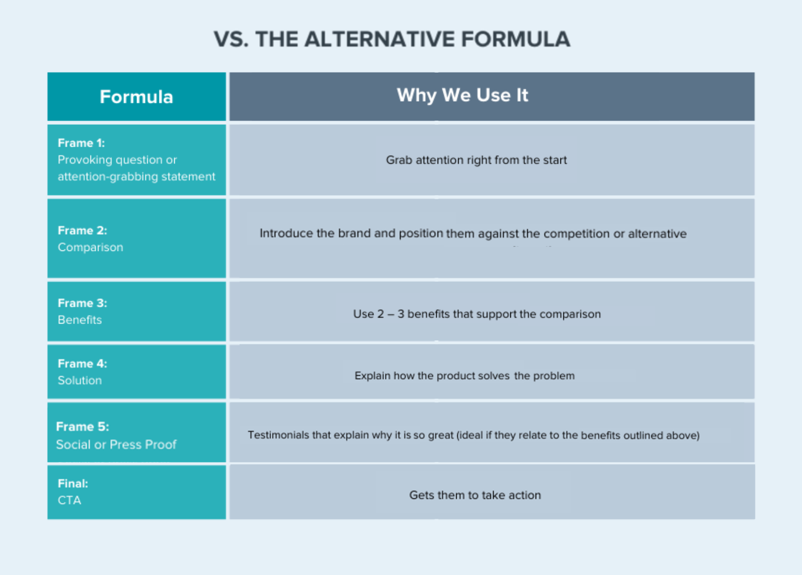
Vs Alternative Template
This framework is by far one of the most used templates for the supplement vertical. By positioning your product as the best solution, it saves your audience the time and effort of comparing options, and gives you the chance to control the narrative.
Highlight your product’s unique advantages while contrasting it against alternatives. Whether it’s a competitor, a different solution, or doing nothing at all, this approach emphasizes why your offering is superior.
Try this framework for moderately sophisticated audiences that are ready to evaluate their options. By showcasing specific advantages like affordability, ease of use, or sustainability, you guide potential customers toward confidently choosing your product.
For example:
UGC Vs Competitors
UGC is vital for building trust and creating high-converting video ads. When real customers compare your product to their past experiences with other brands, it adds authenticity and credibility to your messaging, making it more relatable.
| Formula | Copy Example |
| Attention-grabbing statement | I’m breaking up with glucosamine and switching to Antinol Plus for my dogs joint health |
| Comparison | Antinol plus is made with powerful ingredients like green-lipped muscle and krill oil, working two weeks faster than other supplements.. |
| Benefit | Since I started giving my dog Antinol plus we’ve been hitting our trails with less stiffness and more energy. |
| Benefit | Their clinical studies show improvement in dog mobility in as little as 30 days. |
| Benefit | We’re getting more miles and having more fun. |
| Benefit | They’ve got a 30 day moneyback guarantee you’ve got nothing to lose |
| CTA | Check them out if you wanna keep your best friend without worry. |
No UGC? No problem: Use Comparison Lists
If you don’t have UGC yet, this template is a game-changer for supplement brands.
It works exceptionally well for both image and video ads, driving conversions and helping you stand out in a competitive market.
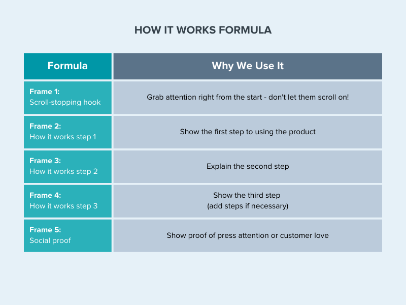
How It Works Template
The How It Works Framework is an incredibly effective tool we’ve tested for driving conversions. It simplifies the journey from problem to solution, breaking it down into actionable, easy-to-follow steps.
Using this framework effectively helps to demystify your product for potential customers, thereby reducing their hesitations and increasing their likelihood to convert.
It’s particularly impactful for middle-of-the-funnel and top-of-the-funnel audiences. These users may know about your product, but learning how it works gives them the clarity and confidence to take the next step.
For solution-aware audiences, it demonstrates why your product is the ideal choice compared to alternatives. For product-aware audiences, it highlights unique functionalities and advantages that set your product apart, helping sway their decision in your favor.
Here it is in action:
Simple Steps
Getting your supplements has never been easier with these 3 simple steps… That’s how this framework works.
| Formula | Copy Example |
| Attention-grabbing statement | Another ‘miracle’ weight loss claim?I was skeptical – but DrBrainRX CHANGED my mind |
| Step 1 | Free consultations with DrBrainRX’s team via online meetings |
| Step 2 | Got questions? They’ve got answers, plus they handle insurance and plans starting at $186/month |
| Step 3 | Post-consult, get meds delivered the NEXT DAY |
| Benefit | Customized program for your specific needs is the path to success |
| Benefit | Explore their 30-day satisfaction guarantee. |
| CTA | Nothing to lose but weight! |
Now take a look at this example: same niche, similar product, different approach.
Although we know UGC is key, if you don’t have any then you need to get creative. Screen recording is a major element to share steps. It’s easy and allows users to watch the process in real time.
| Formula | Copy Example |
| Attention-grabbing statement | 90% of women have menopause symptom relief within 4 weeks with Alloy |
| Media proof | As seen in… |
| Step 1 | Just complete a quick medical intake form |
| Step 2 | Receive a personalized treatment plan |
| Step 3 | Get medication delivered |
| Benefit | Their medical team is always there for ongoing support and education |
| CTA | Get a treatment plan in as little as 2 days with Alloy |
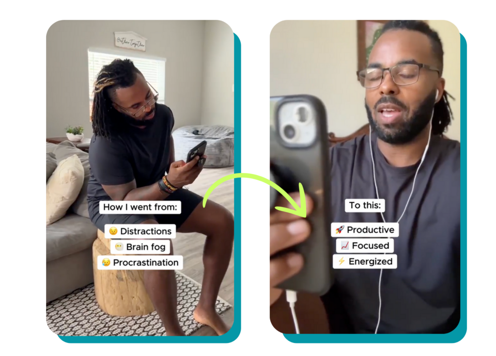
How I went from (…) to (…)!
This hook suggests a clear narrative of transformation, indicating a before-and-after scenario. Using this engages the audience by illustrating the process that allows for the change, making it relatable and understandable.
| Formula | Copy Example |
| Attention-grabbing statement | Here’s how I went from… To this. |
| Solution | Nootropic Brain Support |
| Benefits | 8-10 hours of focus, mental clarity and drive |
| CTA | Try Nootropic Brain Support |
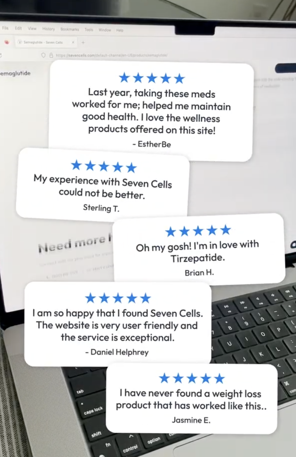
Press/Testimonials Template
The Press/Testimonials Framework is a powerful way to showcase social proof and build trust with moderately sophisticated and most aware audiences.
By leveraging customer testimonials and press quotes, this template validates your product’s effectiveness and inspires confidence. It’s ideal for audiences evaluating their options or seeking reassurance before making a decision.
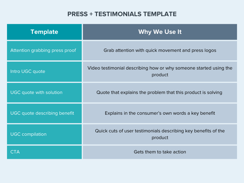
Mixing Social with Press proof
What makes this video effective is its simplicity and brevity. As the reviews appear, you see people working out, proving that using the Pre-Workout enhances their training.
⭐️Pro tip: using star ratings is always a great way to grab attention.
Social proof
Authentic testimonials of users that have used your product are essential for social proof. The more testimonials you have, the better.
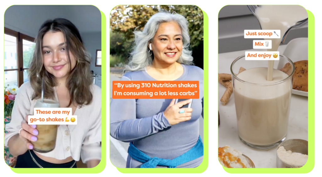
Reviews
Reviews are always a smart choice for social proof. Real comments help users take action and build trust.
When users feel unsure, reading positive reviews can tip the scales and encourage them to make a decision.
🔥Pro tip #2: This kind of template works amazing for warmer audiences.
Buyer Decisions Questions (BDQs) Template
And last but not least we have BDQs.
This template is designed to address the most pressing Buyer Decision Questions (BDQs) potential customers ask before purchasing. It focuses on answering essential queries that alleviate concerns, clarify your product’s value, and guide prospects toward making a confident decision.
For moderately to highly sophisticated audiences, this framework is perfect for showcasing what sets your product apart. BDQs help highlight specific advantages, build trust, and remove doubts by providing clear, compelling answers backed by social proof or UGC. This template also works best for Product Aware consumers, since it offers an opportunity to reaffirm your product’s value and unique features.
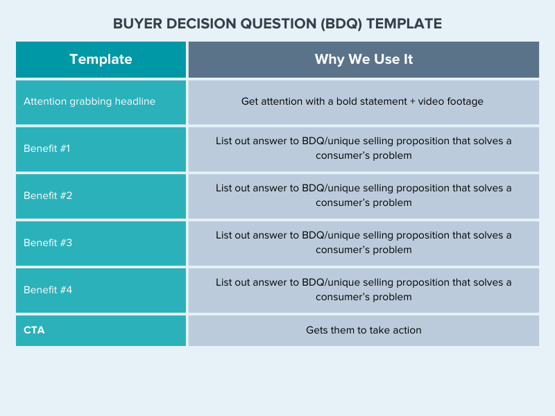
X Reasons Why
X Reasons Why template simplifies decision-making. It’s an impactful way to address customer doubts, highlight your product’s key benefits, and guide prospects toward choosing your brand.
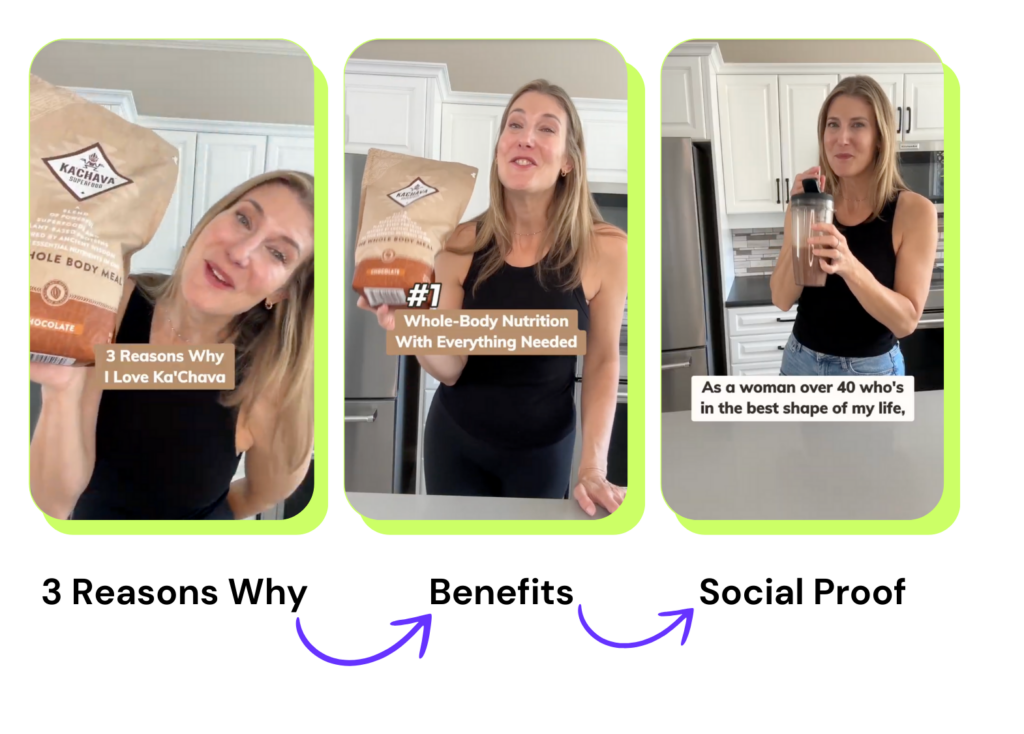
| Formula | Copy Example |
| 3 Reasons why | 3 Reasons why I love Ka’Chava |
| Benefit #1 | Whole body nutrition with everything needed |
| Benefit #2 | So EasyPerfect on the go meal |
| Benefit #3 | Good for your body and delicious |
| Social proof | As a woman over 40s who is in the best shape of my life, taking Ka’Chava shake everyday is my SECRET to giving my body the nutrients it needs to support my joints, bones and muscles. |
| CTA | 5 Incredible Flavors |
💪🏼Pro tip #3: Tiktok comment boxes are on fire! 🔥It makes your ads look native. What are you waiting for to use it?
| Formula | Copy Example |
| 3 Reasons why | 3 Reasons why Jocko Fuel Energy Drink is a big deal |
| Benefit #1 | Pure clean energy |
| Benefit #2 | No crash or jitters |
| Benefit #3 | No harmful preservatives |
| CTA | Get yourself a go. |
Time to Fuel Your Sales
Throughout this blog, we’ve explored various templates you can apply to your video ads to boost your conversions. Standing out in the supplement industry requires not just creativity but also a convincing approach. These proven templates give you the tools to captivate your audience and drive real results.
Always remember, that authenticity is key. Pair these proven templates with genuine messaging that resonates with your audience, and you’ll position your brand as a leader in the market. It’s time to fuel your sales—start implementing these strategies today!
Get Video Ads with These Templates Crafted By Growth Experts
From UGC to landing pages, Primer helps create high-converting marketing assets. Trusted by top brands like Jocko Fuel, Seven Cells, Ka’chava and more, we’d love to work with you to grow your revenue, and can partner in whatever way suits you best.
Your Growth Marketing Team: Partnering with Primer means we take care of everything—strategy and planning, creative production, reporting, and optional media buying—to achieve your growth objectives. You focus on your business while we deliver the results.
Creative On-Demand: Access a subscription-based marketing creative platform to request UGC, video ads, images, and landing pages crafted by top marketing creative strategists and designers who understand what drives conversions.
Most Aware and Highly Sophisticated audiences are among the most challenging to convince that you’re their best solution. However, if your video ads are well-crafted, they are highly likely to convert quickly. Skincare, Fitness Equipment, Health & wellness supplement products often are targeting these audiences. This audience is bombarded with dozens of ads for skincare and collagen supplements daily.
As growth marketers, you’re constantly battling to improve your conversion rates, hook rates, CTR, ROAS, and CAC.
Today, we’re diving deep into five powerful video ad frameworks. With these frameworks, you will craft winning ads to convince these highly aware prospects you are the best product to solve their problem and buy now.
The Challenge: Converting the Converted
Picture this: Your audience knows your product inside and out. They’re familiar with your competitors, and they’ve probably watched dozens of similar ads. How do you convince them that your product is the crème de la crème and that now is the perfect time to hit that “Buy Now” button?
It’s time to level up your video ad game. Let’s explore five frameworks that will help you break through the noise and speak directly to your savvy audience.
| Framework Finder | Highly Sophisticated |
| Most Aware | Frameworks: FABU, SUUP, TEU, FOMO, SUE
Highlight the advanced features and superior performance of your product. Offer personalized demos or consultation sessions |
1. FABU: Features – Advantages – Benefits – Urgency
The FABU framework is your secret weapon for showcasing your product’s unique selling points while creating a sense of immediacy or sophistication. Here’s how to identify where they are and what messaging will drive results:
- Features: Highlight what makes your product stand out.
- Advantages: Explain why these features matter.
- Benefits: Show how these advantages improve the customer’s life.
- Urgency: Create a compelling reason to act now.
Why it works: FABU addresses the “what’s in it for me?” question that sophisticated audiences always ask. By clearly articulating the value proposition and adding a time-sensitive element, you’re giving them a reason to choose your product over competitors.
Example: Imagine you’re selling a smart water bottle. Your FABU ad might showcase its precise temperature control (feature), explain how it keeps drinks at the perfect temperature for hours (advantage), demonstrate how it enhances hydration and productivity (benefit), and offer a limited-time discount (urgency).
| Section | Element | Captions & Stickers | Voice Over | Footage |
| 1 | Hook | |||
| 2 | Key Features | |||
| 3 | Advantages/Unique Selling Points | |||
| 4 | Benefits | |||
| 5 | Urgency | |||
| 6 | Call To Action/Outro Hook |
2. SUUP: Scarcity – Urgency – USP – Proof
SUUP is all about creating desire through exclusivity and backing it up with solid evidence.
- Scarcity: Emphasize limited availability.
- Urgency: Highlight time-sensitive offers.
- USP: Showcase your Unique Selling Proposition.
- Proof: Provide evidence of your claims.
Why it works: Sophisticated audiences are skeptical by nature. SUUP addresses this by not only creating desire through scarcity and urgency but also substantiating your claims with proof.
Example: For a limited-edition skincare product, your SUUP ad could showcase the limited quantity available (scarcity), mention a 24-hour sale (urgency), highlight its patented formula (USP), and feature before-and-after photos or testimonials from dermatologists (proof).
| Section | Element | Captions & Stickers | Voice Over | Footage |
| 1 | Hook | |||
| 2 | Scarcity | |||
| 3 | Urgency | |||
| 4 | Exclusivity or Unique Selling Points | |||
| 5 | Social Proof | |||
| 6 | Call To Action/Outro Hook |
3. TEU: Transformation – Exclusive – Urgency
TEU focuses on the emotional journey and the exclusive opportunity your product offers.
- Transformation: Show the before and after.
- Exclusive: Highlight what makes your offer unique.
- Urgency: Create a reason to act immediately.
Why it works: TEU framework with the emotional journey and exclusive opportunity your product offers can be highly effective in capturing the attention of sophisticated audiences. By showcasing the transformation your product can bring, highlighting its unique features, and creating a sense of urgency, you can compel your audience to take immediate action.
Example: Imagine promoting a productivity tool by emphasizing how it has helped thousands of professionals 10x their output and urging them not to let their competition get ahead. Joining the productivity revolution today becomes an irresistible proposition for sophisticated audiences too.
| Section | Element | Captions & Stickers | Voice Over | Footage |
| 1 | Hook | |||
| 2 | Transformation | |||
| 3 | Exclusivity or Uniqueness | |||
| 4 | Urgency | |||
| 5 | Call To Action/Outro Hook |
4. FOMO: Fear Of Missing Out
FOMO is particularly effective with sophisticated audiences who pride themselves on being ahead of the curve:
- Create a sense of exclusivity or limited opportunity
- Showcase what others are gaining from your product
- Imply the potential regret of not taking action
Why it works: Even the most rational consumers can be swayed by the fear of missing out on something valuable. When done tastefully, FOMO can be a powerful motivator.
Example: A luxury travel company could use FOMO by showcasing exclusive experiences that are booking up fast, with testimonials from satisfied customers who got in early.
| Section | Element | Captions & Stickers | Voice Over | Footage |
| 1 | Hook | |||
| 2 | Trend or Popularity Statement | |||
| 3 | Showcase Demand | |||
| 4 | Product Intro | |||
| 5 | Unique Selling Point | |||
| 6 | Urgency | |||
| 7 | Call To Action/Outro Hook |
5. SUE: Scarcity – Urgency – Exclusivity
SUE combines three powerful motivators to create a compelling call to action.
- Scarcity: Emphasize limited availability
- Urgency: Create time pressure
- Exclusivity: Highlight the unique or privileged nature of the offer
Why it works: This framework creates a perfect storm of motivation, appealing to the sophisticated audience’s desire for unique, valuable opportunities.
Example: A high-end tech gadget could use SUE by offering a limited number of devices (scarcity), available for pre-order for just 24 hours (urgency), with exclusive features not available in the regular release (exclusivity).
| Section | Element | Captions & Stickers | Voice Over | Footage |
| 1 | Hook | |||
| 2 | Scarcity | |||
| 3 | Urgency | |||
| 4 | Exclusivity | |||
| 5 | Call To Action/Outro Hook |
Putting It All Together
Each of these frameworks offers a unique approach to engaging your sophisticated, most-aware audience. The key is to choose the framework that best aligns with your product, brand, and specific campaign goals.
Remember, the power of these frameworks lies not just in their structure, but in how you execute them. Be authentic, provide real value, and always respect your audience’s intelligence.
Start implementing these frameworks today and watch your conversion rates soar.
Get Video Ads with These Frameworks Crafted By Growth Experts
In the competitive realm of DTC marketing, these frameworks serve as your secret arsenal for engaging even the most discerning and informed audiences. By mastering and utilizing FABU, SUUP, TEU, FOMO, and SUE, you’re not merely selling a product—you’re creating captivating stories that resonate with your audience’s needs and aspirations.
Your Growth Marketing Team: Partnering with Primer means we take care of everything—strategy and planning, production, reporting, and optional media buying—to achieve your growth objectives. You can focus on your business while we deliver the results.
Creative On-Demand: Access a subscription-based marketing creative platform to request UGC, videos, images, and landing pages crafted by top marketing creative strategists and designers who understand what drives conversions
We’ve officially partnered with TikTok to produce performance marketing videos for advertisers through the TikTok Creative Exchange! The Creative Exchange allows brands like yours to use our video ad expertise to grow quickly on the platform.
Every single one of our partners that we’ve worked with on TikTok has been featured in TikTok’s Top Ads, their library of top-performing ad creative. This achievement has garnered us a spot as one of the top agencies on TikTok, even giving us access to unique beta opportunities.
100% of the partners we’ve worked with on TikTok have been featured in TikTok’s Top Ads.
Do you want to be featured, too? If you’re a direct-to-consumer brand needing to hit growth goals, we may be a perfect fit.
“Our unique method works extremely well on TikTok,” said Primer CEO and Co-Founder, Kamo Asatryan. “We take formulas that have proven to work across multiple partners and platforms and create a version that is native to TikTok. The results have been incredible.”
A Must-Have For B2C Brands
As TikTok’s influence as an e-commerce engine grows, advertisers are finding huge opportunities to tap into a highly engaged audience of shoppers. A recent study from Insider Intelligence found that 71% of TikTok users worldwide shop when they stumble across something in their feed, stories, or other content.
“Right now, TikTok is one of the most powerful platforms for advertisers, combining the two most successful marketing tactics of 2021 and 2022: short-form video and UGC content. Any DTC brand would be remiss not to invest in TikTok,” said Primer COO and Co-Founder Brady Flynn.
More TikTok resources
Looking to amp up your performance marketing videos yourself?
- 7 things you can try that get our partners on TikTok Top Ads 🔝
- 9 ways to create outstanding video ads that convert [Free Templates + Examples]
Not on TikTok quite yet?
Curious how you can better leverage TikTok?
Like the sound of all this? Schedule a call with us to learn how we’ve gotten our partners on TikTok ads, and how we’d hope to do it for you, too.
As a fast-growing, direct-to-consumer (DTC) business, it can be hard to create static and video ads for paid social that stand out among the competition. Especially if your brand is among the largest DTC category: apparel and accessories.
What Is a Facebook Ad Library? Why Does It Matter to DTC Fashion Brands?
The Facebook ad library is an example of how social media companies like Facebook and TikTok have started compiling ads using their platforms, so they’re searchable by category and can be used to track ad spending data.
We found 10 scroll-stopping ads from top DTC fashion apparel and accessories brands in the Facebook ad library and broken down the winning features so you can apply them to your campaigns today.
Through the process of testing thousands of ads on paid social channels like Facebook, TikTok, and Instagram, Primer has developed its own library, where you can find even more examples of winning ads that are proven to convert and drive growth for your organization.
1. AllBirds – Facebook Video A
What they’re selling: sustainable, lightweight footwear.
The ad:
Why the ad works:
This video ad from the Facebook ad library puts the user in AllBirds’ shoes–literally! The ad achieves this by showing their product in action, avoiding static ad and branding elements, and highlighting some key selling points.
- Shows the shoe in action. We can imagine ourselves running with these shoes more easily because the ad shows not just the shoe in action but also a person putting on the shoes before running in the woods.
- End card with the logo. Instead of a static end card, we see the Allbirds logo flash before a video of the runner.
- Highlights additional selling points in the headline. Allbirds takes advantage of headline and description real estate to share two more reasons to buy: “free shipping + free returns.”
2. Reformation – Facebook and Instagram Image Ad
What they’re selling: eco-friendly, upscale women’s clothing.
The ad:
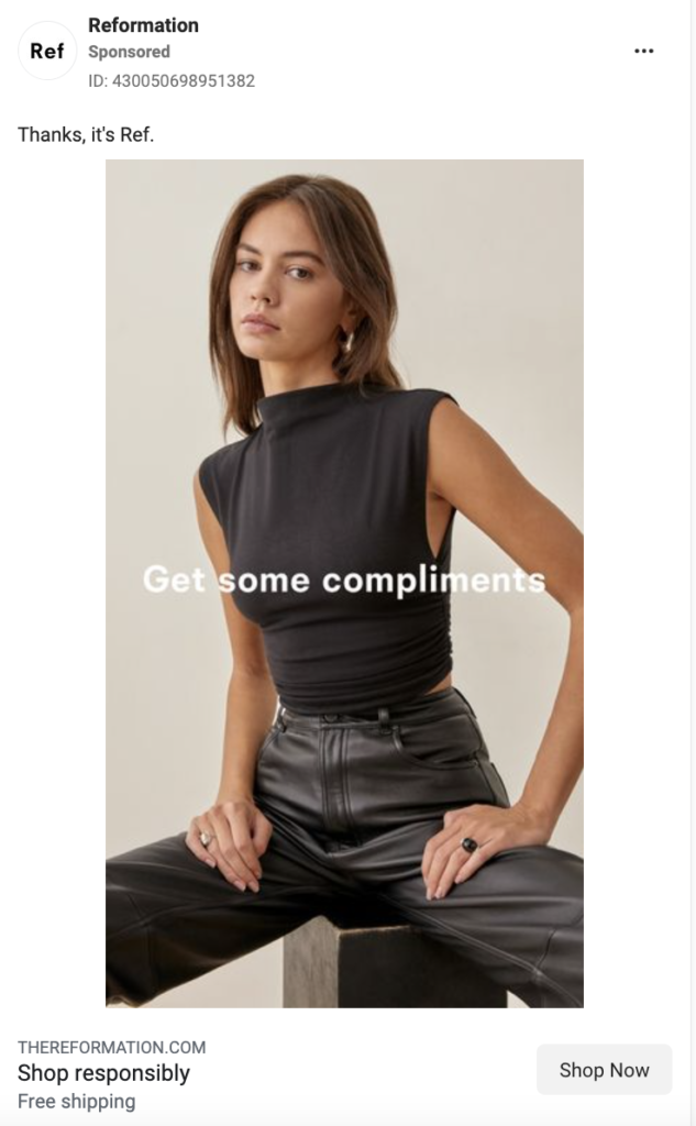
Why the ad works:
We wanted to highlight this image ad by Reformation from Instagram and the Facebook ad library because of its use of selling points in the headline, appeal to buyers’ emotions, conversational tone, and stand-out use of color.
- Highlights additional selling points in the headline. In this instance, “shop responsibly” speaks to sustainability. It subtly positions itself against the competitors (largely fast fashion retailers) with this headline.
- The image headline appeals to buyers’ emotions. “Get some compliments” taps into their buyers’ desire.
- Uses a casual tone in its copy. “Thanks, it’s Ref” achieves a few things for this ad: it allows the brand to speak for itself; it converses with the headline in the image; and it stays true to the brand’s casual, “best friend”-esque tone.
- Plays with color. While most of the “thumb-stopping” ads you’ll find on this list utilize a bright color palette, this ad focuses on having the monochromatic outfit stand out against the bright background of the webpage.
3. StitchFix – Facebook Video Ad
What they’re selling: a personal stylist box.
The ad:
Why the ad works:
- Includes a compelling testimonial in the thumbnail. The user quote serves as social proof of how awesome the service is, and its effectiveness is a perfect example of why this ad makes Primer’s top 10 list from the Facebook ad library. It’s particularly scroll-stopping in a thumbnail because that’s the first thing people see. Continuing the user-generated content (UGC) throughout the video also makes it feel relatable and approachable. Bonus that StitchFix says these are “real clients paid for their time.”
- Shows unboxing footage. Not only is unboxing a current trend on organic social media, but it adds a sense of trustworthiness and excitement.
- Describes the process in easy-to-understand steps. The video breaks down what StitchFix is and how to use it very easily: we learn that you sign up, take a style quiz, and then have clothes picked for you delivered.
4. Pact – TikTok Video Ad
What they’re selling: women’s underwear.
The ad:
Why the ad works:
- Has a person in the first two frames. We’ve found that our best TikTok ads showcase a user in the first two frames. This suits the overall shift to more UGC-style content. Learn more about creating ads that work on TikTok.
- Shows unboxing footage. Pact, like StitchFix, uses unboxing video to complement the rest of their ad. Here, it’s equally successful at making the video seem like a real customer’s journey, and thus being more trustworthy.
- Shows a variety of style options. In multiple frames, we see different color and style options, including in the hand of the narrator, on a screenshot of the website, and laid out one-by-one.
- Has captions (good for both sound on and off viewing). A bonus is that this particular caption style is native to TikTok and reflects TikTok’s “auto-generated” captions.
- Calls out some unique selling points that might appeal to an ideal buyer. (e.g. How Pact’s underwear is sustainable because it’s made from organic cotton.)
5. Alo Yoga – Facebook and Instagram Stories Ad
What they’re selling: workout and athleisure clothing.
The ad:
Why the ad works:
This ad by Alo Yoga earned a top spot in our winning Instagram and Facebook ad library because of how it utilizes urgency, highlights the usefulness of their product,uses simple animation, and makes their ad timely.
- Adds a sense of urgency with “limited edition” messaging. By including “limited edition” in a rotating sticker, this ad not only adds a reason to buy right now (as opposed to later) but also implies an increased sense of exclusivity and competition. It fits with the higher-income audience Alo is likely targeting.
- Shows a full outfit. Matching separates are in right now, and Alo’s ad is not only on-trend, but it also makes their clothing seem more wearable by styling an outfit for buyers right away. They made two versions of this ad: one with a bandaeu top and shorts, and one with a bra top and capris leggings. Tip: Swapping outfits but keeping the rest of your ad the same is a great way to test which product items have the most click-through interest.
- Includes simple motion. One way to stand out from the crowd with your images is to make them GIFs. Here, Alo Yoga takes the static one step further by adding animation to key copy: “blue splash” and “limited edition.”
- Hints at the season in the description. Alo stays relevant to shoppers by including a nod to the current season. Here, we see it in a less prominent location: the description (“So essential for all your summer plans”).
6. Fabletics – TikTok Video Ad
What they’re selling: men’s athleisure apparel.
The ad:
Why the ad works:
- Uses a conversational tone. This ad sounds like a friend talking to you, which makes it seem less like an over-the-top sales pitch.
- Shows the website and different color options. We’ve seen this before: showing the real user experience on a website and the variety of product options entices a variety of buyers and makes your brand seem more legitimate. This ad does something unique, though: instead of just using a screen recording of the website shopping experience, we get a video of the woman actually using the website on her computer. Having her hand in the frame makes this feel like a real user experience.
- Uses native-feeling green screen trend. By utilizing the green screen TikTok filter, this ad feels on-trend and native to the platform. You can also use this filter to keep a person in frame, even when showing off screenshots.
- Has native-style, “auto-generated” captions (good for both sound on and off viewing).
7. Mejuri – Facebook and Instagram Image Ad
What they’re selling: trendy fine jewelry.
The ad:
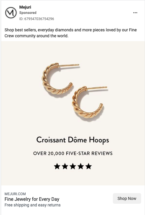
Why the ad works:
- Shows a real number of customers. By including “over 20,000” in their sub-headline, Mejuri makes the positive reviews seem more tangible to potential customers. This is much more impactful versus saying something vague like “Thousands of five-star reviews.”
- Visually shows the stars in the star rating. It may seem like a small thing, but we’ve found that ads that include the stars on the image when talking about the number of positive reviews perform better than those without that same imagery.
- Adds two secondary selling points in the description. They make efficient use of the description space to pack in two more reasons to buy: “free shipping and easy returns.”
8. Rocksbox – Facebook and Instagram Stories Ad
What they’re selling: a jewelry rental subscription box.
The ad:
- *Made by Primer
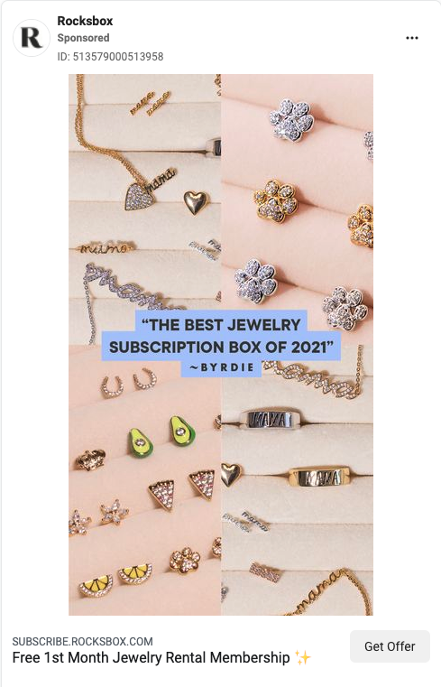
Why the ad works:
This video ad, which Primer made for our long-time partner Rocksbox, deserves a top spot from both Instagram and the Facebook ad library. We’re proud of this ad because it effectively uses press quotes, highlights a variety of product styles, and uses colors that pop.
- Image headline is a press quote. Press quotes, like user testimonials, add a sense of trustworthiness to positive feedback. Here, for example, seeing “the best” feels truer (and less like exaggeration) than if the brand were to claim this themselves.
- Shows a variety of styles. There’s a style that works for everyone, from cute avocado earrings to refined gold chains. By showing a variety of options, you can entice a wider buyer base. People may click on the ad because one specific piece of jewelry caught their eye, and they want to sign up to get it.
- Blue headline background stands out. The sold background color imitates Instagram story captions, while the specific color choice—a bright blue-purple— stands out against the pink background, making the press quote pop.
9. James Allen – TikTok Video Ad
What they’re selling: custom engagement rings.
The ad:
Why the ad works:
- Walks users through the purchase. Videos that follow the “how to” format perform well because they guide the viewer through the buying process and let them know what to anticipate when ordering. This ad walks the user through every step of the process of buying a ring at a specific budget. (More video hooks here.)
- Shows users exactly where to look. Because this video is so jam-packed with information, it uses additional design elements, like arrows and circles to direct attention to the portions of the screen that the voiceover discusses.
- Shows the product on a real hand. After spending so much time on the James Allen website, the ad brings it back to a real person: at the end, they show this DIY’d ring on a real hand.
10. Warby Parker – Facebook and Instagram Stories Ad
What they’re selling: prescription eyeglasses.
The ad:
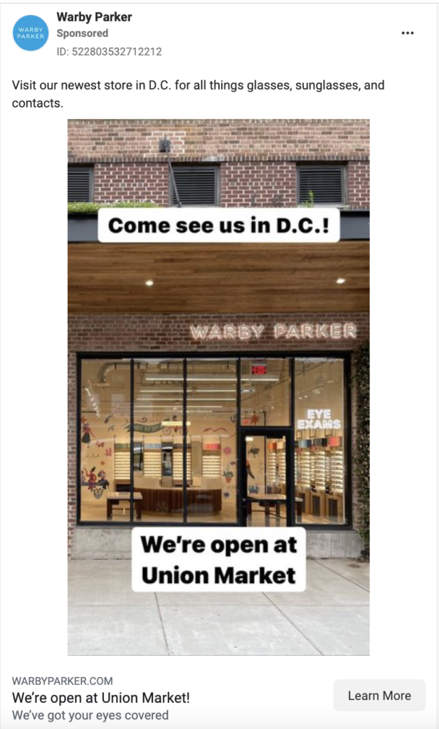
Why the ad works:
- Regional call-out. When your goal is to grow in a specific market or with a specific product, it’s best to filter out unqualified customers by not only targeting the audience but also targeting the content to speak with those you want to reach. This Warby Parker ad creative speaks directly to their target: buyers in D.C.
- Native text style in the image. The black text and white background combination in the image mimics the text style of both Instagram stories and TikTok videos, making this ad feel organic.
What can we take away from these 10 outstanding fashion ads?
Want to create ads that drive conversions, facilitate rapid brand growth, and would be a top performer in the Instagram, TikTok, or Facebook ad library?
Here are 5 rules of thumb for making your content stand out on the feed:
- Include native-style captions and trends to blend more organically into the platform you’re on
- Walk users through the full buyer journey (decision making, after ordering, and unboxing)
- Choose eye-catching, scroll-stopping colors
- Make use of the description to further differentiate your product
- Use your ad creative to target your consumers
Check out more examples of high-converting ads in the Ad Library.
Want to use paid social to stand out from your competition?
Primer works with several DTC apparel and accessories brands, helping them scale their business and hit their goals. If you’re interested in learning how Primer can help you, book a complimentary growth consultation.
Seeing examples of successful ads can help inspire you to create new creative that actually converts.
How the Facebook Ad Library and Others Inspire Us
Popular paid social channels like TikTok, Instagram, and Facebook have developed searchable ad libraries of the ads that brands run on their platforms.
Facebook ad library is the first and most prominent example of this. Hypergrowth marketers can use ad libraries to research competitors and popular ad trends across different industries to draw inspiration for their own ad campaigns.
We’ve even compiled our own ad library of Primer-developed ads for examples of those that are proven to drive conversions.
When we searched the Facebook ad library including Facebook and Instagram ads, as well as TikTok’s ad library, we discovered these 10 image and video ads from Facebook, Instagram, and TikTok that made us click. We show you what they look like, break down why they work, and discuss how you can implement those principles for your brand.
Let’s dive into 10 compelling video ads from food and beverage powerhouses like Daily Harvest, Hello Fresh, and Drizly.
TikTok Ads to Copy:
1. MUD/WTR | TikTok Video Ad
What they’re selling: a coffee alternative made from mushrooms.
Why the ad works:
- Sells a lifestyle. Rather than just a product, this video sells an entire lifestyle—idyllic, filled with wanderlust and beautiful sunsets, peaceful —with MUD/WTR at the center of it all.
- Emphasizes brand tone. The natural imagery underscores the brand’s desire to be connected with health and holistic wellness in contrast to its alternative, coffee, which is usually associated with city life and “the grind.”
- Shows the product in action. Demonstrates how easy it is to make a cup of MUD/WTR in step by step format.
2. Kencko | TikTok Video Ad
What they’re selling: powdered packets that rehydrate into a thick smoothie.
Why the ad works:
- Starts with a strong hook—”want a more nutritious way to start your morning?” This sets up the premise of the rest of the video and speaks to a key buyer decision question. See 101 more video hooks that will improve your ads.
- Displays flavor variety in the first frame. This can draw in people who may only like one or two smoothie flavors.
- Calls out key benefits, including daily servings of fruits and veggies, good taste, flavor variety, and easy to make.
- Shows the product in action. This makes it seem like anyone could use their product. It also highlights their proprietary blender bottle, which looks a bit different from the common ones on the market.
- Emphasizes sustainability. This is particularly important since it is a single-use product. Emphasizing its compostable packaging can help ease the minds of people worried about single-use plastic.
- Includes a clear CTA to tell viewers what to do next—“order yours at kencko.com.”
3. Daily Harvest | TikTok Video Ad
What they’re selling: a subscription to frozen smoothie mixes.

Why the ad works:
- Uses elements that look native to TikTok, including the “ask box.” This helps viewers engage more because it seems less like an ad interrupting their scrolling experience and more like…well, a TikTok.
- Shows the site and how to actually order a variety of flavors. This can help alleviate any anxieties about the subscription process by making it feel transparent.
- Highlights strong value propositions, including good taste, health benefits, and ease of use.
- Includes a clear CTA
Want to run TikTok ads like Daily Harvest?
Learn how this hypergrowth company optimizes their TikTok ads, and how you can, too, in our free interactive teardown. We’ll break multiple ads down frame-by-frame and tell you why they work. (And some things Daily Harvest could improve.)
Top Ads From the Facebook Ad Library That We Clicked On:
There’s a reason these ads stood out to us in the Facebook ad library. Each contains elements that make them high-performing ads and drive conversions on these platforms.
We believe these ads can act as a springboard for success in your future campaigns.
4. Misfits Market | Facebook and Instagram Image Ad
What they’re selling: a food box that compiles less aesthetically-pleasing food that’s still good to eat.
Why the ad works:
- Shows a price comparison. This ad uses one of our favorite styles: “vs. competition.” Here, we see a picture of blackberries with two prices laid out—”ours” vs. “theirs.” Of course, “ours” is more affordable. This is a good way to simply and concisely showcase price comparisons.
- Uses strong headlines. The image headline and the copy headline both offer compelling commands: “Save up to 40% on groceries” and “Stop overpaying for groceries.” It’s nice that they convey the same value prop—saving money vs. the competition—in two different ways: if someone isn’t convinced to click by the image headline, they might be by the copy headline.
- Offers a secondary value prop in the description. What we can see of the headline before it is cut off introduces another reason to switch to Misfits Market: sustainability. It mentions fighting food waste and going green. While the headlines focus on saving the individual money, the description goes broader. This is a good example of a brand knowing its buyer personas and speaking to multiple levels of buyer questions.
5. Farmstead – Facebook and Instagram Carousel Ad
What they’re selling: free, local grocery delivery.
Why the ad works:
- Seamless carousel. For many accounts, carousels will work better than single static images because of the ability to highlight additional value propositions, the native feel (many popular Instagram posts are carousels), and, for Facebook, the variation from other posts on people’s feeds. For this ad, we chose to go the way of a “seamless carousel,” meaning each image interplays someway with the next. That way, the ad feels like a cohesive image instead of disconnected stills.
- Local call out. In the copy, we spoke directly to the local geography: “Hey Charlotte.” This helps scrollers feel like the ad is more relevant to them and reaffirms that any offers in the ad work for their area.
- Includes a testimonial. While the first two images focus on defining what Farmstead is and its benefits, the last frame relies on using a real user review as social proof. Including testimonials not only feels more real and casual but also shows that the product or service has worked for other people and will work for your new buyers, too.
Learn more about how we’ve used high-volume ad testing to grow Farmstead in our Farmstead Case Study.
6. HelloFresh – Facebook Stories Ad
What they’re selling: At-home meal kits.
Why the ad works:
- Includes a comparison to the competition. Remember how the Misfits Market ad relied on a price comparison to place themselves as better vs. the competition? In this ad, Hello Fresh uses both the number of meals and a visual of the plates to set themselves apart in a larger, bright yellow section. This is a good template for brands who might want any comparisons to the competition to be secondary to their value props.
- Provides clear numbers. As part of the image headline and comparison text, we see concrete numbers: 6 meals vs. 3 meals; ready in 20 min or less. This makes the ad feel as if it’s backed by data, and thus, for many, more trustworthy. We also see a great, concrete price listed in the copy headline: “Start for just $3.99/meal!”
- Is a scroll-stopping bright color. The bright yellow stands out against other images on one’s feed.
- Uses emojis in the copy. Using emojis to help set off a list of value props is one of our tried-and-true methods for creating compelling, clickable ad copy. It’s icing on the cake that Hello Fresh also used emojis in the description, which helps separate it from the copy headline.
7. Drizly – Facebook and Instagram Image Ad
What they’re selling: Online liquor store and alcohol delivery.
Why the ad works:
- Shows the app (with prices). Seeing a screenshot of the app adds a trust factor to it. For selling a regulated product like alcohol, this is particularly important so that people know it’s a legitimate business. Even better, the screenshot shows a real price for a bottle of wine—at $11, helping to entice buyers who are also looking for a good deal on wines.
- Showcases a relatable lifestyle. This lifestyle photo presents a laid-back, social, warm-weather vibe: it’s outdoors, with a cute dog, presumably at a public park. It makes the ad more relatable while reinforcing that their app can be used to order alcohol from anywhere.
- Uses simple copy that gets at the heart of what the brand is and why someone should order from them right now. What does Drizly provide? “The widest selection of drinks delivered in under 60 minutes.” And why is now the best time to order? Aside from it being summer, you can “get free delivery on your first order” with their code. Then, they provide a bunch of scannable emojis that make it clear to a quick scroller what the company sells. I only wish that the copy headline included more of a command/call-to-action instead of only a description of the product (e.g. “Get Alcohol Delivered for Free in 60 min.” vs. the current “60 min. Alcohol Delivery”)
Read more about how Drizly is winning on Facebook in our free Drizly Teardown.
8. ALOHA – Facebook Image Ad
What they’re selling: plant-based protein bars.
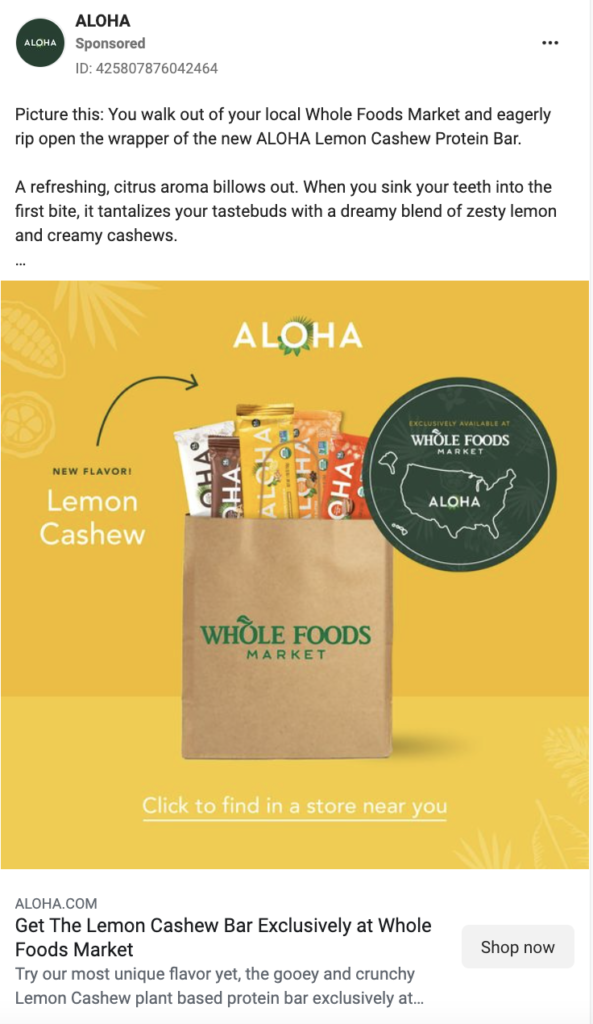
Why the ad works:
- Tells a story. The copy of this ad walks the viewer through a sensory visualization. By telling a story about your audience purchasing your product, you can help make buyers understand how your brand can fit into their lives. In this instance, the sensory visualization also serves to highlight the mouth-watering flavors and ingredients of ALOHA’s newest bar.
- The map makes it feel local. By including a map sticker, the ad not answers an important question(Where can I buy ALOHA? At Whole Foods) but also, at first glance, makes it seem like a local product.
- Simple enough to understand at a glance. With just a quick glance, viewers can tell this ad is introducing a new flavor of ALOHA bar. This ad would work particularly well in a remarketing campaign: the new flavor might interest past purchasers, or it might convince people who have seen the brand before to now convert.
9. Huel – Facebook Image Ad
What they’re selling: Nutritionally complete grab-and-go meals.
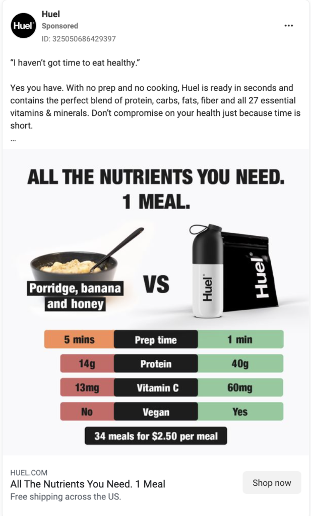
Why the ad works:
- Detailed comparison. Although similar to the “vs. the competition” ads above, this Huel ad has a slightly different take—we’ll call it “vs. alternative.” In it, we see the Huel product being compared to a worse alternative.
- Backs up comparison with numbers. Facts and stats lend credibility to products. In this instance, the protein and Vitamin C comparison indicates that Huel has the proof to support their claim.
- Clear, concise headline. This ad uses the same headline both on the image and in the copy headline spot: “All the Nutrients You Need. 1 Meal.” It clearly tells the viewer what Huel is and the most important benefit of it (complete nutrition).
- Refutes a common buyer claim and presents Huel as a solution. Huel mentions a common misconception (“I haven’t got the time to eat healthy”), then explains why it’s inaccurate and presents its product as the solution.
10. Daily Harvest – Facebook Image Ad
What they’re selling: a subscription to frozen smoothie mixes.
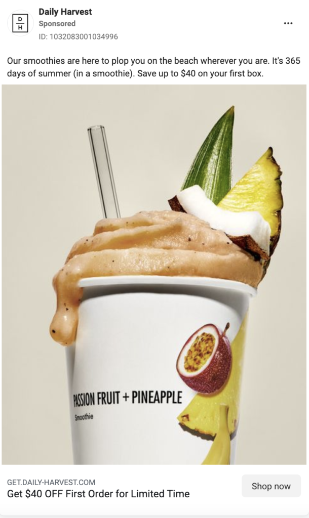
Why the ad works:
- It’s seasonal. Daily Harvest has chosen to showcase tropical ingredients in the image and call out the current season in their copy: “It’s 365 days of summer (in a smoothie).” It’s always great to paint a picture for the buyer that shows how easily a product or brand can fit into their ideal aesthetic.
- It highlights the discount up front. We see the discount in two places: the caption and the headline text. Both are worded slightly differently (“Save up to $40 on your first box” vs. “Get $40 OFF First Order for Limited Time”). The image and the first part of the caption copy seek to answer the question “why buy Daily Harvest?” while the headline brings urgency: why buy Daily Harvest right now?
- Includes a texture shot. Thanks, in large part, to the rise of beauty influencers, the texture shot feels super native to Instagram and Facebook. Here, Daily Harvest shows it off with a nice “drip” of the smoothie off the side of the cup. This little “imperfection” feels more authentic than a perfect image, and it contributes to an aesthetic sense of mouthwatering goodness.
—
As we’ve seen in these 10 clickable ads from TikTok and the Facebook Ad Library, there are many reasons why an ad would appeal to your audience. That’s why it’s important to test variations of each key component, including the image, headline, copy, and call-to-action.
No matter your audience, your ads should achieve three things:
- answer common questions that your buyers have
- present your product as the best solution to a problem
- be visually scroll-stopping
Learn more about composing ads that convert in our templates and guides:
- How to write a buyer persona and develop buyer decision questions (and why they’re important)
- 25+ Ways to write ad copy (and why they work) [Templates + Examples]
- 9 Outstanding video ad templates that convert
As you can see, the Facebook ad library, TikTok, and others are a great place to start when looking for inspiration on how to stay ten steps ahead of the competition.
Even better: If you want access to ads that have been tested and proven to drive conversions across the most popular social media channels including Facebook, Instagram, TikTok, and more, check out our comprehensive ad library of winning Primer-original ads! (link coming later)
Need help creating enough compelling ad creative to kick your growth into high gear?
Primer On-Demand is an online ad platform that delivers videos, images, and landing pages produced by top marketing designers who know what converts.
When you sign up for Primer On-Demand, you’ll get access to 10+ frame-by-frame templates for image ads, video ads, and landing pages. And you’ll be able to request an unlimited number of ad designs from our team.
TikTok is no longer a newcomer in the digital advertising space. It’s a global platform with global brands spending billions on TikTok ads. Its ads management platform is sophisticated and the reps are top-notch. If you’re not already advertising on TikTok, we have many reasons why you should start, and this guide will give everything you need to know to get your TikTok ads live and winning. Here, you’ll find ad ops best practices for TikTok ads, including how to set up your campaigns, the top TikTok ad audience strategies, and what to avoid.
How do we know what works?
We’re a top TikTok advertiser and a proud partner in the TikTok Creative Exchange. In fact, the majority of the advertisers that have partnered with us to create ads for TikTok have been featured in the TikTok Top Ads Library,, meaning they have high-quality creative, resonate well with audiences, and are high converters.