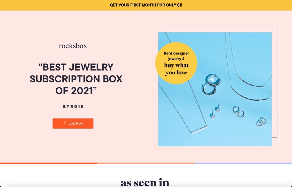
Your landing page is the first intentional point of contact for your customers. Your ad templates led them to your landing page, and now it’s time to generate conversions and make a sale.
Is your landing page effective and provides your target audience with the best possible experience? The only way to know is to test it, but you can be more confident and avoid wasting time by ensuring you have the necessary elements of a winning landing page.
Elements of High-Conversion Landing Pages
The best landing pages focus on the customer’s journey and guide them toward conversion. In other words, consider what your audience needs, from scannable copy to custom-made visuals emphasizing your brand’s product or service, and make sure they can access it on whatever device they’re using.
Landing Page Templates
Keep your landing page template in mind. These variations address different things in their headers, and the remaining structure depends on the goal. For example:
- BDQs (Buyer Decision Questions) – Address the key questions your customer needs answered before they are confident buying. Include concise answers, stats and proof, and include unique selling points mixed in with your answers. I.e if you were buying a car, you would need to know the MPG, the # of doors and the paint color.
- Listicle – In a sequence, specify why your product will solve problems or what makes it unique. Using the listed examples as proof, promise to satisfy your future customers.
- Vs. Alternative – Position your product as the best possible solution to a customer’s problem, comparing directly to traditional solutions, your direct competitors, or doing nothing. You should provide meaningful comparisons vs alternatives, trustworthy testimonials, and a breakdown of why your product is the best solution.
- Sales Questions – Rather than you reminding them their problem or goal, ask a question that causes your target customer to recall their problem on their own. Continue asking Qs so that they remember how urgently they want to solve it, and how they’ll feel when they solve it. Once they’ve reminded themselves of what they want, they will be excited to follow through with your call to action (CTA) right away.
- Personalized – Simply state what makes your product different. Get the press talking about how great your product is, demonstrate how easy it is to get the product, share customer testimonials, add before and after pictures, and show what makes the product special.
- Press/Testimonial – Start with a quote validating your product’s selling points and show quotes from press outlets, customers, and UGC examples. Tell customers how easy it is to reach similar results and guarantee the product fits their needs.
Download Primer’s favorite landing page templates here!
Landing Page Key Elements
Run through this at-a-glance checklist to make sure your landing page has all of the essential elements that set it up for success.
- Most Crucial: Information that addresses your audience’s core Buyer Decisions Questions (BDQs)
- Differentiation from potential alternatives and competitors (position directly vs the alternatives)
- A focused and direct headline addressing your target audience according to your landing page template
- Clear calls to action (CTAs) both above the fold and in each section
- Easily scannable copy with no more than 3 lines per paragraph
- Responsive design — optimized for mobile and desktop use
- Uncluttered, consistent design elements throughout
Browse our landing page gallery to glimpse this checklist in action.
Strategizing Variety
Variations
Landing page wins fatigue much more slowly, so you get more bang for your investment in landing page creation. Once you find a win, you can easily scale that win by swapping the hero section headlines, body copy, images and videos (as well as within other sections) to improve results. This will give you a way to test a specific message or feature within the page without creating an entirely new page.
Test With Primer
Whether you’re looking for someone to deliver ready-to-launch landing pages designed to convert or you need a partner to develop and manage your landing page testing strategy, Primer can help.
You can access high-converting landing pages, images and videos with Primer On-Demand, Primer’s trusted online platform.
Interested in learning more about how Primer can help you create video ads and landing pages that convert? Schedule a free consultation today.
So you’re in the market for an online platform to get ad creative designed for you. That’s what Primer is for. But naturally, there are similar options out there that do things a bit differently, serve a different type of company, and/or have a different price point. Let’s dig into how Primer On-Demand differs from one major competitor: No Limit Creatives.
Ad Creative Platform Comparison
What are they and what are they for?
Primer On-Demand is a platform that allows you to get high-quality ad creative designed for conversion and produced by our creative team in 2 to 4 business days.
It is for building a continuous pipeline of conversion-focused creative for paid social ads.
No Limit Creatives is a platform that gives you access to their design team to produce a variety of marketing content in 1-4 business days. They have 4 different plans, but their “Graphic & Video” package is the only one that’s comparable to On-Demand.
Rather than serving a particular niche, it is for getting various types of marketing designs produced as needed.
How Do They Work?
Both work in a similar way:
- Request an unlimited amount of marketing designs directly through an online platform.
- Get paired with the right designer for your unique request.
- Receive your creative back in 1-4 days after it passes a quality assurance check. Request revisions if needed.
There are some differences. When requesting edits, Primer On-Demand provides an easy-to-use review studio within our platform where you can make markings and leave comments in specific places. It makes giving feedback a breeze – much better than only using words over email.
What’s Included?
Primer On-Demand includes:
- Image Ads
- Graphic Design
- Custom Illustrations
- Video Ads
- Videos (image compilations, UGC, etc.)
- Custom Animations
- Fully hosted Landing Pages
What’s not included in Primer On-Demand?:
- General marketing design that is not tied to a specific growth goal
- Creative designed for physical applications (signage, presentations), including:
- Print graphics
- Logos
- Branding
No Limit Creatives includes:
- Digital & Print Graphics
- Custom Illustrations
- Motion Graphics & Video
- Landing Pages
- Logos & Branding
- Amazon Listing Designs
What’s not included in No Limit Creatives?:
- Creative that’s always designed for conversions
Since Primer’s specialty is growth and the biggest growth lever is ad creative, the types of designs we provide are always for the purpose of getting conversions.
Price:
No Limit Creatives: Approximately $949 per month
Since No Limit Creatives serves all marketing creative needs, the lower cost is offset with the lack of specialty. This is good for companies that are okay with having generalist designers rather than growth-focused designers, and want the ease of having a one-stop-shop for their design needs.
Primer On-Demand: $3,400 per month
Serving a different purpose, Primer On-Demand is the premium option for companies focused on generating revenue from high-quality ads produced by specialized graphic designers, video designers, and landing page designers, with an average rating of 4.9/5 stars.
Key Differentiators
No Limit Creatives’ key differentiators are:
- All your marketing design needs in one place, produced by one team
- Lower monthly price
Key differentiators for Primer On-Demand are:
- High-quality ad creative: Only 1.1 rounds of revision on average and 4.9/5 stars
- Conversion-focused ad creative produced by growth marketing designers
Ideal Customers
No Limit Creatives is best:
- if you have a lot of general marketing content needs and not enough graphic designers.
- if you can spend extra time in multiple rounds of revisions since the design team is not specialized in any single type of marketing niche.
- if your priority is ease and convenience amongst all marketing team members and you need all creative to come from one place.
Primer is best:
- If you are prioritizing growth marketing and don’t have enough graphic designers.
- If you’re a time-pressed growth marketer that expects top-notch ad creative on the first round of revisions.
- if your priority is ad creative that’s designed to convert.
The Verdict
So which one is better? It depends on your priority and bandwidth.
Companies that need high-quality, growth-focused creative with fewer revisions should go with Primer On-Demand, whereas companies that have various content needs and more time to spend in review stages may find No Limit Creatives to be the better option.
Ready for More Ad Creative?
Start getting more high-quality ad creative today. Learn more about Primer On-Demand and how to get started here.
What marketer doesn’t like to increase the conversion rate on their ads? It’s what we all want, yet, one of the most important factors in closing the deal is often forgotten: the landing page.
Some companies (ahem, a lot of companies) direct their ads to the homepage. We get it – it’s a hassle to create a landing page for every new campaign. But that consistency is exactly what’s expected from users and, yes, it does result in higher conversions.
While it might take more effort, creating a landing page that’s consistent with your ad is certainly worth your while. Read on to learn why landing pages are so much more effective than homepages in increasing conversions on your ads.
5 reasons why landing pages increase conversion rate on your ads
1. Landing pages carry over the ad experience
Who’s the audience you’re targeting in your ad? Is it Gen Z women? If so, wouldn’t they be a bit confused if they tap on the ad thinking “this is for me” but get directed to a landing page that doesn’t feature any Gen Z women, or worse, features older men? Or maybe you’re targeting puppy owners in your ads. If it leads to a homepage about generic dog food rather than puppy food, you’ve lost ‘em. But personalize the experience from ad to landing page and your customer will feel seen, heard, and much more likely to buy.
The good news? Not everything needs to be the exact same. The ad experience has a few key elements:
- the messaging (or key theme)
- the visuals
- the offer
- the audience
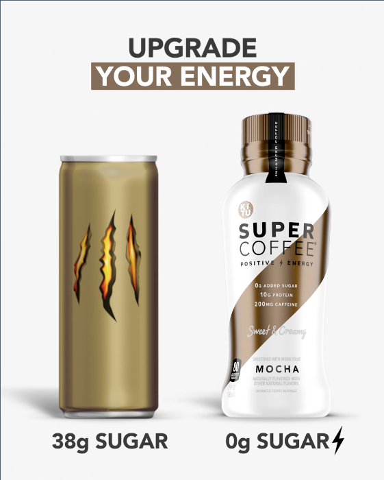
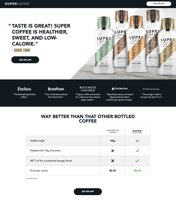
You might be able to get away with mixing and matching landing pages with ads that have a different key theme or message. For example, the ad theme may be testimonials, or it may be “how it works.” These can have the same audience and offer provided in the ad, and direct to the same landing page that features both the testimonials and the “how it works” section. See the ad and landing page below for a great example.
 |
 |
The non-negotiable: your landing page must be unique to the audience and the offer. And of course, there should be some consistency in the visuals (that’s just Branding 101).
2. Landing pages answer questions sparked by the ad
While homepages serve a more general audience that aim to cast as wide a net as possible, landing pages answer specific questions that the user will have after they see your ad.
There’s a reason they clicked on that ad and they want to finish the storyline you started. You can’t take them to a different story and expect them to stay interested enough to keep reading.
In a “vs. the competition” ad, for example, the landing page should answer questions about how the product specifically compares to the mentioned competitor. When all their questions are answered, boom, conversion. While you might have this info on your homepage, it will take the user a lot more scrolling to find the info they need, and by the time they reach your comparison chart, they’ve already bounced.
3. Landing pages have a single call to action
Perhaps the biggest thing that makes a landing page a landing page is the one singular purpose it serves. While homepages aim to educate the audience, provide value, and offer loads of different content, landing pages have one single call to action: make a purchase or submit a form.
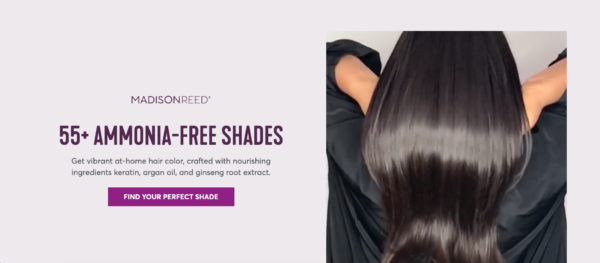
When you limit the distraction caused by navigation menus, case studies, blog posts, and other links, the user has a much more streamlined pathway to your conversion point. You don’t provide the temptation for them to click away to another area of your site. Instead, you show them exactly what to do. To make it even easier on them, you should add multiple CTA buttons throughout your landing page so that if they’re already convinced, they don’t have to keep scrolling.
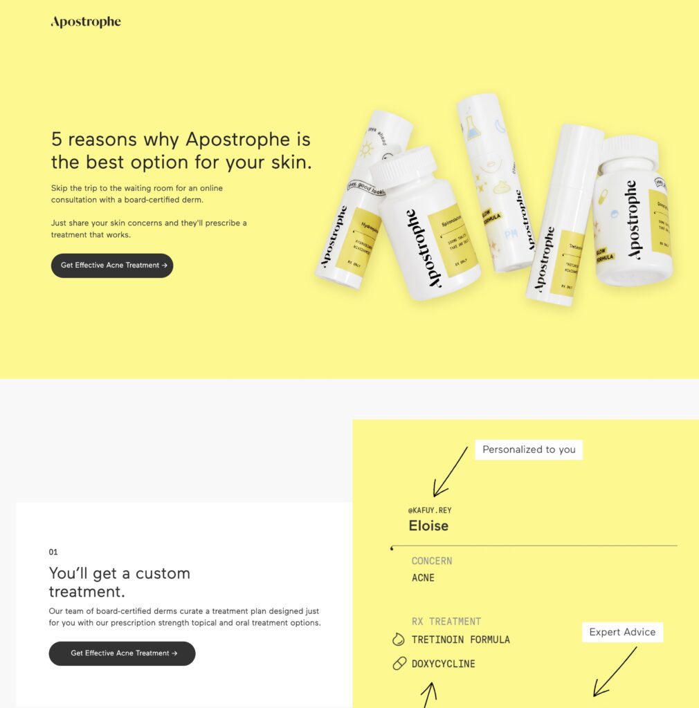
See how there’s no navigation on this landing page?
4. Landing pages show personalized social proof
While a homepage might feature rave reviews about your product in general, a landing page can get very specific to your target audience. For example, in a “vs. the competition” ad, the reviews on your landing page can make direct references or comparisons to your competitors, or pain points your competitor didn’t solve that you do. Check out this example from the Super Coffee landing page we saw earlier:
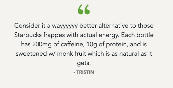
Likewise, you can (and should!) tailor the UGC on the page to the specific audience or product featured in the ad. This personalization provides reliability and trustworthiness that you can’t achieve with just generic UGC and generic reviews. Today, representation matters more than ever. People want to see people who look like them in your ads and on your landing page.
5. Landing page wins tend to last longer than ad wins
You shouldn’t just test your ads. You should also test your landing pages. Test big ideas and iterations, just as you would with your on-platform ad creative, in order to find wins. We’ve found that after testing a few different landing pages and finding wins, those wins last much longer than ad wins. A landing page might be successful for 4-5 months, whereas in-platform ad creative quickly fatigues out and is successful for a much more limited time.
This is reassurance that, while you’ll have to create new ad creative pretty often, you can continue to reap the benefits of strong landing page performance when launching new ads.
Landing pages increase conversion rate and decrease CPA
This is all great, right? But is it actually proven to help you achieve your goals? Of course!
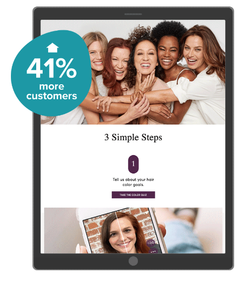
After starting a new campaign and testing dozens of Facebook-friendly, mobile-first landing pages, we found a clear landing page win for our client, Madison Reed. It was a “how it works” style landing page covering the three simple steps of their product. The results:
- It increased click-to-purchase conversions by 54%
- It Increased customer acquisition by 41% when paired with ad creative wins
Need another example?
For our client, Otter.ai, we tested and found a winning, quiz-style landing page that increased conversion rate 65%. We also made a landing page specific to their retargeting ads, and therefore, their more middle-of-funnel audience, which lowered retargeting CPA by 43%.
Time to increase CVR on your landing pages
If you’re already using landing pages for your ads, congrats! If not, here are a few tips on how to create landing pages that convert.
Already running landing pages but not seeing those conversions? We can help! Get expertly crafted landing pages with Primer On-Demand or leverage our full-service agency for landing page and ad testing for maximum growth.
To Primer Friends and Partners:
As marketers, we find ourselves again in uncertain times. The recent tumult of the financial markets, increased inflation, and a long road ahead to economic recovery have many of us reconsidering our marketing strategies.
Sequoia Capital called this a “Crucible Moment” in their recent “Adapting to Endure” presentation. “We must recognize the changing environment and shift our mindset to respond with intention rather than regret.”
At Primer, we have a close eye on these macroeconomic impacts across our entire portfolio of partners – spending $10s of millions across Facebook, TikTok, Snap, Google, Pinterest, YouTube, and more.
We have seen some partners adjust their budgets and others double down. If you’re not sure which changes to implement, you’re not alone. As your partner in growth, we would like to share what we’re seeing in the media marketplace today.
Here’s some good news: it’s encouraging.
Reduced competition is driving low CPAs
The brands that have pulled back are leaving opportunities for those that choose to invest in ads and marketing right now.
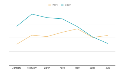
The first five months of 2022 were more expensive in paid social than 2021, but that trend has recently reversed.
Blended CPAs across our partners have decreased 45% since January. For the month of July, CPAs are 27% lower than in 2021.
CPAs are the lowest of the year
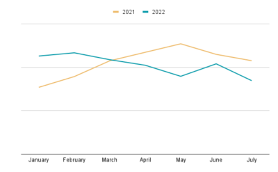
CPMs are also down — 25% lower since January 2022 and 21% down in July, compared to July 2021.
CPMs lower year over year
This is a great time to test and learn
These lower costs can make up for any drop in conversion you may be seeing as a result of reduced demand. With lower costs, learnings are more affordable, and you can emerge from this economic downturn with winning ads that are ready to scale when you are.
Our advice is to consistently run tests to find new winners that can be easily scaled when demand returns. You’ll be there for an incredible intersection of cheap CPAs and a spike in demand (similar to the surge in 2020).
Stay agile. Stay connected. You will succeed.
Similar to our advice at the very beginning of the pandemic, we still believe these keys to success will guide you through these times.
- Have empathy for your customers. Show them you care and understand their needs by speaking directly to their most important questions about your product.
- CPAs are the lowest they’ve been since early pandemic days. Utilize opportunity.
- Demand for home delivery and digital experiences has held strong. Acquire a huge generation of lifelong customers who remember you for making their lives easier during tumultuous times.
- UGC is what users are responding to these days. Test native-style ads featuring “real people” showing how they can benefit from your product.
- Stay informed. Stay agile.
We’re here to help
We believe that thoughtful testing, rich ad creative, and intentional investments will lead to growth that will endure these ever-changing times. It worked for our partners through the pandemic, and we’re here to help you through whatever comes our way next.
Whether that’s through full-service, hands-on management of your paid media or by providing high-quality ad creative on-demand, our team is ready to help you find ways to test more and win more.
If you work in advertising, you know that the key to growth is performing lots of ad tests very quickly. But those ad tests wouldn’t be possible without a lot of creative. And that creative wouldn’t exist without the ideas behind them.
Sometimes, those ideas just don’t come quickly. We’ve all been there. So how can you keep the creativity flowing? Well, you open up the creative faucet, of course.
What is the creative faucet?
The creative faucet is a term coined by Julian Shapiro to describe the process of getting out all of your ideas in order to eventually land on a good idea, similar to flushing out the water of a dirty faucet to get to clean water.
Whenever you have to come up with something creative, you open your creative faucet, meaning, you let the ideas start pouring out…even if they’re terrible. In fact, the worse your ideas, the more you need to get them out of your brain and into the world, whether on paper, in a Google doc, in a notes app, through your vocal chords, or just jamming on your instrument.
Once the bad ideas are out, you’ll start to get some okay ideas. Those okay ideas should give you some aha moments that lead to good ideas, and those good ideas will then turn into something great.
The point being – great ideas don’t just happen. They don’t come out of nowhere. They come to fruition once they’re sparked by something that’s only good or okay, or maybe even something bad.
The creative faucet in action
To showcase the creative faucet in action, here’s an example from John Mayer.
In this video, John Mayer picks up his guitar and almost immediately starts brainstorming lyrics. He says that if you don’t start immediately, you’re simply wasting time. “You just keep going until you get something,” he sings to a freestyle melody.
How does the creative faucet apply to marketing?
Whether you’re a designer, a copywriter, a growth marketing manager that needs to write briefs, a content writer, a creative strategist, or anyone that relies on ideas for marketing, you can apply this process immediately in order to help you:
- Get work done faster
- Produce better and more effective creative or creative briefs
- Stay focused on the task at hand
As marketers, our attention is pulled in a million different directions at all times. But when you open the creative faucet, your ideas will wait for no distractions. This means that you’ve got to dedicate time to this process or else a good idea might come and go while you’re busy checking Slack.
In return, you’re able to complete the task faster and in a process you’ll hopefully enjoy much more, with deliverables that are better and more effective. When it’s time for you to get started, make sure to do it the right way, free of distractions.
How to open the creative faucet in marketing
- Block off 90 minutes. Make yourself completely unavailable on calendar, Slack, social media, phone, email, pager, Alexa, kids, knocks on the door, carrier pigeons, everything. It’s just you and your ideas.
- Use the first 10-15 minutes for a rapid brainstorming session. Type out anything that comes to mind, letting your ideas build upon each other.
- Immediately go straight into your deliverable. For a Growth Marketer this might mean step one was brainstorming your ad image copy, and step two is actually writing your ad description copy and/or creative brief.
- If you need to provide any specific formatting, links, or add in images or videos, do this last. This would just be a distraction to your creative faucet.
It’s super important to do this all right away when your ideas are fresh and the creativity is flowing. It will get done way faster without any distractions. Plus, it will actually be fun to get it all done in one go. The longer a project drags on while you switch from project to project and app to app, the more the outcome, your productivity, and your own personal enjoyment suffers.
Creative requires creativity
Creative requires creativity, and when creativity is your day job, it requires dedication to the brainstorming process. Over the course of 1 quarter, we test about 100 visuals and 50-75 copy variations for each of our partners. To test a lot, we have to come up with a lot of ideas.
This has been the tried and true process that helps us come up with ideas worth testing, whether it’s for the big idea tests or small iterative ones. And from those ideas come the wins and the revenue. Check out “What To Test on Your Social Media Ads: Big Ideas vs. Small Iterations.”
Learn more about our growth marketing agency or on-demand creative platform.
It takes a lot to keep social media ads performing these days. While budget, audiences, and account strategy can all have an impact, the biggest driver of success (or failure) is your ad creative. And the secret to having winning ad creative is to test a lot of it.
There are several ways to test your social media ads, making it hard to strike the right balance between launching new “big idea” ads vs. small tweaks, or iterations, of those big ideas. Thankfully, we’ve found a method that helps us find winning ads fast. We call it the Outlier Method.
The Outlier Method
At Primer, we have a simple, four-step approach for our creative tests that allows us to launch dozens or even hundreds of high-quality social media ads per month:
- LAUNCH: Ideate and launch “big idea” ads based on key questions buyers have. (Get our step by step guide on ad testing here.)
- PAUSE: Pause underperforming ads and determine the ads that beat the account average and become top performers — the “wins” — we call these the Outliers.
- SCALE: Scale the budget for the “wins” and make creative iterations on them for your next test.
- REPEAT: Periodically start a new “big idea” process and repeat steps 1-3. We do this 1-2 times per month for our partners.
With this method, it is easy to launch dozens or even hundreds of ads per month. In this article, we’ll define big ideas and iterations, explain why they’re important, and show you how to leverage both for your social media advertising.
Step 1: LAUNCH
What is a “big idea” in advertising?
For social media ads, a big idea is a brand new idea, theme, or creative style. Generally, for every big idea, you should create 3-10 ads and launch them into one combined “big idea test.” This is also sometimes called research and development, or R&D, testing.
How to create big ideas in paid social ads
When brainstorming big ideas, focus on concepts that do any one (or a combination) of the following:
- Emphasizes a totally different value proposition than your past tests
- Targets a different audience (e.g. change what gender or age range you’re targeting)
- Uses a fresh visual look
- Includes all-new copy and headlines
- Is part of a larger, new “campaign” (e.g. ads that correspond with your brand’s current influencer campaign)
Make sure your ideas are grounded in your buyer personas. Once you determine your ideal buyer, you can then figure out what types of questions they would ask before purchasing. (Tip: Use our easy buyer decision question worksheet to figure these out for your brand.)
These “buyer decision questions” should guide your copy, headlines, calls-to-action, and more.
Resources for creating high-quality ad creative that converts
When you create new paid social creative, you have the opportunity to try a new style or new content for any of the following ad elements. Below, we’ve linked to a few of our free templates so you can hit the ground running sooner:
- Copy
- Static Imagery
- Image Headlines
- Facebook and Instagram Videos
- TikTok Videos
- Calls to action (CTAs) — See a full list of Facebook calls-to-action and a full list of TikTok calls-to-action
- Headline — This is usually a compelling value prop framed as a next step (e.g. Get 15% Off Now)
- Video thumbnails
- Landing pages
An example of a big idea test
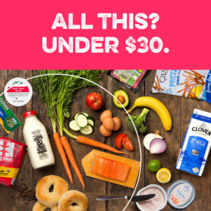
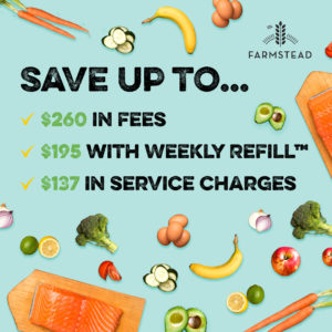
For our partner, Farmstead, we wanted to test an idea that visually shows how much value a customer would get by using Farmstead’s grocery delivery service. For this test, we created 9 images and GIFs, each taking a slightly different approach to the concept.
https://goprimer-1.wistia.com/medias/0xcu36l0w3?embedType=async&videoWidth=381
 |
 |
Step 2: PAUSE
Within 48 to 72 hours after you launch, you should start making adjustments to the ads within your test. Quickly pause the ads that are underperforming in order to focus on the wins. (Don’t sleep on this – you don’t want to waste money on poor performers.)
Find the wins. A “win” is a top-performing ad that is a performance outlier. Wins should have better performance than your account average by at least 10%. They should also have at least 10 conversions.
After figuring out which ads for a test are wins, you can then move on to step 3: SCALE.
Step 3: SCALE
Now that you have identified your winners you can increase the ad spend to the wins and then start to scale. The fastest way to scale is to create at least 3 ad creative iterations on your winning ads
What is an iteration?
An “iteration” is a variation of your previous top-performing ads (i.e., “wins”) in which you change one or two elements. By creating multiple iterations and testing those, you can thoughtfully scale your account’s wins.
By reusing key elements from past top-performing ads, you can also hone in on what really makes an ad work.
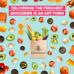
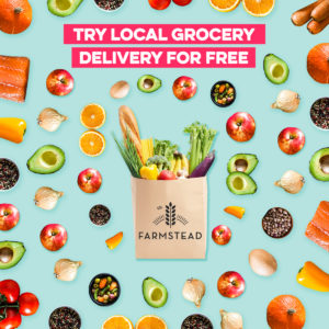
For example, let’s say we have an ad with the same image but a bunch of different headlines.
 |
 |
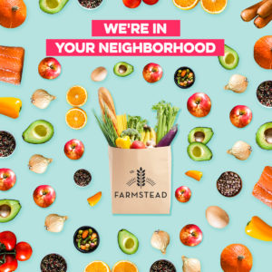 |
If multiple versions of that ad (with those different headlines) perform, it’s likely that something about the main image is leading to increased conversions.
Once you have a top performer, iterations can help refine performance. Over time, you’ll be able to combine multiple winning elements from different ads (say, one top performer’s headline and another’s image) into a new Franken-ad.
 |
Since each element has been proven to work multiple times over, you should see even better performance when combining them all together.
Tip: For every win, create at least 3 iterations. Focus on changing 1 or 2 key aspects of the ads (see a full list of what to test below).
How to create good iterations
Ways to iterate on landing page wins:
- Change the header section at the top of the winning landing page. You can include a new header/hero image, new headline, and a new subhead
- Include a different call-to-action on your buttons
- Swap sections of the landing page around
- If you have a testimonial section, change which testimonials are there
- Keep the copy the same but change the landing page’s images
- Test a longer or shorter version of the page
- Test out a different signup or purchase flow after your button click
- (If applicable) Swap which product you feature
- (If applicable) Change what audience you’re focusing on (e.g. a women-focused page vs. a man-focused page for clothing)
Ways to iterate on video wins:
Select one or two core elements to test and change within your winning video, such as:
- Different testimonials
- Different call-to-action
- Different first frame
- Different thumbnail
- Change the order of the sections within the video (e.g. swap order of price and UGC sections)
- Keep the captions the same but swap the background imagery for something new
- Keep everything the same but swap for a new color scheme
Ways to iterate on image or GIF wins:
Select one or two core elements to test and change within your image/GIF, such as:
- Keep the copy the same but change the main image
- Keep the main image the same but change the main headline
- Change the call-to-action
- Add animation if there is none
- Change animation to static
- Add or swap the background music
- Try the same image with a different color scheme
How we used the big idea and iteration process to scale Farmstead

Step 4: REPEAT
Keep this process going. As you continue to find wins, iterate on those wins. Then, depending on your budget, you should also launch new big ideas 1 – 2 times per month. This continuous pipeline of new tests ensures that your ad account is never going stale and that you always have ads that can support more budget.
Ready to find some big wins?
Altogether, this method significantly and rapidly expands both the number of ads you’ve launched and the advertising spend you’re putting towards proven top-performers. It allows you to spend with a clear strategy for growth rather than wasting money on a series of mediocre, big idea tests.
If you’re ready to try out our Outlier method, you can D.I.Y. with the help of our step-by-step guide to ad testing for social media ads. In it, you’ll find out exactly how often to test, how many ads to test each month, and how to structure your creative testing.
If you’re looking for help scaling and testing your ads, you’ve come to the right place. We’ll handle it all for you – the creative strategy, design, production, reporting, and media buying. You just enjoy the wins.
Just need help producing the creative? Try our new Primer On-Demand platform and get access to a team of expert marketing designers. Make unlimited requests for images, videos and landing pages.
Book a consultation to get started.
Iconic beauty brand Revlon filed for bankruptcy and has been having a rollercoaster of a week. Whether their stock is up or down, it’s clear that Revlon is not going anywhere, and we have a hunch that their need to meet goals and grow will only become more important.
We feel for you, Revlon. This has probably been a tough week for their marketing team, so we thought we’d help them out.
We applied the Primer method to create a hypothetical campaign, including ad creative and a landing page, that we’re sure would help Revlon drive sales for their ColorStay foundation.
Revlon, here are ads that are sure to acquire more customers. To help create more ads like this, we’ve broken down how and why we made these ads.
Disclaimer: Revlon is not a Primer customer, nor does Primer have any real association with Revlon.
How do we develop an ad strategy for paid social?
When we first partner with a company, we kick off by learning their goals and developing their best customer persona. Then we dig into the most important buying decision questions – these are the answers that their customers HAVE to have before making a purchase. Next, we plug that critical information into key themes we have tested thousands of times over and know will help to generate results.
Since we aren’t actually working with Revlon, we had to take some educated guesses. Here’s what we came up with.
A Best Customer Persona for Revlon
Taylor is a 33-year-old dental hygienist who lives in the suburbs of Chicago. After she graduated from college, she moved to Chicago to live in the city, but as her job has changed, and she has gotten a little older, she has been looking for a little more space that isn’t too far from the action.
Fashion and beauty have always been important to her, but with student loans and rent, she isn’t able to spend as much on her makeup as before. She doesn’t want to trade quality, though, and is looking for the smartest choice in makeup that will still help her look young and trend-forward.
Taylor has tried many makeup varieties, including the trendy, celebrity brands, but with higher gas costs and an increased cost of living, she is looking for ways to save that don’t involve much of a sacrifice.
She wears foundation every day and knows Revlon from the drugstore, but she isn’t sure if it is as high quality as the other brands she has tried. She is about to run out of her current foundation and is looking at alternatives.
Buyer Decision Questions from a Revlon Customer
- Is Revlon a good quality foundation?
- How much does it cost?
- How do I know what it will look like on me?
- Where can I buy it?
- What does it look like on other people?
- Are other people happy with it?
- Is it trendy?
What ideas should we test in paid social?
Once we get a handle on who we’re talking to with our ads, we determine what we are going to say in the ads. This focuses on the key value propositions of the product and addresses those key buyer decision questions above.
At Primer, we’ve tested thousands of ads and through our learning, we have developed several themes that we know are successful at driving conversions for our direct-to-consumer partners. For Revlon, we chose to use the “vs. the competition” theme because we saw that they have faced “increased competition from new brands like those backed by celebrities such as Kylie Jenner’s Kylie Cosmetics and Rihanna’s Fenty Beauty.”
In this theme, we position Revlon’s foundation directly against the competition. In this case, it’s the “trendy, celebrity brand.” Fortunately for us, Revlon has a lot going for it. Here’s what we came up with.
Image Ads That Answer Questions
For our hypothetical ad campaign, we created two images, two videos, and a landing page. Of course, if we were really partnering with Revlon, we would significantly increase the volume of tests we’re running tailored to hit their goals.
This should give them something to get started with.
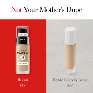
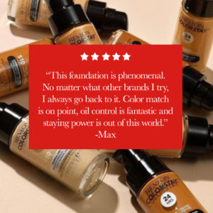
Here’s why these image ads work:
- They directly contrast the Revlon foundation against the “trendy, celebrity brand”
- The headline speaks directly to the target audience using “dupe” and addressing the concept that Revlon could be considered an “old” brand head-on
- The testimonial image gives a great customer quote about having tried other brands and always coming back
- A longer testimonial tends to stop users from scrolling to read a bit more (note: this doesn’t work as well with brand copy, but it does work when it’s a customer talking)
- The five stars visually reinforce the testimonial
As a bonus, we also made them this gif:
https://goprimer-1.wistia.com/medias/2g01hbfbu6?embedType=async&videoWidth=381
Video Ads For Instagram and TikTok
These two video ads are designed to feel native in Instagram and TikTok, positioning Revlon as the trendy foundation that wins over millennials’ hearts and budgets.
| https://goprimer-1.wistia.com/medias/psat1syox4?embedType=async&videoFoam=true&videoWidth=3 | https://goprimer-1.wistia.com/medias/7z2eulr5dx?embedType=async&videoFoam=true&videoWidth=3 |
Here’s why these videos work:
- They are fast-paced, grabbing attention from the first frame
- Trendy, upbeat music feels native to the platform and entices you to keep watching
- Native-style text treatment makes it hard to distinguish if it’s an ad
- Opening copy “hooks” (e.g. Why millennials are switching to Revlon) grab attention
- Keeps Revlon branding to a minimum, again tapping into the organic feel of the platform
- Directly positions Revlon against the competition
A Landing Page Designed to Sell
Landing pages are an often forgotten part of the conversion rate optimization (CRO) process. However, they can hold just as much value as the ads themselves in improving conversions and cost per acquisition (CPA).
It would be so easy for Revlon to run an ad campaign that leads to their website (which is pretty good, we think), but when you pair a landing page with ads that are focused on answering all of those key buyer decision questions, that’s when you find yourself with those smokin’ hot CPAs (the kind that I think the Revlon team would get excited about right now).
So, to help out, we built out a fully functioning Revlon landing page. You can check it out here.

Why this landing page works:
- The landing page continues the “vs. the competition” theme from the ads – what the user sees in the ad is being continued in the landing experience
- User testimonials and press logos validate the quality and trendiness of the product – two core buyer questions
- The page walks you through how you can try on the foundation and make a purchase
- Customer images validate the trendiness and popularity of the product
- CTA buttons are included throughout the page
- The price is included in the CTA button – reinforcing the key value proposition of price in every section
Test More, Win More
We don’t have insights into the real marketing strategy of Revlon, nor do we presume to know the real challenges they face, however, we can see the mountain of opportunity that awaits Revlon ahead. With such a vast consumer base, there are so many testimonials, user images, videos and experiences that can be incorporated into powerful paid social advertising campaigns.
The best way to learn what works is to keep testing.
We hope this inspired you. If you’re looking for more inspiration, we invite you to check out any of these resources:
- Our analysis of Dollar Shave Club’s UGC ads on Instagram
- 10 fashion Facebook & Instagram ads we love right now
- 9 ways to create winning video ads
Looking for more growth marketing help? Primer delivers conversion-focused images, video ads and landing pages within 2 – 4 business days through our On-Demand platform for marketing creative. For brands looking to scale quickly, Primer also offers managed growth marketing services through our full-service agency. To learn more, book a complimentary growth consultation.
As a fast-growing, direct-to-consumer (DTC) business, it can be hard to create static and video ads for paid social that stand out among the competition. Especially if your brand is among the largest DTC category: apparel and accessories.
What Is a Facebook Ad Library? Why Does It Matter to DTC Fashion Brands?
The Facebook ad library is an example of how social media companies like Facebook and TikTok have started compiling ads using their platforms, so they’re searchable by category and can be used to track ad spending data.
We found 10 scroll-stopping ads from top DTC fashion apparel and accessories brands in the Facebook ad library and broken down the winning features so you can apply them to your campaigns today.
Through the process of testing thousands of ads on paid social channels like Facebook, TikTok, and Instagram, Primer has developed its own library, where you can find even more examples of winning ads that are proven to convert and drive growth for your organization.
1. AllBirds – Facebook Video A
What they’re selling: sustainable, lightweight footwear.
The ad:
Why the ad works:
This video ad from the Facebook ad library puts the user in AllBirds’ shoes–literally! The ad achieves this by showing their product in action, avoiding static ad and branding elements, and highlighting some key selling points.
- Shows the shoe in action. We can imagine ourselves running with these shoes more easily because the ad shows not just the shoe in action but also a person putting on the shoes before running in the woods.
- End card with the logo. Instead of a static end card, we see the Allbirds logo flash before a video of the runner.
- Highlights additional selling points in the headline. Allbirds takes advantage of headline and description real estate to share two more reasons to buy: “free shipping + free returns.”
2. Reformation – Facebook and Instagram Image Ad
What they’re selling: eco-friendly, upscale women’s clothing.
The ad:
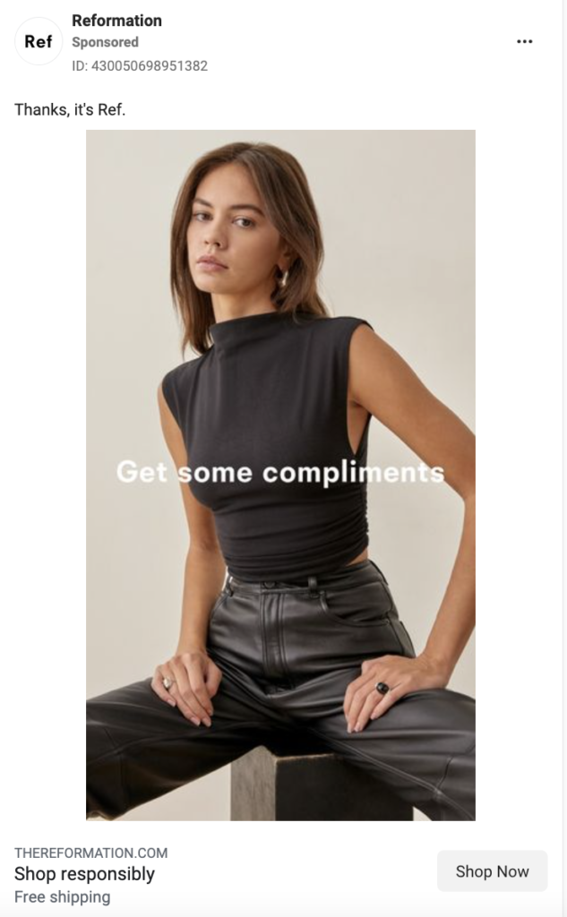
Why the ad works:
We wanted to highlight this image ad by Reformation from Instagram and the Facebook ad library because of its use of selling points in the headline, appeal to buyers’ emotions, conversational tone, and stand-out use of color.
- Highlights additional selling points in the headline. In this instance, “shop responsibly” speaks to sustainability. It subtly positions itself against the competitors (largely fast fashion retailers) with this headline.
- The image headline appeals to buyers’ emotions. “Get some compliments” taps into their buyers’ desire.
- Uses a casual tone in its copy. “Thanks, it’s Ref” achieves a few things for this ad: it allows the brand to speak for itself; it converses with the headline in the image; and it stays true to the brand’s casual, “best friend”-esque tone.
- Plays with color. While most of the “thumb-stopping” ads you’ll find on this list utilize a bright color palette, this ad focuses on having the monochromatic outfit stand out against the bright background of the webpage.
3. StitchFix – Facebook Video Ad
What they’re selling: a personal stylist box.
The ad:
Why the ad works:
- Includes a compelling testimonial in the thumbnail. The user quote serves as social proof of how awesome the service is, and its effectiveness is a perfect example of why this ad makes Primer’s top 10 list from the Facebook ad library. It’s particularly scroll-stopping in a thumbnail because that’s the first thing people see. Continuing the user-generated content (UGC) throughout the video also makes it feel relatable and approachable. Bonus that StitchFix says these are “real clients paid for their time.”
- Shows unboxing footage. Not only is unboxing a current trend on organic social media, but it adds a sense of trustworthiness and excitement.
- Describes the process in easy-to-understand steps. The video breaks down what StitchFix is and how to use it very easily: we learn that you sign up, take a style quiz, and then have clothes picked for you delivered.
4. Pact – TikTok Video Ad
What they’re selling: women’s underwear.
The ad:
Why the ad works:
- Has a person in the first two frames. We’ve found that our best TikTok ads showcase a user in the first two frames. This suits the overall shift to more UGC-style content. Learn more about creating ads that work on TikTok.
- Shows unboxing footage. Pact, like StitchFix, uses unboxing video to complement the rest of their ad. Here, it’s equally successful at making the video seem like a real customer’s journey, and thus being more trustworthy.
- Shows a variety of style options. In multiple frames, we see different color and style options, including in the hand of the narrator, on a screenshot of the website, and laid out one-by-one.
- Has captions (good for both sound on and off viewing). A bonus is that this particular caption style is native to TikTok and reflects TikTok’s “auto-generated” captions.
- Calls out some unique selling points that might appeal to an ideal buyer. (e.g. How Pact’s underwear is sustainable because it’s made from organic cotton.)
5. Alo Yoga – Facebook and Instagram Stories Ad
What they’re selling: workout and athleisure clothing.
The ad:
Why the ad works:
This ad by Alo Yoga earned a top spot in our winning Instagram and Facebook ad library because of how it utilizes urgency, highlights the usefulness of their product,uses simple animation, and makes their ad timely.
- Adds a sense of urgency with “limited edition” messaging. By including “limited edition” in a rotating sticker, this ad not only adds a reason to buy right now (as opposed to later) but also implies an increased sense of exclusivity and competition. It fits with the higher-income audience Alo is likely targeting.
- Shows a full outfit. Matching separates are in right now, and Alo’s ad is not only on-trend, but it also makes their clothing seem more wearable by styling an outfit for buyers right away. They made two versions of this ad: one with a bandaeu top and shorts, and one with a bra top and capris leggings. Tip: Swapping outfits but keeping the rest of your ad the same is a great way to test which product items have the most click-through interest.
- Includes simple motion. One way to stand out from the crowd with your images is to make them GIFs. Here, Alo Yoga takes the static one step further by adding animation to key copy: “blue splash” and “limited edition.”
- Hints at the season in the description. Alo stays relevant to shoppers by including a nod to the current season. Here, we see it in a less prominent location: the description (“So essential for all your summer plans”).
6. Fabletics – TikTok Video Ad
What they’re selling: men’s athleisure apparel.
The ad:
Why the ad works:
- Uses a conversational tone. This ad sounds like a friend talking to you, which makes it seem less like an over-the-top sales pitch.
- Shows the website and different color options. We’ve seen this before: showing the real user experience on a website and the variety of product options entices a variety of buyers and makes your brand seem more legitimate. This ad does something unique, though: instead of just using a screen recording of the website shopping experience, we get a video of the woman actually using the website on her computer. Having her hand in the frame makes this feel like a real user experience.
- Uses native-feeling green screen trend. By utilizing the green screen TikTok filter, this ad feels on-trend and native to the platform. You can also use this filter to keep a person in frame, even when showing off screenshots.
- Has native-style, “auto-generated” captions (good for both sound on and off viewing).
7. Mejuri – Facebook and Instagram Image Ad
What they’re selling: trendy fine jewelry.
The ad:
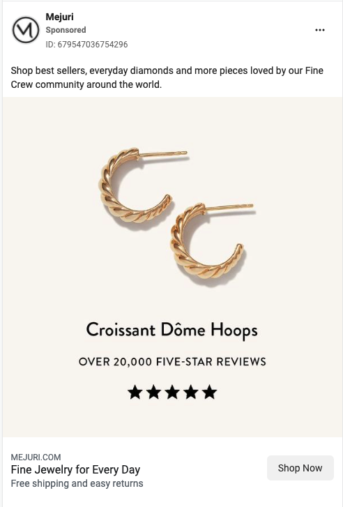
Why the ad works:
- Shows a real number of customers. By including “over 20,000” in their sub-headline, Mejuri makes the positive reviews seem more tangible to potential customers. This is much more impactful versus saying something vague like “Thousands of five-star reviews.”
- Visually shows the stars in the star rating. It may seem like a small thing, but we’ve found that ads that include the stars on the image when talking about the number of positive reviews perform better than those without that same imagery.
- Adds two secondary selling points in the description. They make efficient use of the description space to pack in two more reasons to buy: “free shipping and easy returns.”
8. Rocksbox – Facebook and Instagram Stories Ad
What they’re selling: a jewelry rental subscription box.
The ad:
- *Made by Primer
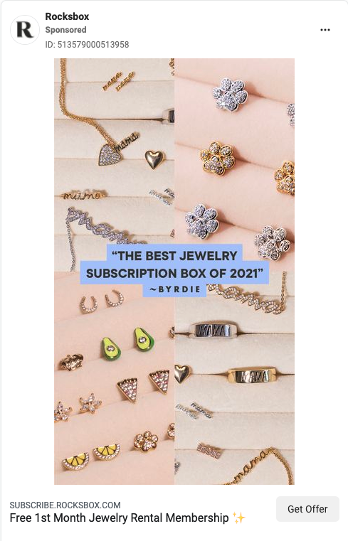
Why the ad works:
This video ad, which Primer made for our long-time partner Rocksbox, deserves a top spot from both Instagram and the Facebook ad library. We’re proud of this ad because it effectively uses press quotes, highlights a variety of product styles, and uses colors that pop.
- Image headline is a press quote. Press quotes, like user testimonials, add a sense of trustworthiness to positive feedback. Here, for example, seeing “the best” feels truer (and less like exaggeration) than if the brand were to claim this themselves.
- Shows a variety of styles. There’s a style that works for everyone, from cute avocado earrings to refined gold chains. By showing a variety of options, you can entice a wider buyer base. People may click on the ad because one specific piece of jewelry caught their eye, and they want to sign up to get it.
- Blue headline background stands out. The sold background color imitates Instagram story captions, while the specific color choice—a bright blue-purple— stands out against the pink background, making the press quote pop.
9. James Allen – TikTok Video Ad
What they’re selling: custom engagement rings.
The ad:
Why the ad works:
- Walks users through the purchase. Videos that follow the “how to” format perform well because they guide the viewer through the buying process and let them know what to anticipate when ordering. This ad walks the user through every step of the process of buying a ring at a specific budget. (More video hooks here.)
- Shows users exactly where to look. Because this video is so jam-packed with information, it uses additional design elements, like arrows and circles to direct attention to the portions of the screen that the voiceover discusses.
- Shows the product on a real hand. After spending so much time on the James Allen website, the ad brings it back to a real person: at the end, they show this DIY’d ring on a real hand.
10. Warby Parker – Facebook and Instagram Stories Ad
What they’re selling: prescription eyeglasses.
The ad:
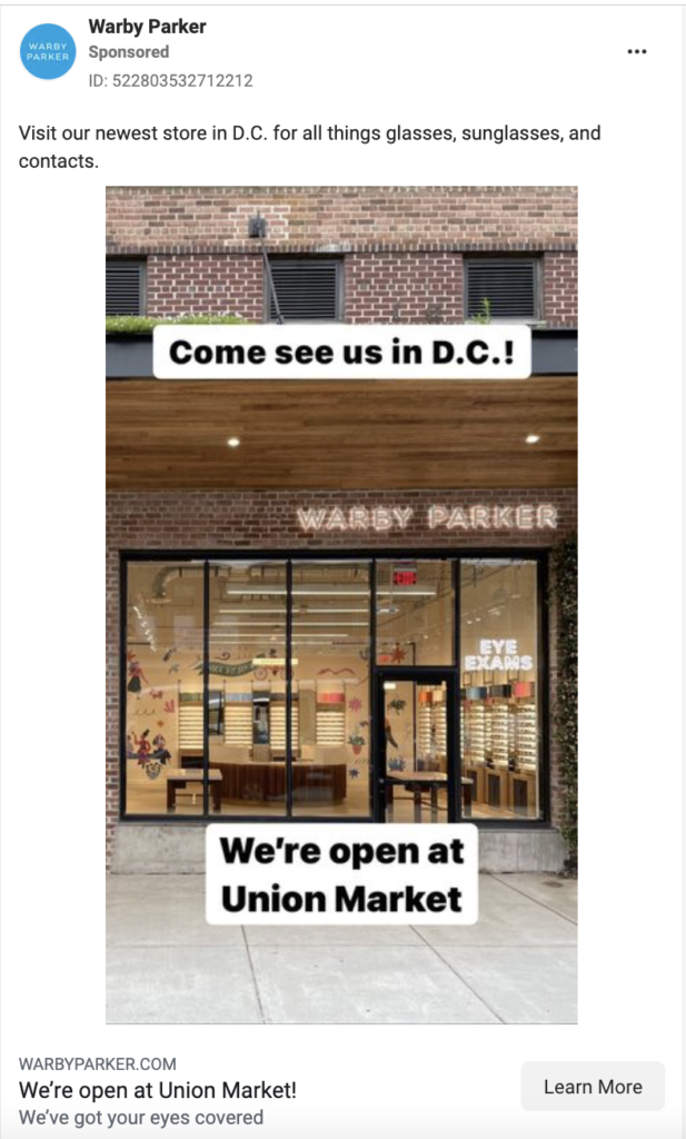
Why the ad works:
- Regional call-out. When your goal is to grow in a specific market or with a specific product, it’s best to filter out unqualified customers by not only targeting the audience but also targeting the content to speak with those you want to reach. This Warby Parker ad creative speaks directly to their target: buyers in D.C.
- Native text style in the image. The black text and white background combination in the image mimics the text style of both Instagram stories and TikTok videos, making this ad feel organic.
What can we take away from these 10 outstanding fashion ads?
Want to create ads that drive conversions, facilitate rapid brand growth, and would be a top performer in the Instagram, TikTok, or Facebook ad library?
Here are 5 rules of thumb for making your content stand out on the feed:
- Include native-style captions and trends to blend more organically into the platform you’re on
- Walk users through the full buyer journey (decision making, after ordering, and unboxing)
- Choose eye-catching, scroll-stopping colors
- Make use of the description to further differentiate your product
- Use your ad creative to target your consumers
Check out more examples of high-converting ads in the Ad Library.
Want to use paid social to stand out from your competition?
Primer works with several DTC apparel and accessories brands, helping them scale their business and hit their goals. If you’re interested in learning how Primer can help you, book a complimentary growth consultation.
You’re probably not launching enough new ads to hit your goals. With changing algorithms and creative styles, it’s more important than ever to refresh your ad creative and unlock new audiences. Here at Primer, we determine how many ads we should test based on the ad spend. We aim for 50 new ads for every $25,000 in ad spend.
Why do we recommend launching 50+ new ads per month?
Testing a high volume of ad creative in paid social helps in four key ways:
- Improves critical metrics like CPA and ROAS
- Keeps ad creative from growing stale (this is increasingly important as converting creative styles change)
- Unlocks new audiences (this is particularly helpful for content-marketing-focused brands
- Leads to a more sustainable growth strategy (Bonus: Consistent testing means you can find wins even as algorithms change)
Won’t testing that much hurt CPA?
Short answer: no.
Using a regular, high-volume testing cadence, we scaled purchase volume by 60% and increasing conversion rate by 65% over a 3-month period for one of our partners.
You can expect a new ad set to increase CPA during its learning phase (right after launching); however, if you structure your test correctly, you can minimize the impact.
Here’s how: create your test in a separate ad set and make sure this testing ad set budget should be less than half of your overall monthly ad spend. This means any spikes in CPA should be both temporary and minor.
In the long run, you’re much more likely to hit your goals with regular testing than by leaving the same two to three ads active for months at a time. This is because of “creative fatigue.” Over time, an ad that was once a strong performer loses its efficiency, and CPAs start to increase. By consistently finding new wins, you can defend your account against this phenomenon and unlock new strategic learnings to use in your future tests, content marketing, email campaigns, and more.
This is particularly true on TikTok, where creative fatigue happens much faster than on Meta.
Here’s what to test in new ads
Launching dozens of ads per month means you should be able to run multiple split tests.
For our purposes, a paid media “split test” means trying out multiple new variations of one element of an ad while keeping everything else the same. And then seeing how those new ads or audiences perform against the old “winner” (i.e. your control ad).
Here are some elements of ads you should test regularly:
- Copy
- Images
- Image Headlines
- Videos
- Calls to action (CTAs)
- Headline
- Audiences
- Video thumbnails
- Landing pages
Try testing out new colors, layouts, phrases, and more. Maybe your audience likes emojis, or maybe they’re more into facts and stats. You won’t know until you try those elements.
How to launch a lot of ad tests fast
(This works for TikTok, Facebook, and Instagram)
Step 1: Set up a new test ad set in your the campaign with your current goal (e.g. Website Purchases)
- For audience tests, use your past top-performing ads with a new ad set audience
- For all other types of tests, use your top-performing audience with new ads within the ad set
- Tip: Make sure you name your ad set so that you can easily tell what it’s testing at a glance. (example: 2022_Purchase_ImageTest_THEME)
Step 2: Launch Ads in Bulk
- Batch together ads in a new test, changing one element (e.g. the copy) and keeping all other elements the same, as a control
- For example, when you test 15 new copy variations, use your top-performing image and audience
- On Facebook, we recommend launching ad sets with 10 – 25 ads in them, though you can go up to 50
- On TikTok, we recommend keeping tests to between 4-6 ads per ad set
Step 3: Set Your Budget
- You want to make sure your budget is high enough that your test can exit the learning phase within 1 – 1.5 weeks. Since the learning phase is generally more expensive, this will help minimize the impact of new launches on your overall CPA.
- For most Facebook campaigns, we recommend using ad set budget optimization (ABO) to have increased control in your test spend. For TikTok, if your budget is under $100k per month, the best option is usually CBO because of the increased creative turnover rates. [Here’s more about setting up TikTok ad campaigns.]
- For Facebook, Instagram and TikTok here’s how much you should spend:
- For ad set budget optimization (ABO): set a daily budget that will yield a minimum of 3x conversions a day with your average CPA
- For campaign budget optimization (CBO): pick a daily budget that ensures you can hit at least 50 conversions per week in the campaign
Step 4: Pause Bottom Performers
- After 48 – 72 hours, you can begin pausing bottom-performing ads (Note: Changes in iOS App Tracking Transparency mean there can be up a 72-hour delay in conversion reporting)
- Pause ads with a higher-than-average CPA
- Continue this process for 1-2 weeks (depending on your budget)
- Once you have 1-4 ads left that either beat the previous period’s average CPA or beat your goal CPA, those are your WINS
Step 5: Scale Wins and Repeat
- First, scale the budget to the wins in the test ad set (for ABO) or campaign (for CBO)
- Then, iterate off of those wins for your next test
- Make sure to keep all elements except what you’re testing the same so you can compare performance between the new ads and the control (i.e., the previous wins)
___
Routinely testing on paid media is the best way to ensure long-term success and growth for your brand. And determining how many ads you should test should be simply based on ad spend.
If the above process feels familiar, it should. At its core, split testing on paid media is grounded in the scientific method.
As you get more information about what performs for your buyer personas (and, perhaps, why), your ads should lead to more conversions from your key audiences and unlock new audiences to expand into.
Still curious about how our methodology works in practice?
See how we launched over 2,200 ads in six weeks for Madison Reed to get them 41% more customers.
Or, book a consultation to get a free growth plan below.
Marketers today face incredible challenges. Technology is changing at break-neck rates. Goals are ever-shifting. The pace to scale your business is faster than ever. And you, the marketer, are held accountable for meeting these ever-changing needs, often without enough resources.
We get it. We’ve been there, and we see it with our partners time and again. You’re strapped for design resources. And engineering resources. Every new martech system seems to require a “simple” integration that still needs some form of decoding from an expert. Your ad accounts need new creative, but your design queue is filled with other priorities.
The one constant among all of this is your goals. No matter what, you need to hit your goals.
Direct-to-consumer brands need to achieve some form of repeatable (and ideally scalable) growth. For our partners, that comes in the form of paid social advertising, but when they come to us, they are often seeing their CACs climb up and have topped out in their ability to scale.
Why? The reason is almost always the same: they are not testing enough.

