In this article
Your landing pages play a big role in turning visitors into customers. No matter how someone arrives—through an ad, an email, or another channel—the page they land on can determine whether they take another step further down the marketing funnel.
What makes a landing page successful in converting visitors? It varies by audience and offer, but top-performing pages share a handful of key elements that help visitors understand the value of an offer and feel confident taking the next step. In this guide, we'll cover how to create a landing page that converts and give strategies for improving its performance over time.
Need support making landing pages that convert? At Primer, we know every click counts. Our CRO specialists can help optimize your landing pages for performance, not just aesthetics.
What is a landing page conversion
A landing page conversion occurs when a visitor completes the primary action you want them to take on a page. Depending on your goals, that action might be:
- Making a purchase
- Requesting a demo
- Filling out a lead form
- Downloading a resource
- Signing up for a newsletter
Landing page conversion rate is calculated by dividing the total number of conversions by the total number of visitors and multiplying by 100.
(Total conversions / Total visitors) x 100 = Conversion rate (%)
If 1,000 people visit your landing page and 50 complete your desired action, then your conversion rate is 5%.
For context, the average landing page conversion rate across all industries is around 6.6%, although there’s a lot of variation depending on your exact industry and offer. Still, no matter what you’re selling, a high-converting landing page should make it easy for visitors to:
- Understand your offer
- Trust your brand
- Take action
How to create a landing page that converts
You should develop a strategy for a high-converting landing page before you even start writing a headline or CTA. As a guide, consider these 4 questions:
1. What is the conversion goal?
Every landing page should be designed around a single conversion goal—what we’ll refer to more broadly below as your offer. That could be getting visitors to:
- Purchase your product
- Request a demo
- Download a resource, e.g., an ebook
- Sign up for your newsletter
When a page tries to accomplish too many things at once, it becomes harder for people to understand what action to take.
2. Who is the audience, and what do they need to know?
Different audiences have different motivations, challenges, and priorities. Before building your page, think about what information your target audience wants to know before making a decision about whether or not to proceed, like:
- How your product compares to alternatives
- What results they can expect
- How much your offer costs
- Whether your solution is the right fit for their needs
High-converting landing pages anticipate these questions and answer them clearly, helping people feel more confident about taking the next step.
3. What makes your offer different?
People rarely evaluate a product or service in isolation. They compare multiple options and contemplate whether they need a solution at all.
Identify the factors that set your offer apart. This could include unique features, pricing, customer support, speed of implementation, proven results, or another advantage that matters to your audience.
A clear understanding of your differentiators will help shape your messaging and give people a compelling reason to choose your solution over competing options.
4. How did they get here?
The most effective landing pages create a cohesive experience from click to conversion.
If someone arrives from an ad, email, social media post, or another marketing channel, the messaging and visuals on the page should reinforce the promise that brought them there. Consistency helps build confidence and reassures people that they've arrived in the right place.
For example, if an ad promotes a free consultation, the landing page should prominently feature that same offer rather than introducing a completely different message or CTA.
Looking for landing page inspiration? Browse Primer's collection of landing pages that convert to see these principles in action.
7 key elements of a high-converting landing page
Regardless of industry or audience, the highest-performing landing pages tend to share the same core components. Together, these elements help visitors understand the offer, build trust, and take action.
1. A clear value proposition
Your value proposition should be the first thing people notice, making it one of the most important elements on the page. Within seconds, it should communicate what you're offering and why it matters.
Focus on the outcome instead of the product itself. People care less about features and more about how your product or service will solve a problem or help them achieve a goal.
- Bad example: Project management software
- Good example: Manage projects 2x faster without increasing headcount
A clear value proposition gives people a reason to keep reading.
2. Engaging visuals
Instead of just being aesthetically pleasing, your visuals should reinforce the message on the page and help people understand the offer.
Primer worked with Jocko Fuel to build a landing page for its Mölk protein shakes, combining bold product imagery, visual contrast, and a prominent CTA to communicate its offer and keep the focus on conversion.
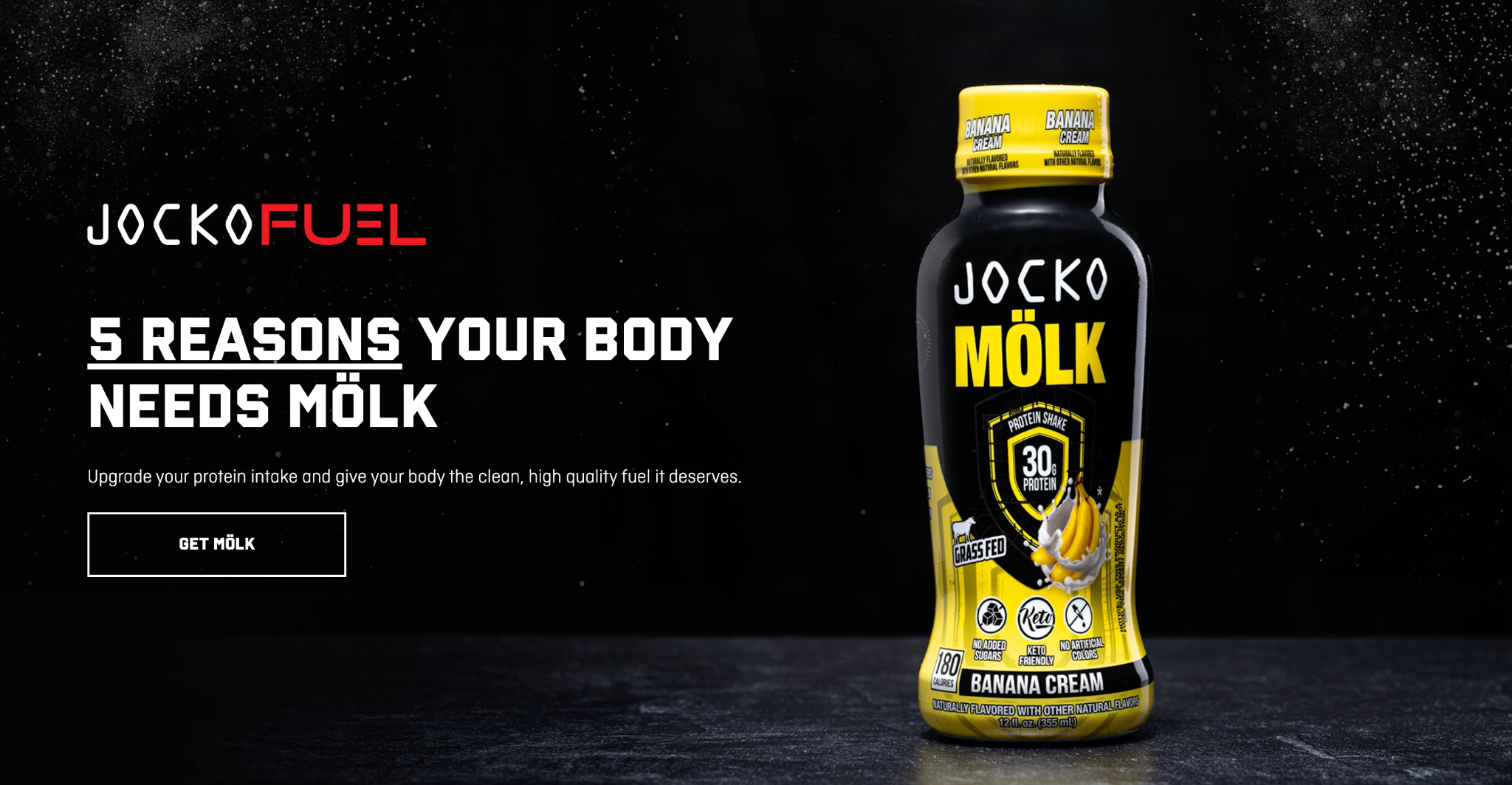
Depending on the product or service, your landing page might include product photography, demonstrations, user-generated content, or video.
When you have to explain complex products, demonstrate results, or show a product in use, a video may be the most effective. A short video near the top of the page may answer questions that would otherwise require several paragraphs of copy.
3. One clear CTA
Every landing page should be built around a single primary action.
This CTA should be obvious and take center stage beginning in your page’s hero section. You can repeat it throughout the page, but each one should reinforce the same conversion goal. Introducing multiple competing actions can create confusion and reduce conversions.
For example, a landing page promoting a free consultation should consistently encourage visitors to book that consultation. Adding competing actions—such as signing up for a newsletter, downloading a resource, and requesting a demo—can make it confusing what step people should take next.
Once you've identified your primary goal, make sure your CTA is easy to find and clearly communicates what people can expect after clicking.
- Instead of "Learn more" → try "Start my free trial"
- Instead of "Submit" → try "Download the guide"
The best CTAs make the next step feel clear, simple, and worthwhile.
4. Social proof that builds trust
People are more likely to take action when they see evidence that others have already had a positive experience. Research on landing page conversion behavior has found that trust signals, including customer reviews and ratings, are among the most influential factors in conversion decisions.
Social proof can take many forms, including:
- Customer testimonials
- Reviews and ratings
- Case studies
- User-generated content
- Media mentions
- Customer logos
For instance, Primer helped Cameo showcase fan testimonials, review volume, and ratings, providing multiple forms of social proof in a single section.
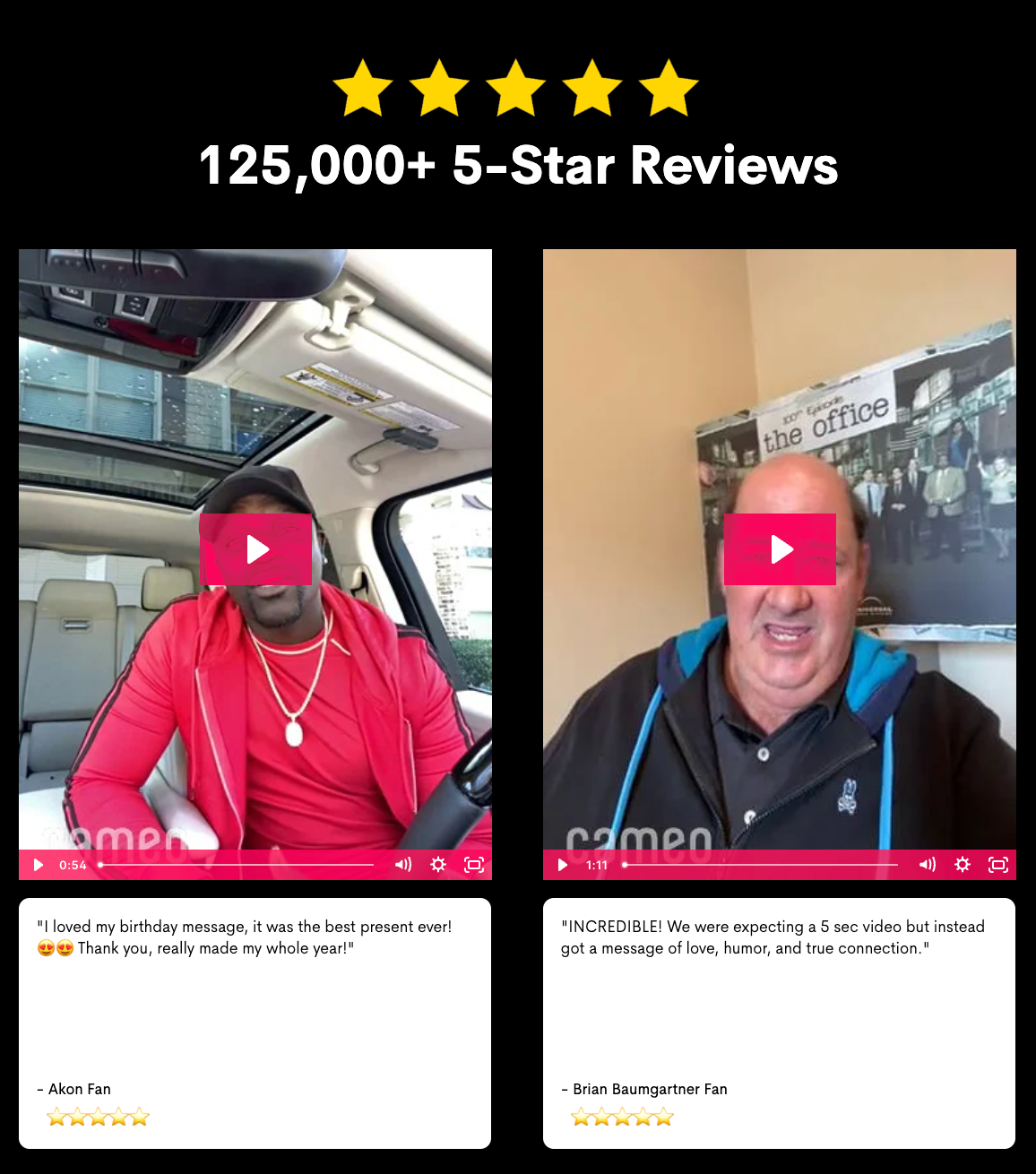
The most persuasive social proof is specific and measurable. This helps prospects clearly understand the value you can deliver.
- Bad example: Great service and excellent results.
- Good example: Primer helped us increase our conversion rate by 32% in six weeks.
5. Differentiation from alternatives
When people are evaluating your product, they’re also considering competitors, alternative solutions, or simply maintaining the status quo instead of making any purchase.
A high-converting landing page should communicate why your solution is the better choice.
For example, if you're promoting a marketing service, you might compare:
- Speed of execution
- Level of expertise
- Testing capabilities
- Cost efficiency
- Expected outcomes
Comparison tables can be particularly effective for helping prospects evaluate solutions side by side since they organize information in a format that's easy to scan.
For Ello, an AI-powered reading coach for children, Primer created a comparison section highlighting how the platform differs from other reading apps.
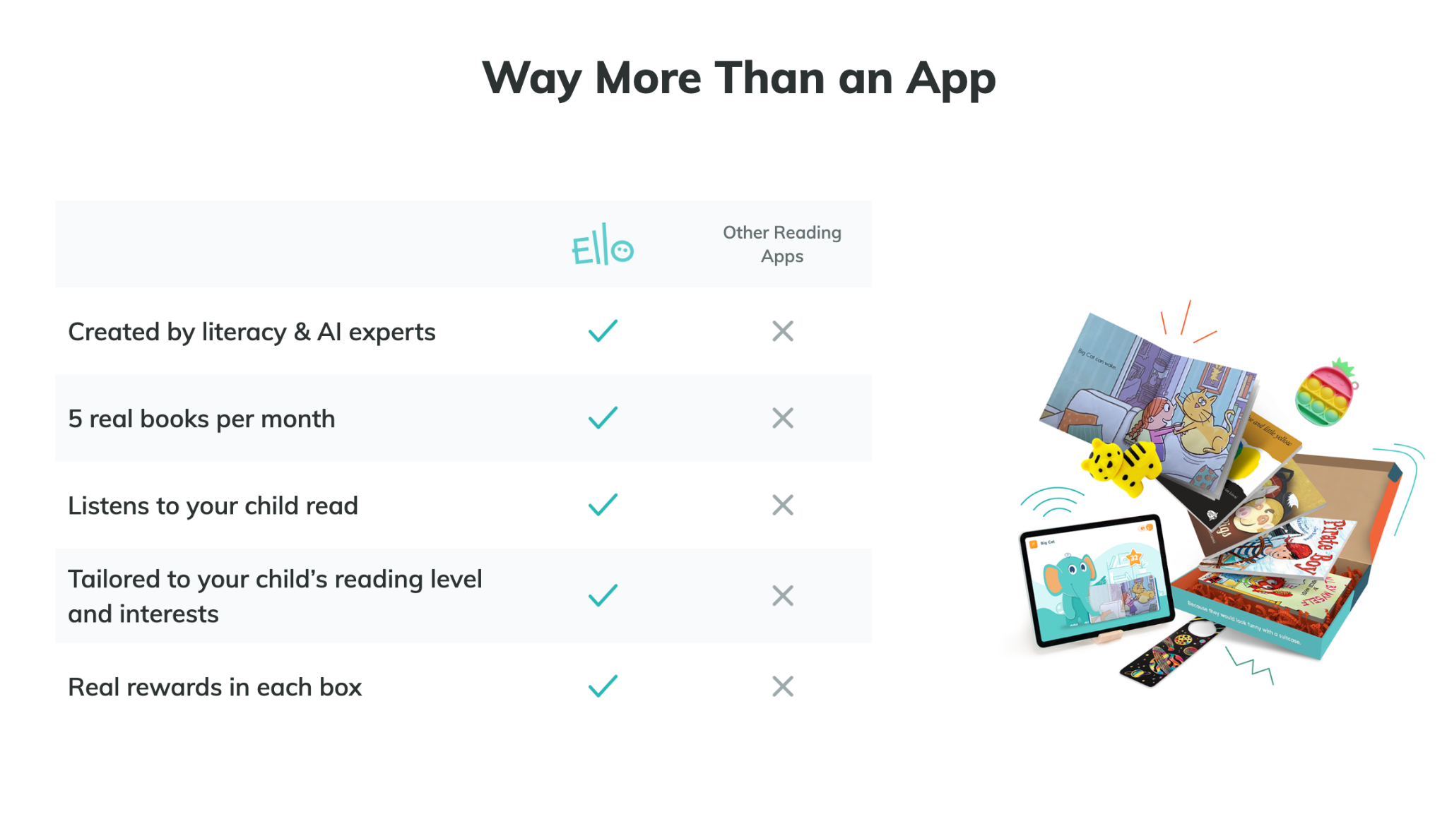
By presenting key differentiators in a simple side-by-side format, the page helps parents quickly understand the platform's unique benefits.
Comparison content works best when it focuses on decision-making rather than criticism. Show how your solution differs and let prospects evaluate the tradeoffs for themselves.
6. Scannable copy
Most people skim before they read.
Long paragraphs and dense blocks of text can make important information harder to find. Clear headings, short paragraphs, bullet points, and white space help readers easily locate the information they care about most.
7. Mobile-friendly design
83% of landing page traffic comes from mobile, making mobile optimization essential.
The page’s performance matters just as much as its design. Slow-loading pages can reduce conversions before visitors even engage with your content. Prioritizing page speed, responsiveness, and usability helps create a smoother experience across devices.
A mobile-friendly page should:
- Load quickly
- Be easy to navigate
- Use readable text sizes
- Feature thumb-friendly CTA buttons
- Display content correctly on smaller screens
Even a strong offer can underperform if visitors struggle to navigate the page or complete the desired action on mobile devices.
How to improve landing page performance: 4 tips
Customer preferences change, new competitors enter the market, and different audiences may respond to different messages. Regularly optimizing your page can help you uncover new opportunities and improve results.
1. Test one variable at a time
When making changes to a landing page, focus on a single element at a time. This is unlike ad creative testing, where we don’t recommend isolating one variable. That’s because when it comes to landing pages, testing multiple variables at once can make it difficult to determine which change influenced performance.
For example, you might test a new headline, update your hero image, or adjust CTA copy. Narrowing your changes makes it easier to identify what resonates with your audience.
2. Look beyond conversion rate
Conversions are important, but they don't tell the whole story.
Metrics such as bounce rate, time on page, scroll depth, and CTA click-through rate can provide additional insight into how people interact with your landing page. These signals can help identify areas for improvement before they start affecting conversions.
3. Revisit assumptions regularly
The messaging, offers, and creative that perform well today may not perform as well six months from now.
As your business evolves, revisit the assumptions behind your landing page. New customer pain points, competitive pressures, or market trends may create opportunities to refine your messaging and improve performance.
4. Learn from your audience
Customer feedback, sales conversations, survey responses, and user behavior can all provide valuable insight into what's working—and what isn't.
Pay attention to recurring questions, objections, and points of confusion. These insights can help you strengthen your messaging, address gaps in the customer journey, and create a more effective landing page experience.
Landing page optimization is an ongoing process. The most successful brands continuously test, learn, and refine their approach to better serve their audience and drive conversions.
Frequently asked questions
What is a good landing page conversion rate?
Landing page conversion rates vary by industry, traffic source, audience, and offer, but the average conversion rate across industries is approximately 6.6%. High-performing landing pages generally exceed that benchmark by combining strong messaging, compelling creative, trust-building elements, and ongoing optimization.
What makes a high-converting landing page?
High-converting landing pages share several characteristics, including:
- A clear value proposition
- Engaging visuals
- A strong CTA
- Social proof
- Differentiation from alternatives
- Scannable copy
- A mobile-friendly design
What is the difference between a landing page and a homepage?
A homepage is designed to help people explore a brand, while a landing page is designed around a specific conversion goal. A high-converting landing page should remove distractions and focus on guiding people toward a single action.
Create higher-converting landing pages with Primer’s support
The success of your landing page depends on how well your messaging, creative, trust signals, and user experience work together to guide people toward a decision. And even if your page gets users to convert, its success may not last. Taking time to regularly evaluate your pages’ performance and make adjustments can help you maximize results over time.
Looking for help creating and optimizing high-converting landing pages? Contact Primer to learn how our team can support your growth goals.
.avif)
.avif)
.avif)
.avif)
.avif)
.avif)
.avif)