In this article
Using ad templates and producing user-generated content can boost your brand’s traffic, but what happens after your leads click through? It’s time to take a closer look at your brand’s landing page to make sure it sparks curiosity, answers essential questions, and motivates your customers to take action.
Developing high conversion landing pages does not need to be an arduous process. By knowing the anatomy of an effective landing page or taking advantage of Primer’s exclusive landing page templates, you can improve your customer experience, increase conversions, and build brand loyalty within your target audience.
A Deeper Look At High Conversion Landing Pages
A stopwatch starts the moment an interested shopper clicks through your ad to your landing page. A few seconds can make all the difference in converting visitors into customers. According to Wordstream, the average landing page CVR is around 2.35%, with the top 25% of pages converting at 5.31% or higher.
The moment your site loads, your persuasive copy, compelling value propositions, and sleek design grab your customers’ attention. And it’s up to you to guide them through that experience from start to finish.
Your high conversion landing pages should direct visitors to the information they are looking for, answer questions they didn’t know they had, and make it exceptionally easy to follow through with your call to action—regardless of whether you’re converting visitors into customers, adding new subscribers, or collecting new leads.
If you connect with your audience quickly, you demonstrate that your brand anticipates and meets the buyer’s needs, motivating them to look for more information and learn more. As soon as you succeed in this, you’ll have the winning formula you’re looking for to optimize your ad templates and continue building successful high conversion landing pages that cater to your customers’ needs.
The Three Steps to a Great Landing Page
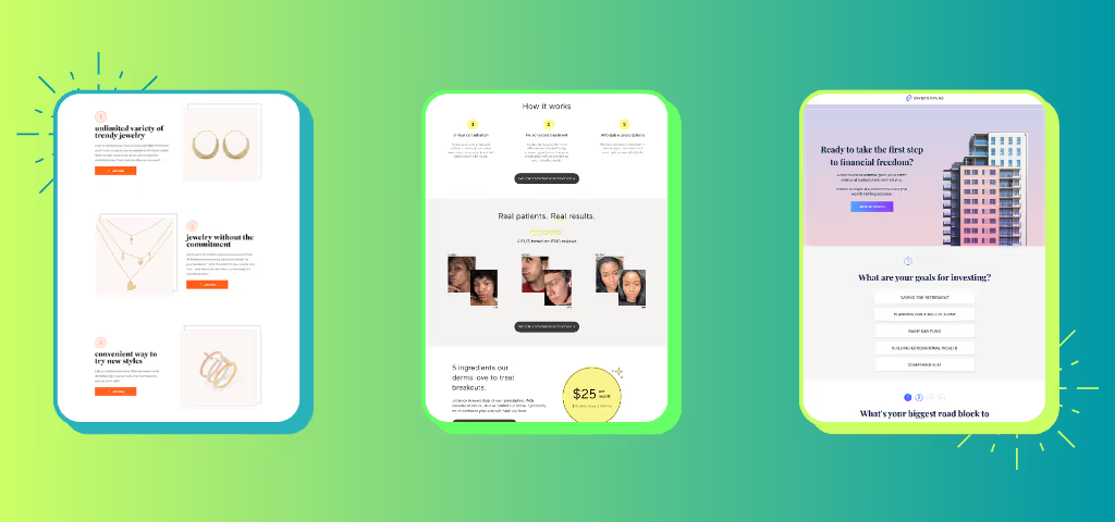
Step 1: Build Buyer Personas
When you know your customers, you can create a landing page tailored specifically to their needs.
What are their struggles? What do they need to simplify or enhance their lives?
If you don’t know them, they won’t believe your product will make a difference in their lives, and they’ll move on.
That’s what makes buyer personas so crucial for marketing teams. These personas are essentially summarized characteristics of your brand’s ideal customer. They pinpoint essential information, including your typical customers’ age, income range, location, hobbies, and common pain points. At Primer, we go a step further and dig into their urgent need. What is happening that would trigger this person to choose your product right now?
With the persona in place, we can define the buyer decision questions (BDQs). These are the most essential questions that have to be answered before a purchase can be made and reflect your customers’ wants, needs, motivations, intentions, and decision-making processes.
With a well-defined buyer persona, you have a solid understanding of your buyers and what they want out of an experience. You can then use this to develop targeted, outcome-focused questions that get into your customers’ heads, offering insight into what they’re thinking, what they’re looking for, and the most effective way to deliver every BDQ answer—before they have to ask. Landing pages that are informed by buyer personas boosts conversions, all while checking off their criteria for making a well-informed purchase.
Step 2: Anticipate Buyer Questions
Your engaging video ads using proven ad templates direct prospects to your landing page, but you need to hold their attention while they quickly skim over the content and keep them on the page even after realizing that your product meets their needs and lives up to the hype.
They need your guidance.
When curating your user experience, do you want your customers to scratch their heads and come up with questions, or would you prefer to give them the most crucial information right away? It’s most beneficial for brands to foster an environment where buyers can immediately imagine themselves using the product.
This is where persona-centric BDQs come in. Organize your BDQs by priority and ensure the answers to your buyers’ most critical questions are easy to find in your ads and on your landing page.
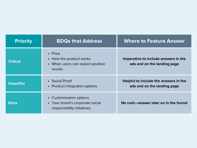
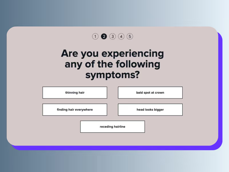
This Primer-developed landing page answers critical BDQs for the brand hims. Including conversion-focused questions like:
- How do you use it?
- Does it smell?
- How does it work?
- How much does it cost?
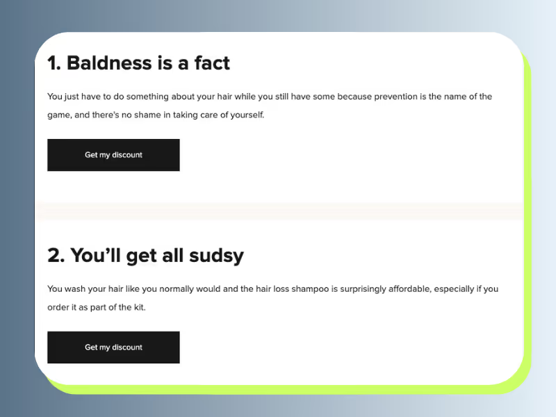
Example:
Step 3: Optimize for Speed, Scannability, & Simplicity
You have a finite amount of time to provide essential benefits to your customer, and it all comes down to speed, scannability, and simplicity.
Speed
You have to keep load times in mind when designing landing pages. If your landing page takes too long to load, you’ll frustrate your users out of purchasing your product and into looking elsewhere to satisfy their needs. And because multi-platform advertising is crucial to your user experience, your killer ad templates and optimized high conversion landing pages must load quickly on all device sizes, mobile browsers, and screen sizes.
- Google notes that an increase of one second in site speed can increase conversion rates for mobile users by 26 percent.
- You can check your page load speed for free with Uptrends.
Scannability
A great headline draws your customers in so you can share your value proposition, but you also need to keep them interested. It’s important to remember that they are searching for answers to BDQs, and they don’t want to read endless blocks of copy to find them.
Actually, the majority of people don’t read site copy at all—they scan it.
Humans have a shockingly short attention span. It’s just 8 seconds long! This race against the clock might feel daunting until you start using it to your advantage. You have an opportunity to satisfy your customers’ thirst for fresh, captivating content.
No matter how interesting or well-written you think your site copy is, your
customers won’t use their 8 seconds of focus reading your landing page copy word for word—at least not right away.
If you optimize your landing page for scannability, your customers will circle back from their initial scan to learn more, including the answers to BDQs you categorized as “extra.”
Remember—don’t let your design distract customers from converting. Design influences scannability, so consider how colors, images, and layouts appeal to customers and evoke an emotional response.
You can draw your customers even further down your sales funnel by getting rid of any clashing or competing design elements in favor of a clean and clutter-free design.
Simplicity
A landing page that is connected to an acquisition campaign should have one goal: conversion. You should have just one CTA on the page placed conveniently throughout the page. Leave navigation off of your landing page so you don’t distract users from the goal.
Landing Page Dos and Don'ts From The Pros
Every landing page we develop at Primer is optimized to maximize conversion rates by following these rules of thumb and incorporating features that are proven to work.Add
- Straightforward headlines address consumers’ core BDQs
- Clear CTA above the fold and in each section
- Responsive and adaptive design, optimized for mobile and desktop usage
- Scannable copy—limit paragraphs to 3 lines max
- Consistent design elements throughout the landing page
- Differentiation strategies for your brand from competitors or alternatives
Avoid
- Stuffing the header with too many elements
- Making the headline too small
- Low-quality images
- Using too many fonts in your design
- Keeping irrelevant sections
- Creating a text-heavy landing page
Downloadable Easy-To-Use Landing Page Templates
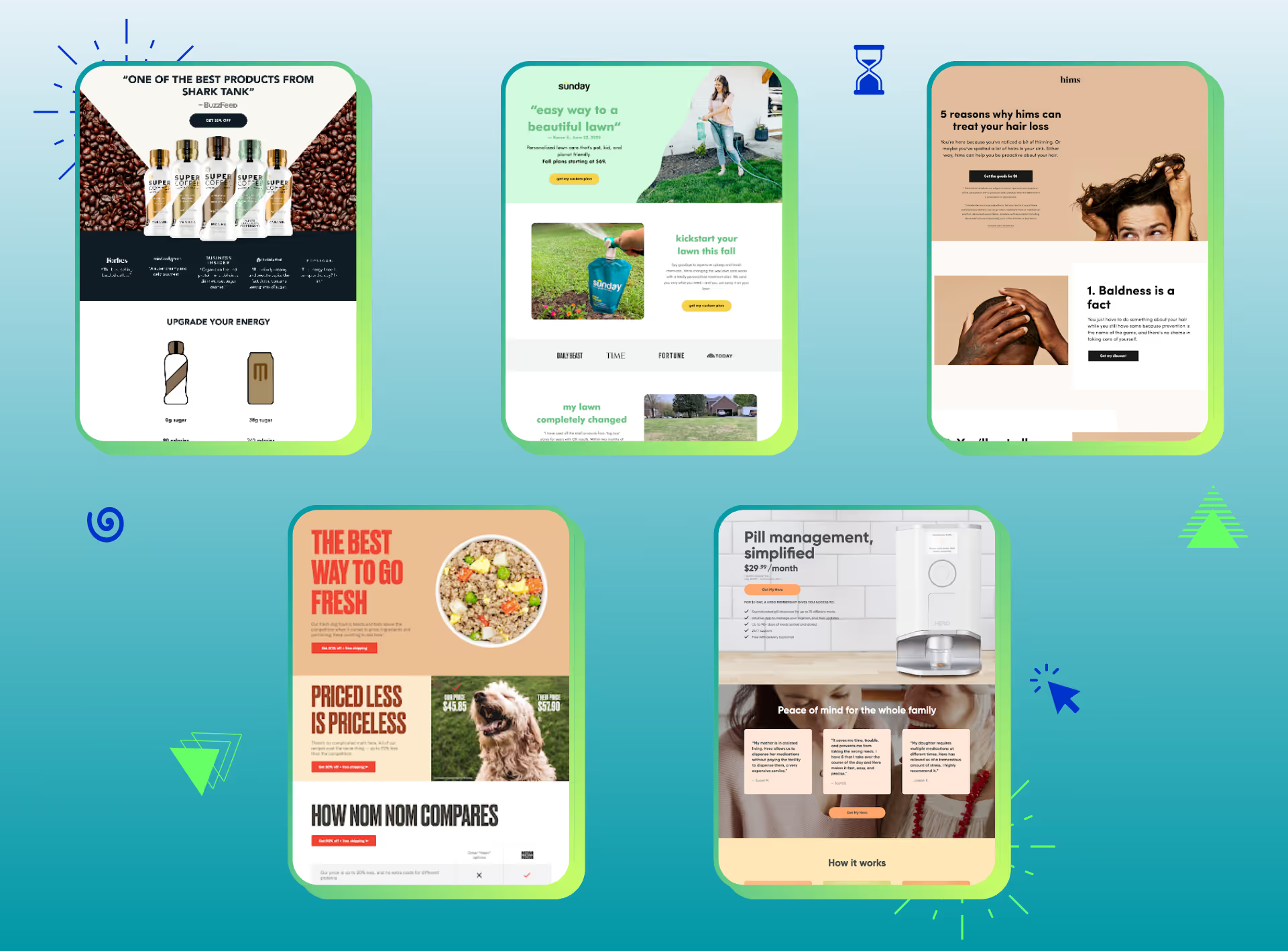
Streamline your landing page for optimized scannability but don’t skimp on critical or impactful information. These are our favorite landing page formats. Which works best for your brand?
BDQs
Walk through Primer's Buyer Decision Question template and consider what matters most to your target buyer.
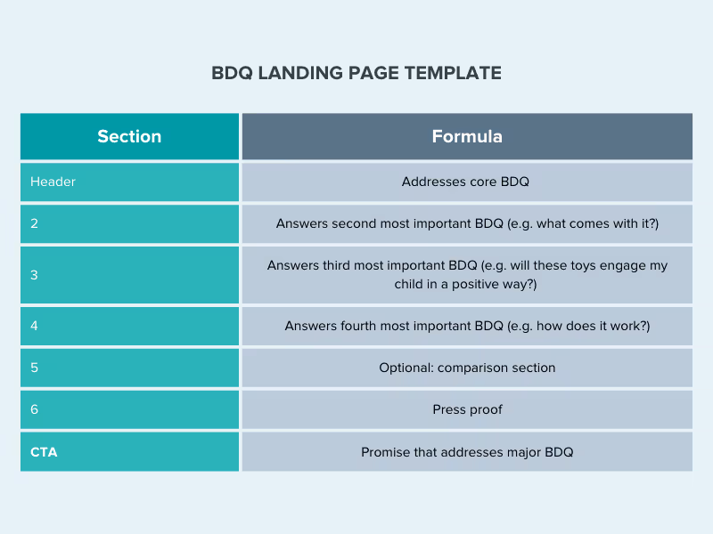
Example: Sunday

Listicle
A Listicle template emphasizes how your product solves a problem or makes life easier for your customers.
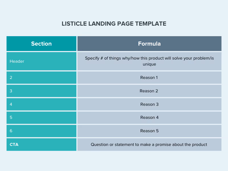
Example: Mini Luxe

Vs. Alternative
This template highlights your brand’s benefits, positioning your brand vs. competitors’ products.
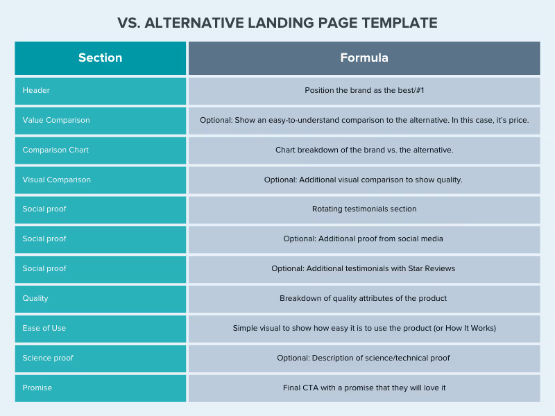
Example: Super Coffee

Sales Questions
The Q&A style template asks questions that prompt the user to say “yes” and reinforce the value of the product.
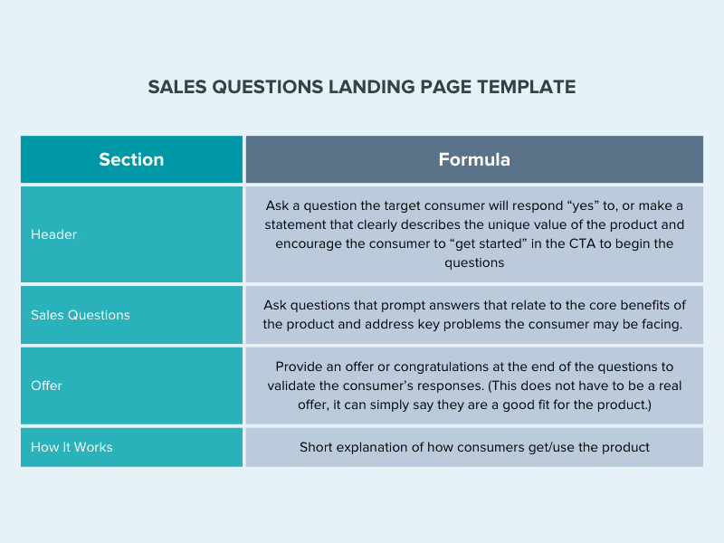
Example: hims
From Engaging Ad Templates to High Conversion Landing Pages
A well-designed landing page increases customer engagement by incorporating your customer’s needs with a clear call to action and without any clutter.
No idea which high conversion landing page template format to choose, or don’t have time or resources to implement it yourself? Let Primer do it for you!
Primer can design and deliver ready-to-launch landing pages within four business days. No developers or code needed.
Looking for copywriting or creative strategy support? We can do that too. Schedule a call to find out more.


.avif)
.avif)
.avif)
.avif)
.avif)
.avif)
.avif)
