In this article
Seeing examples of successful ads can help inspire you to create new creative that actually converts.
How the Facebook Ad Library and Others Inspire Us
Popular paid social channels like TikTok, Instagram, and Facebook have developed searchable ad libraries of the ads that brands run on their platforms.
Facebook ad library is the first and most prominent example of this. Hypergrowth marketers can use ad libraries to research competitors and popular ad trends across different industries to draw inspiration for their own ad campaigns.
We’ve even compiled our own ad library of Primer-developed ads for examples of those that are proven to drive conversions.
When we searched the Facebook ad library including Facebook and Instagram ads, as well as TikTok’s ad library, we discovered these 10 image and video ads from Facebook, Instagram, and TikTok that made us click. We show you what they look like, break down why they work, and discuss how you can implement those principles for your brand.
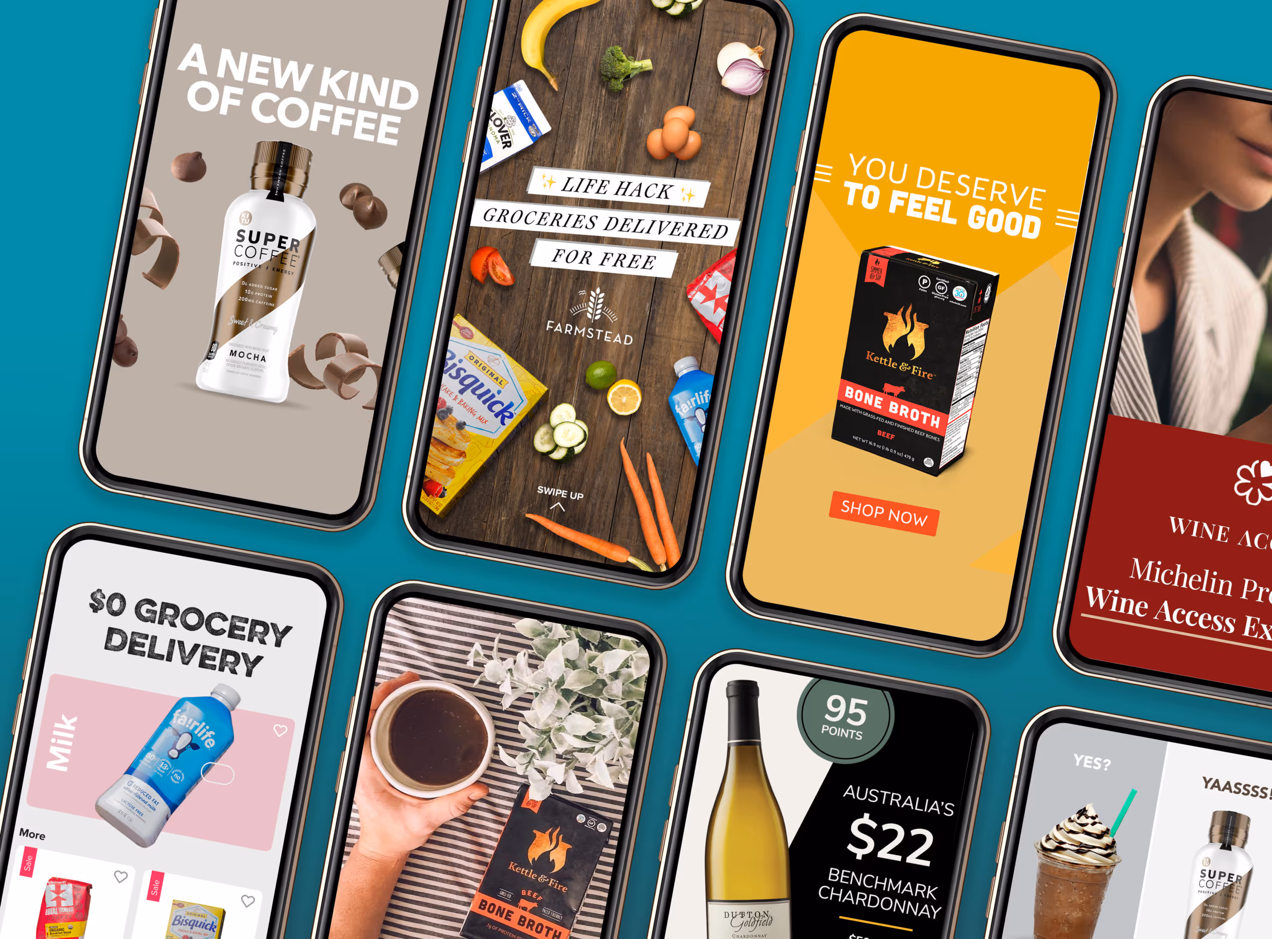
Let’s dive into 10 compelling video ads from food and beverage powerhouses like Daily Harvest, Hello Fresh, and Drizly.
TikTok Ads to Copy:
1. MUD/WTR | TikTok Video Ad
What they’re selling: a coffee alternative made from mushrooms.[embed]https://goprimer-1.wistia.com/medias/i1m7y5zp10[/embed]Why the ad works:
- Sells a lifestyle. Rather than just a product, this video sells an entire lifestyle—idyllic, filled with wanderlust and beautiful sunsets, peaceful —with MUD/WTR at the center of it all.
- Emphasizes brand tone. The natural imagery underscores the brand’s desire to be connected with health and holistic wellness in contrast to its alternative, coffee, which is usually associated with city life and “the grind.”
- Shows the product in action. Demonstrates how easy it is to make a cup of MUD/WTR in step by step format.
2. Kencko | TikTok Video Ad
What they’re selling: powdered packets that rehydrate into a thick smoothie.[embed]https://goprimer-1.wistia.com/medias/5k50t90jut[/embed]Why the ad works:
- Starts with a strong hook—”want a more nutritious way to start your morning?” This sets up the premise of the rest of the video and speaks to a key buyer decision question. See 101 more video hooks that will improve your ads.
- Displays flavor variety in the first frame. This can draw in people who may only like one or two smoothie flavors.
- Calls out key benefits, including daily servings of fruits and veggies, good taste, flavor variety, and easy to make.
- Shows the product in action. This makes it seem like anyone could use their product. It also highlights their proprietary blender bottle, which looks a bit different from the common ones on the market.
- Emphasizes sustainability. This is particularly important since it is a single-use product. Emphasizing its compostable packaging can help ease the minds of people worried about single-use plastic.
- Includes a clear CTA to tell viewers what to do next—“order yours at kencko.com.”
3. Daily Harvest | TikTok Video Ad
What they’re selling: a subscription to frozen smoothie mixes.
Why the ad works:
- Uses elements that look native to TikTok, including the “ask box.” This helps viewers engage more because it seems less like an ad interrupting their scrolling experience and more like…well, a TikTok.
- Shows the site and how to actually order a variety of flavors. This can help alleviate any anxieties about the subscription process by making it feel transparent.
- Highlights strong value propositions, including good taste, health benefits, and ease of use.
- Includes a clear CTA
Want to run TikTok ads like Daily Harvest?
Learn how this hypergrowth company optimizes their TikTok ads, and how you can, too, in our free interactive teardown. We'll break multiple ads down frame-by-frame and tell you why they work. (And some things Daily Harvest could improve.)
Top Ads From the Facebook Ad Library That We Clicked On:
There’s a reason these ads stood out to us in the Facebook ad library. Each contains elements that make them high-performing ads and drive conversions on these platforms.
We believe these ads can act as a springboard for success in your future campaigns.
4. Misfits Market | Facebook and Instagram Image Ad
What they’re selling: a food box that compiles less aesthetically-pleasing food that’s still good to eat.
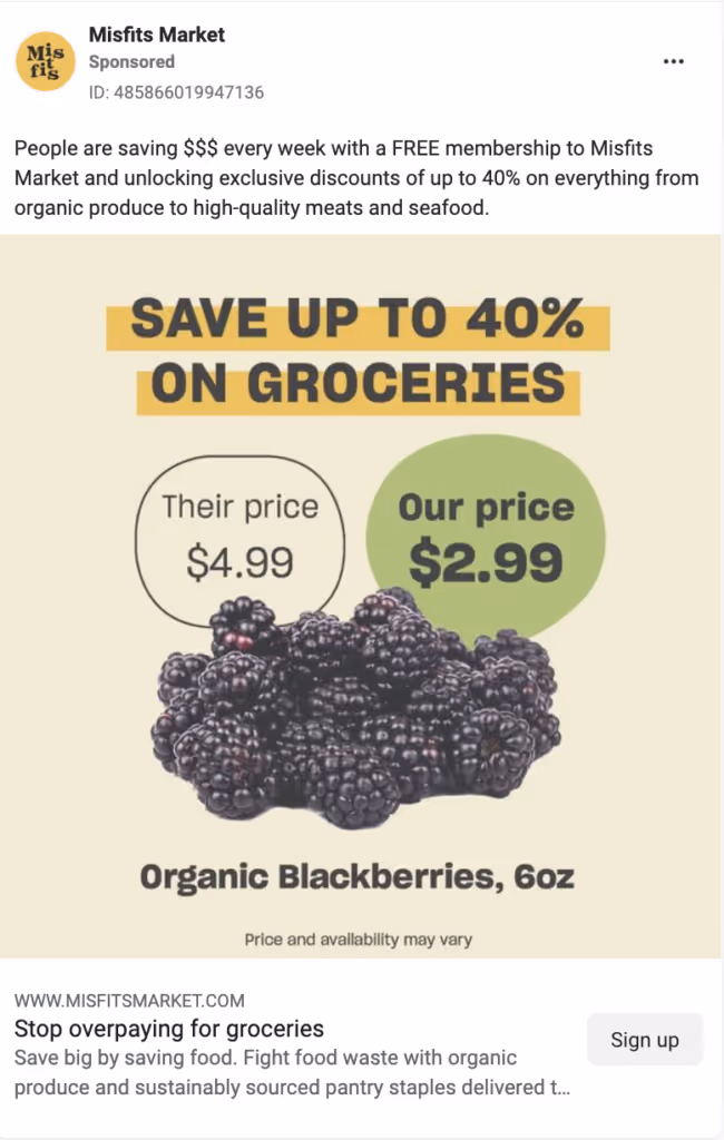
Why the ad works:
- Shows a price comparison. This ad uses one of our favorite styles: “vs. competition.” Here, we see a picture of blackberries with two prices laid out—”ours” vs. “theirs.” Of course, “ours” is more affordable. This is a good way to simply and concisely showcase price comparisons.
- Uses strong headlines. The image headline and the copy headline both offer compelling commands: “Save up to 40% on groceries” and “Stop overpaying for groceries.” It’s nice that they convey the same value prop—saving money vs. the competition—in two different ways: if someone isn’t convinced to click by the image headline, they might be by the copy headline.
- Offers a secondary value prop in the description. What we can see of the headline before it is cut off introduces another reason to switch to Misfits Market: sustainability. It mentions fighting food waste and going green. While the headlines focus on saving the individual money, the description goes broader. This is a good example of a brand knowing its buyer personas and speaking to multiple levels of buyer questions.
5. Farmstead - Facebook and Instagram Carousel Ad
What they’re selling: free, local grocery delivery.https://goprimer-1.wistia.com/medias/v5myfulmxnWhy the ad works:
- Seamless carousel. For many accounts, carousels will work better than single static images because of the ability to highlight additional value propositions, the native feel (many popular Instagram posts are carousels), and, for Facebook, the variation from other posts on people’s feeds. For this ad, we chose to go the way of a “seamless carousel,” meaning each image interplays someway with the next. That way, the ad feels like a cohesive image instead of disconnected stills.
- Local call out. In the copy, we spoke directly to the local geography: “Hey Charlotte.” This helps scrollers feel like the ad is more relevant to them and reaffirms that any offers in the ad work for their area.
- Includes a testimonial. While the first two images focus on defining what Farmstead is and its benefits, the last frame relies on using a real user review as social proof. Including testimonials not only feels more real and casual but also shows that the product or service has worked for other people and will work for your new buyers, too.
Learn more about how we’ve used high-volume ad testing to grow Farmstead in our Farmstead Case Study.
6. HelloFresh - Facebook Stories Ad
What they’re selling: At-home meal kits.
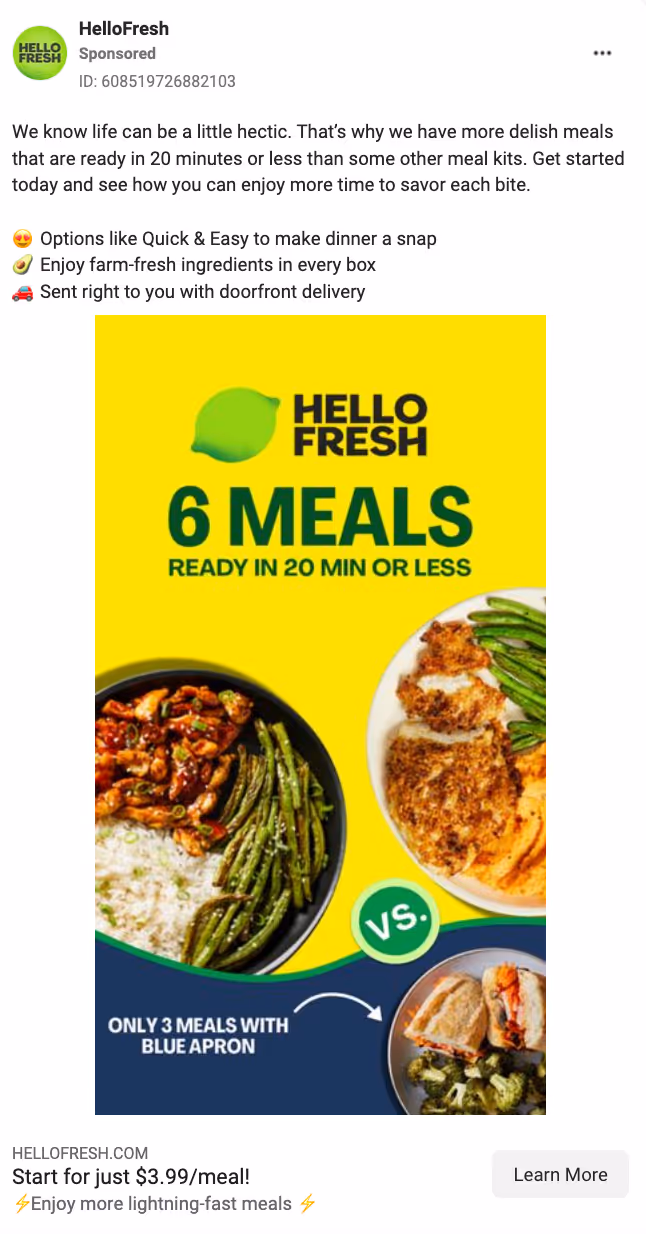
Why the ad works:
- Includes a comparison to the competition. Remember how the Misfits Market ad relied on a price comparison to place themselves as better vs. the competition? In this ad, Hello Fresh uses both the number of meals and a visual of the plates to set themselves apart in a larger, bright yellow section. This is a good template for brands who might want any comparisons to the competition to be secondary to their value props.
- Provides clear numbers. As part of the image headline and comparison text, we see concrete numbers: 6 meals vs. 3 meals; ready in 20 min or less. This makes the ad feel as if it’s backed by data, and thus, for many, more trustworthy. We also see a great, concrete price listed in the copy headline: “Start for just $3.99/meal!”
- Is a scroll-stopping bright color. The bright yellow stands out against other images on one’s feed.
- Uses emojis in the copy. Using emojis to help set off a list of value props is one of our tried-and-true methods for creating compelling, clickable ad copy. It’s icing on the cake that Hello Fresh also used emojis in the description, which helps separate it from the copy headline.
7. Drizly - Facebook and Instagram Image Ad
What they’re selling: Online liquor store and alcohol delivery.
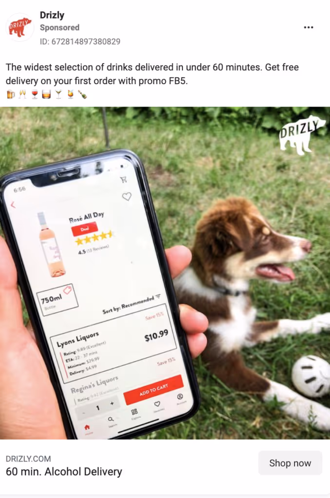
Why the ad works:
- Shows the app (with prices). Seeing a screenshot of the app adds a trust factor to it. For selling a regulated product like alcohol, this is particularly important so that people know it’s a legitimate business. Even better, the screenshot shows a real price for a bottle of wine—at $11, helping to entice buyers who are also looking for a good deal on wines.
- Showcases a relatable lifestyle. This lifestyle photo presents a laid-back, social, warm-weather vibe: it’s outdoors, with a cute dog, presumably at a public park. It makes the ad more relatable while reinforcing that their app can be used to order alcohol from anywhere.
- Uses simple copy that gets at the heart of what the brand is and why someone should order from them right now. What does Drizly provide? “The widest selection of drinks delivered in under 60 minutes.” And why is now the best time to order? Aside from it being summer, you can “get free delivery on your first order” with their code. Then, they provide a bunch of scannable emojis that make it clear to a quick scroller what the company sells. I only wish that the copy headline included more of a command/call-to-action instead of only a description of the product (e.g. “Get Alcohol Delivered for Free in 60 min.” vs. the current “60 min. Alcohol Delivery”)
Read more about how Drizly is winning on Facebook in our free Drizly Teardown.
8. ALOHA - Facebook Image Ad
What they’re selling: plant-based protein bars.
Why the ad works:
- Tells a story. The copy of this ad walks the viewer through a sensory visualization. By telling a story about your audience purchasing your product, you can help make buyers understand how your brand can fit into their lives. In this instance, the sensory visualization also serves to highlight the mouth-watering flavors and ingredients of ALOHA’s newest bar.
- The map makes it feel local. By including a map sticker, the ad not answers an important question(Where can I buy ALOHA? At Whole Foods) but also, at first glance, makes it seem like a local product.
- Simple enough to understand at a glance. With just a quick glance, viewers can tell this ad is introducing a new flavor of ALOHA bar. This ad would work particularly well in a remarketing campaign: the new flavor might interest past purchasers, or it might convince people who have seen the brand before to now convert.
9. Huel - Facebook Image Ad
What they’re selling: Nutritionally complete grab-and-go meals.

Why the ad works:
- Detailed comparison. Although similar to the “vs. the competition” ads above, this Huel ad has a slightly different take—we’ll call it “vs. alternative.” In it, we see the Huel product being compared to a worse alternative.
- Backs up comparison with numbers. Facts and stats lend credibility to products. In this instance, the protein and Vitamin C comparison indicates that Huel has the proof to support their claim.
- Clear, concise headline. This ad uses the same headline both on the image and in the copy headline spot: “All the Nutrients You Need. 1 Meal.” It clearly tells the viewer what Huel is and the most important benefit of it (complete nutrition).
- Refutes a common buyer claim and presents Huel as a solution. Huel mentions a common misconception (“I haven’t got the time to eat healthy”), then explains why it’s inaccurate and presents its product as the solution.
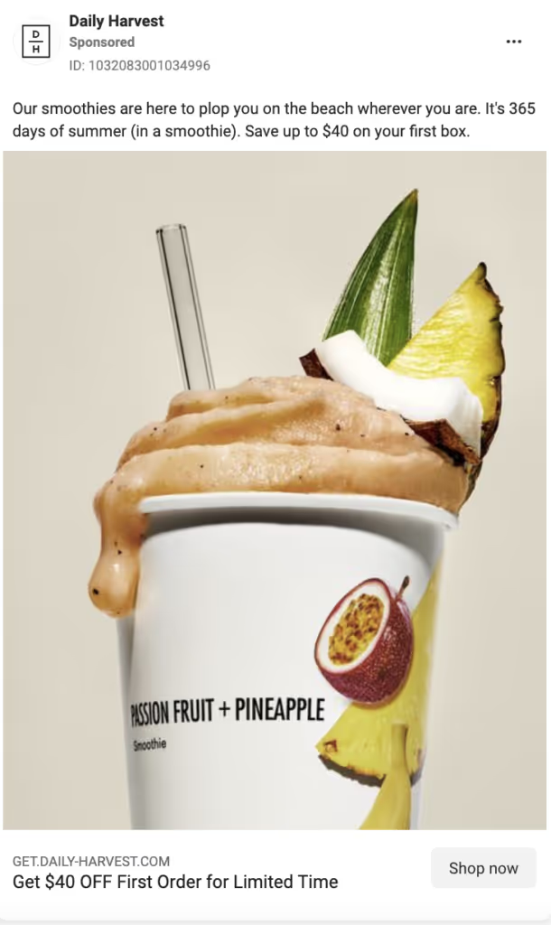
10. Daily Harvest - Facebook Image Ad
What they’re selling: a subscription to frozen smoothie mixes.

Why the ad works:
- It’s seasonal. Daily Harvest has chosen to showcase tropical ingredients in the image and call out the current season in their copy: “It’s 365 days of summer (in a smoothie).” It’s always great to paint a picture for the buyer that shows how easily a product or brand can fit into their ideal aesthetic.
- It highlights the discount up front. We see the discount in two places: the caption and the headline text. Both are worded slightly differently (“Save up to $40 on your first box” vs. “Get $40 OFF First Order for Limited Time”). The image and the first part of the caption copy seek to answer the question “why buy Daily Harvest?” while the headline brings urgency: why buy Daily Harvest right now?
- Includes a texture shot. Thanks, in large part, to the rise of beauty influencers, the texture shot feels super native to Instagram and Facebook. Here, Daily Harvest shows it off with a nice “drip” of the smoothie off the side of the cup. This little “imperfection” feels more authentic than a perfect image, and it contributes to an aesthetic sense of mouthwatering goodness.
Check out More Food & Beverage Ads
—
As we’ve seen in these 10 clickable ads from TikTok and the Facebook Ad Library, there are many reasons why an ad would appeal to your audience. That’s why it’s important to test variations of each key component, including the image, headline, copy, and call-to-action.
No matter your audience, your ads should achieve three things:
- answer common questions that your buyers have
- present your product as the best solution to a problem
- be visually scroll-stopping
Learn more about composing ads that convert in our templates and guides:
- How to write a buyer persona and develop buyer decision questions (and why they’re important)
- 25+ Ways to write ad copy (and why they work) [Templates + Examples]
- 9 Outstanding video ad templates that convert
As you can see, the Facebook ad library, TikTok, and others are a great place to start when looking for inspiration on how to stay ten steps ahead of the competition.
Even better: If you want access to ads that have been tested and proven to drive conversions across the most popular social media channels including Facebook, Instagram, TikTok, and more, check out our comprehensive ad library of winning Primer-original ads! (link coming later)[highlight]Need help creating enough compelling ad creative to kick your growth into high gear?[/highlight]Primer On-Demand is an online ad platform that delivers videos, images, and landing pages produced by top marketing designers who know what converts.
When you sign up for Primer On-Demand, you’ll get access to 10+ frame-by-frame templates for image ads, video ads, and landing pages. And you’ll be able to request an unlimited number of ad designs from our team.
.avif)
.avif)
.avif)
.avif)
.avif)
.avif)
.avif)