In this article
As a fast-growing, direct-to-consumer (DTC) business, it can be hard to create static and video ads for paid social that stand out among the competition. Especially if your brand is among the largest DTC category: apparel and accessories.
What Is a Facebook Ad Library? Why Does It Matter to DTC Fashion Brands?
The Facebook ad library is an example of how social media companies like Facebook and TikTok have started compiling ads using their platforms, so they’re searchable by category and can be used to track ad spending data.
We found 10 scroll-stopping ads from top DTC fashion apparel and accessories brands in the Facebook ad library and broken down the winning features so you can apply them to your campaigns today.
Through the process of testing thousands of ads on paid social channels like Facebook, TikTok, and Instagram, Primer has developed its own library, where you can find even more examples of winning ads that are proven to convert and drive growth for your organization.
1. AllBirds - Facebook Video A
What they’re selling: sustainable, lightweight footwear.
The ad: https://goprimer-1.wistia.com/medias/gtglssl1e7
Why the ad works:
This video ad from the Facebook ad library puts the user in AllBirds’ shoes–literally! The ad achieves this by showing their product in action, avoiding static ad and branding elements, and highlighting some key selling points.
- Shows the shoe in action. We can imagine ourselves running with these shoes more easily because the ad shows not just the shoe in action but also a person putting on the shoes before running in the woods.
- End card with the logo. Instead of a static end card, we see the Allbirds logo flash before a video of the runner.
- Highlights additional selling points in the headline. Allbirds takes advantage of headline and description real estate to share two more reasons to buy: “free shipping + free returns.”
2. Reformation - Facebook and Instagram Image Ad
What they’re selling: eco-friendly, upscale women’s clothing.
The ad:
Why the ad works:
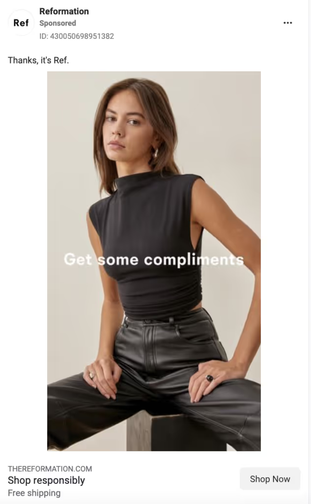
We wanted to highlight this image ad by Reformation from Instagram and the Facebook ad library because of its use of selling points in the headline, appeal to buyers’ emotions, conversational tone, and stand-out use of color.
- Highlights additional selling points in the headline. In this instance, “shop responsibly” speaks to sustainability. It subtly positions itself against the competitors (largely fast fashion retailers) with this headline.
- The image headline appeals to buyers’ emotions. “Get some compliments” taps into their buyers’ desire.
- Uses a casual tone in its copy. “Thanks, it’s Ref” achieves a few things for this ad: it allows the brand to speak for itself; it converses with the headline in the image; and it stays true to the brand’s casual, “best friend”-esque tone.
- Plays with color. While most of the “thumb-stopping” ads you’ll find on this list utilize a bright color palette, this ad focuses on having the monochromatic outfit stand out against the bright background of the webpage.
3. StitchFix - Facebook Video Ad
What they’re selling: a personal stylist box.
The ad: https://goprimer-1.wistia.com/medias/jqvfw1llmb
Why the ad works:
- Includes a compelling testimonial in the thumbnail. The user quote serves as social proof of how awesome the service is, and its effectiveness is a perfect example of why this ad makes Primer’s top 10 list from the Facebook ad library. It’s particularly scroll-stopping in a thumbnail because that’s the first thing people see. Continuing the user-generated content (UGC) throughout the video also makes it feel relatable and approachable. Bonus that StitchFix says these are “real clients paid for their time.”
- Shows unboxing footage. Not only is unboxing a current trend on organic social media, but it adds a sense of trustworthiness and excitement.
- Describes the process in easy-to-understand steps. The video breaks down what StitchFix is and how to use it very easily: we learn that you sign up, take a style quiz, and then have clothes picked for you delivered.
4. Pact - TikTok Video Ad
What they’re selling: women's underwear.
The ad: https://goprimer-1.wistia.com/medias/a0bc4l9yb2
Why the ad works:
- Has a person in the first two frames. We’ve found that our best TikTok ads showcase a user in the first two frames. This suits the overall shift to more UGC-style content. Learn more about creating ads that work on TikTok.
- Shows unboxing footage. Pact, like StitchFix, uses unboxing video to complement the rest of their ad. Here, it’s equally successful at making the video seem like a real customer’s journey, and thus being more trustworthy.
- Shows a variety of style options. In multiple frames, we see different color and style options, including in the hand of the narrator, on a screenshot of the website, and laid out one-by-one.
- Has captions (good for both sound on and off viewing). A bonus is that this particular caption style is native to TikTok and reflects TikTok’s “auto-generated” captions.
- Calls out some unique selling points that might appeal to an ideal buyer. (e.g. How Pact’s underwear is sustainable because it’s made from organic cotton.)
5. Alo Yoga - Facebook and Instagram Stories Ad
What they’re selling: workout and athleisure clothing. The ad:[embed]https://goprimer-1.wistia.com/medias/j8krgc2nkj[/embed]
Why the ad works:
This ad by Alo Yoga earned a top spot in our winning Instagram and Facebook ad library because of how it utilizes urgency, highlights the usefulness of their product,uses simple animation, and makes their ad timely.
- Adds a sense of urgency with “limited edition” messaging. By including “limited edition” in a rotating sticker, this ad not only adds a reason to buy right now (as opposed to later) but also implies an increased sense of exclusivity and competition. It fits with the higher-income audience Alo is likely targeting.
- Shows a full outfit. Matching separates are in right now, and Alo’s ad is not only on-trend, but it also makes their clothing seem more wearable by styling an outfit for buyers right away. They made two versions of this ad: one with a bandaeu top and shorts, and one with a bra top and capris leggings. Tip: Swapping outfits but keeping the rest of your ad the same is a great way to test which product items have the most click-through interest.
- Includes simple motion. One way to stand out from the crowd with your images is to make them GIFs. Here, Alo Yoga takes the static one step further by adding animation to key copy: “blue splash” and “limited edition.”
- Hints at the season in the description. Alo stays relevant to shoppers by including a nod to the current season. Here, we see it in a less prominent location: the description (“So essential for all your summer plans”).
6. Fabletics - TikTok Video Ad
What they’re selling: men’s athleisure apparel.The ad: [embed]https://goprimer-1.wistia.com/medias/x6vld7fqux[/embed]
Why the ad works:
- Uses a conversational tone. This ad sounds like a friend talking to you, which makes it seem less like an over-the-top sales pitch.
- Shows the website and different color options. We’ve seen this before: showing the real user experience on a website and the variety of product options entices a variety of buyers and makes your brand seem more legitimate. This ad does something unique, though: instead of just using a screen recording of the website shopping experience, we get a video of the woman actually using the website on her computer. Having her hand in the frame makes this feel like a real user experience.
- Uses native-feeling green screen trend. By utilizing the green screen TikTok filter, this ad feels on-trend and native to the platform. You can also use this filter to keep a person in frame, even when showing off screenshots.
- Has native-style, “auto-generated” captions (good for both sound on and off viewing).
7. Mejuri - Facebook and Instagram Image Ad
What they’re selling: trendy fine jewelry.
The ad:
Why the ad works:
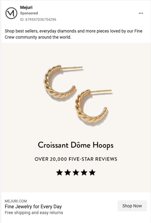
- Shows a real number of customers. By including “over 20,000” in their sub-headline, Mejuri makes the positive reviews seem more tangible to potential customers. This is much more impactful versus saying something vague like “Thousands of five-star reviews.”
- Visually shows the stars in the star rating. It may seem like a small thing, but we’ve found that ads that include the stars on the image when talking about the number of positive reviews perform better than those without that same imagery.
- Adds two secondary selling points in the description. They make efficient use of the description space to pack in two more reasons to buy: “free shipping and easy returns.”
8. Rocksbox - Facebook and Instagram Stories Ad
What they’re selling: a jewelry rental subscription box.
The ad:
- *Made by Primer
-

Why the ad works:
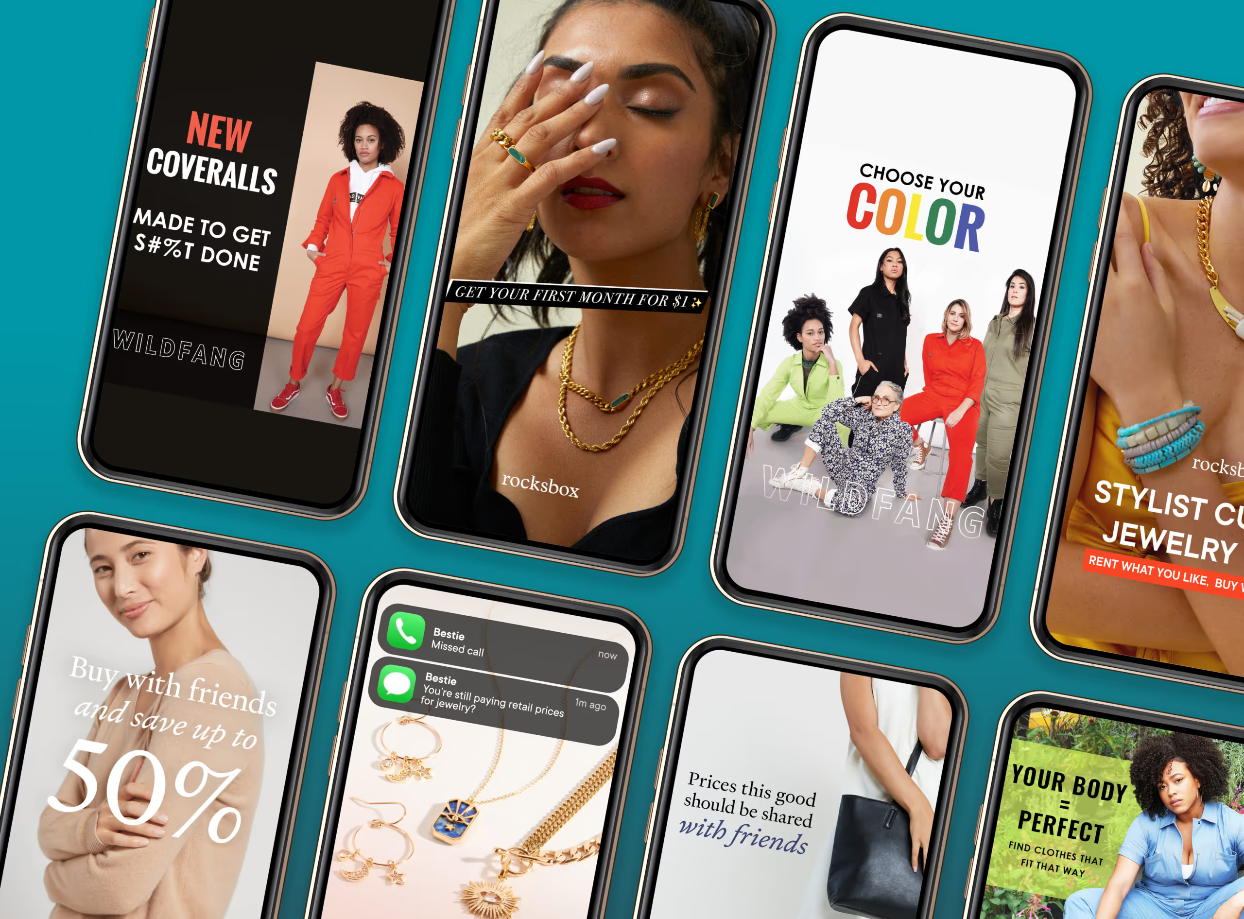
This video ad, which Primer made for our long-time partner Rocksbox, deserves a top spot from both Instagram and the Facebook ad library. We’re proud of this ad because it effectively uses press quotes, highlights a variety of product styles, and uses colors that pop.
- Image headline is a press quote. Press quotes, like user testimonials, add a sense of trustworthiness to positive feedback. Here, for example, seeing “the best” feels truer (and less like exaggeration) than if the brand were to claim this themselves.
- Shows a variety of styles. There’s a style that works for everyone, from cute avocado earrings to refined gold chains. By showing a variety of options, you can entice a wider buyer base. People may click on the ad because one specific piece of jewelry caught their eye, and they want to sign up to get it.
- Blue headline background stands out. The sold background color imitates Instagram story captions, while the specific color choice—a bright blue-purple— stands out against the pink background, making the press quote pop.
9. James Allen - TikTok Video Ad
What they’re selling: custom engagement rings.
The ad: https://goprimer-1.wistia.com/medias/3qyy4ju6y0
Why the ad works:
- Walks users through the purchase. Videos that follow the “how to” format perform well because they guide the viewer through the buying process and let them know what to anticipate when ordering. This ad walks the user through every step of the process of buying a ring at a specific budget. (More video hooks here.)
- Shows users exactly where to look. Because this video is so jam-packed with information, it uses additional design elements, like arrows and circles to direct attention to the portions of the screen that the voiceover discusses.
- Shows the product on a real hand. After spending so much time on the James Allen website, the ad brings it back to a real person: at the end, they show this DIY’d ring on a real hand.
10. Warby Parker - Facebook and Instagram Stories Ad
What they’re selling: prescription eyeglasses. The ad:
Why the ad works:
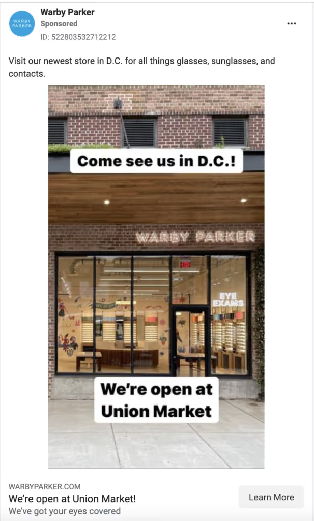
- Regional call-out. When your goal is to grow in a specific market or with a specific product, it’s best to filter out unqualified customers by not only targeting the audience but also targeting the content to speak with those you want to reach. This War by Parker ad creative speaks directly to their target: buyers in D.C.
- Native text style in the image. The black text and white background combination in the image mimics the text style of both Instagram stories and TikTok videos, making this ad feel organic.
What can we take away from these 10 outstanding fashion ads?
Want to create ads that drive conversions, facilitate rapid brand growth, and would be a top performer in the Instagram, TikTok, or Facebook ad library?
Here are 5 rules of thumb for making your content stand out on the feed:
- Include native-style captions and trends to blend more organically into the platform you’re on
- Walk users through the full buyer journey (decision making, after ordering, and unboxing)
- Choose eye-catching, scroll-stopping colors
- Make use of the description to further differentiate your product
- Use your ad creative to target your consumers
Check out more examples of high-converting ads in the Ad Library.
Want to use paid social to stand out from your competition?
Primer works with several DTC apparel and accessories brands, helping them scale their business and hit their goals. If you’re interested in learning how Primer can help you, book a complimentary growth consultation.


.avif)
.avif)
.avif)
.avif)
.avif)
.avif)
.avif)
