In this article
If your landing page isn’t converting, don’t blame your product.
Don’t blame your ad.
Start by looking at your landing page.
Because when someone lands on your site, the first thing they see isn't your brand story, your ingredient list, or your product benefits.
It’s your hero section.
And if it’s not optimized, then you're losing conversions.
We’ve reviewed hundreds of landing pages and performance data at Primer.
And we can tell you this: the hero section has the biggest impact on conversion rate—and the fastest payoff when done right.
A strong hero page should do 5 things within seconds:
- Make your offer clear
- Show the product (and what it solves)
- Build instant trust or curiosity
- Be visually scannable
- Drive action—now
Not in a minute. Not after scrolling. Immediately.
And that’s the key difference between a low-performing landing page and one that turns cold traffic into buyers: clarity, visual cues, and smart positioning.
To show you exactly how this works, we broke down some of our favorite examples. Keep reading to learn more!
The anatomy of a winning hero section
But before diving into those examples, let’s see what does a winning hero section need to convert. The formula is simple, but you need to make sure to have at least 70% of the elements to make it work for you.
And, pro tip, do not overload your landing page. The simpler, the better.
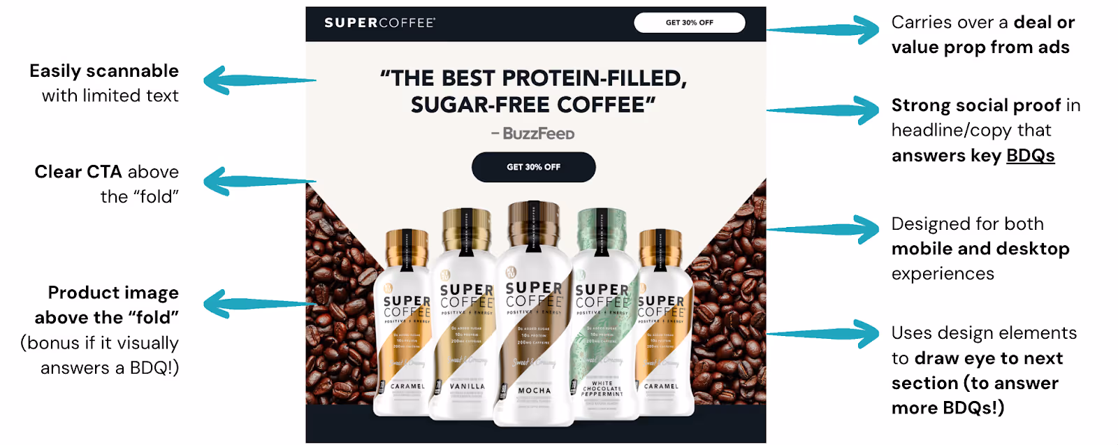
- Easily scannable with limited text: this means the text the consumer sees first should be short, easy to understand, and straight to the point. Ideally, you should summarize a big idea in a single simple sentence.
- Carries over a deal or value prop from ads: it’s important to show an offer right from the start—or at least a clear value proposition like free shipping, discounted products, bundle & save deals, and more.
- Strong social proof in headline/copy that answers key BDQs: you can do this through star ratings, quotes, or even images showing the product/service in use.
- Clear CTA above the “fold”: remember that the call to action has to be visible and highlighted. The button can be in another color to stand out.
- Designed for both mobile and desktop experiences: nearly 70% of website traffic is on mobile, so keep that in mind when designing your hero section.
- Product image above the “fold” (bonus if it visually answers a BDQ!). A clear, high-quality image helps people connect with the offer faster. Make the image understandable, so users don’t need to guess how the product works.
- Uses design elements to draw eye to next section (to answer more BDQs!). Use layout cues like arrows, contrasting shapes or aligned product placement to direct the viewer’s eye downward. This helps users naturally flow into the rest of the page.
With that in mind, creating a hero section that converts should be an easy task. In fact, once you understand what each element is doing it becomes a repeatable formula you can apply across every landing page.
Super Coffee
You’ve probably heard of Super Coffee. Known for its protein-packed, zero-sugar coffee drinks, the brand has become a go-to for people who want energy without the crash. But it’s not just what’s inside the bottle that makes Super Coffee popular: it’s how they market it.
Their growth exploded after appearing on Shark Tank, and they’ve continued to win over customers with a bold brand voice, a strong DTC presence, and smart performance marketing. And their landing page hero section is a perfect example of that in action. We’ve partnered with them to create these amazing hero section.
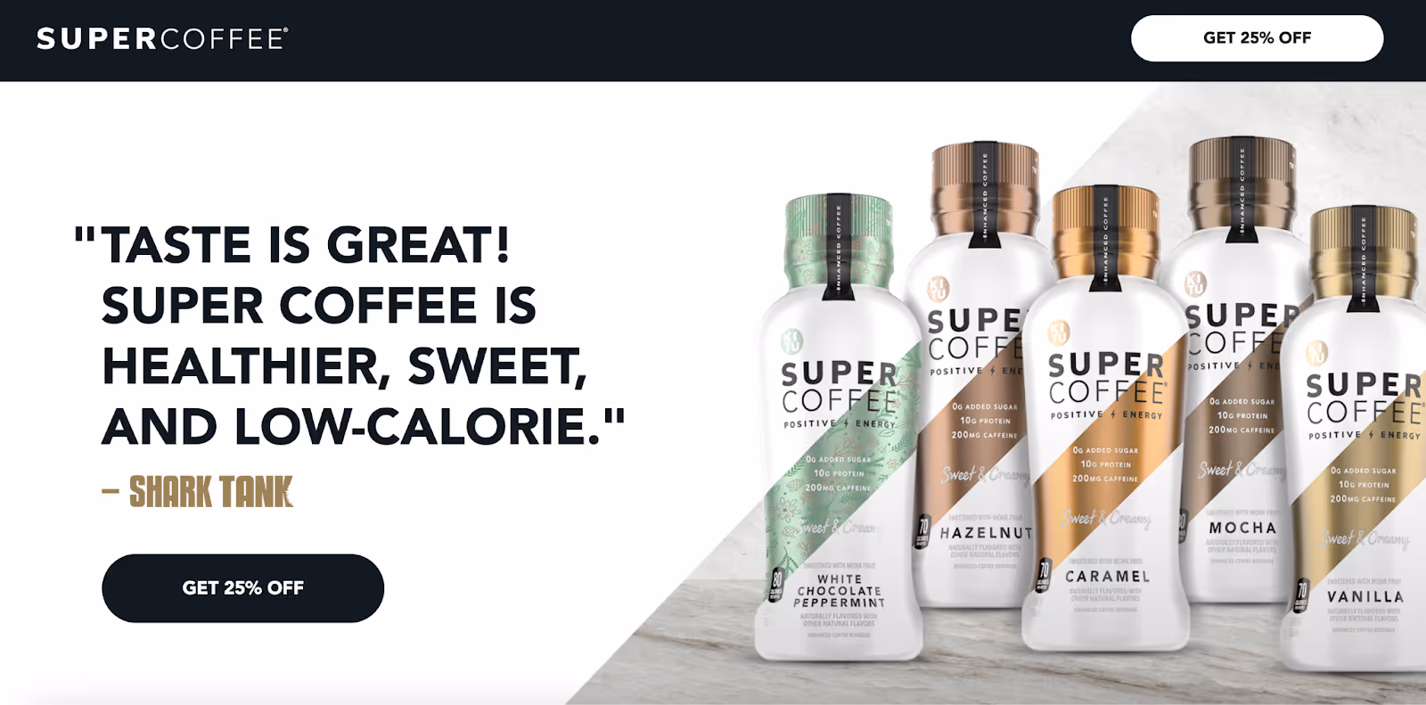
Their landing page is super simple yet effective at the same time.
Firstly, it’s easily scannable. You find everything you need within the very first seconds.
The discount catches your attention, instantly. They’re leading with a benefit not everybody offers. You see the “Get 25% OFF” button on top and as a CTA.
Next, it shows press proof by quoting Shark Tank. Press proof builds credibility and makes the brand feel more real for everyone discovering it for the first time.
FitOn
FitOn is a free fitness app that gives users unlimited access to premium workout classes from top trainers and celebrities. When we worked on FitOn’s landing page, our goal was to capture attention fast and convert immediately without overwhelming the user. Here's what we did to make it work:
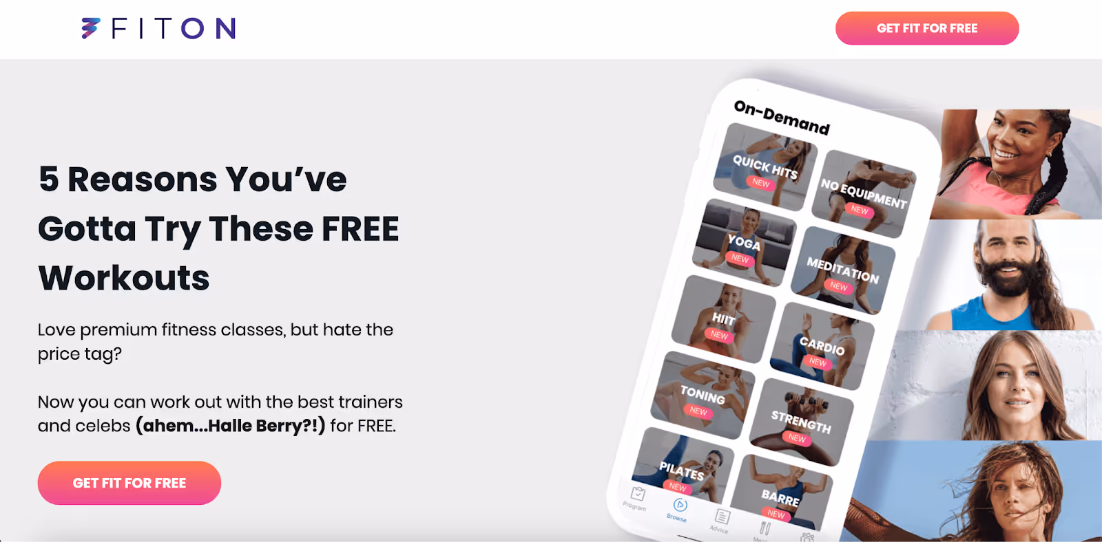
For this hero section, we used one of our favorite templates: the Reasons Why.
The headline “5 Reasons You’ve Gotta Try These FREE Workouts” works, not only because we’re sharing 5 reasons why the user will definitely benefit from those workouts, but also because it says FREE and emphasizes throughout the page, reinforcing the value at every step.
And by mentioning Halle Berry, the page elevates trust, adds excitement, and triggers curiosity, turning a fitness app into a celebrity-backed experience. Who doesn’t want to look like her?
The CTA is also very clear and reinforces the value again.
And lastly, the visuals… this hero section shows a phone mockup showing off the class library (HIIT, Pilates, Cardio, and more). This lets users see the value before signing up, reducing uncertainty and increasing conversions.
Nom Nom Now
Nom Nom Now is a fresh pet food brand that creates real, nutritious meals for dogs. Every recipe is crafted for better digestion, shinier coats, and longer, healthier lives. Their product fits squarely into the pet wellness and DTC (direct-to-consumer) vertical, where personalization, ingredient transparency, and health outcomes matter most.
This was a challenge for us as we created their landing page because we wanted to highlight ingredients and, at the same time, differentiate them from their competitors –not only by sharing the high quality ingredients and all the science behind, but also pricing. We wanted Nom Nom Now to stand out.

Here is what we did:
The headline is simple and short, and it goes straight to the point. The pet food they are offering is fresh, so we needed to highlight that.
Then, the description is also pretty accurate because it mentions all you’ll see in the rest of the landing page: why they are above the competition –pricing, ingredients and portioning, but you’ll know that as you keep reading.
The visual is simple, and although it may not look delicious for humans, but it shows a very balanced food for pets.
And lastly, the CTA button. They’re sharing not only one offer (the 50% off) but also another key point: the free shipping. Free shipping often captivates users to buy just because they are saving one cost.
This hero section is super simple, yet it includes all the right elements to drive high conversions.
How to create a high-converting hero section
While each brand we’ve covered works in a completely different industry, their hero sections share one important truth: they follow the same proven formula.
They don’t try to do everything. They focus on the essentials. And that’s what makes them powerful.
All the hero sections were easily scannable, which is rule number one to create a winning hero section. The headlines are short, bold and clear. The visuals reinforce the message. The CTA buttons are not just present—they stand out. The value is visible before you scroll and you see it twice, in the CTA and in the top.
These pages don’t overload visitors with information. They simplify the experience, remove friction, and create a path to action.
And that’s exactly what a hero section needs to convert. Remember you only have 6 seconds before the user decides either to shop or scroll, and you need to put all the information visible for them.
Once you learn the anatomy of a strong hero—headline, offer, social proof, CTA, product image—you’ll start seeing it everywhere. And better yet? You’ll start using it in every landing page you build.
Because the truth is, great landing pages aren’t built from scratch every time. They’re built from a formula. You just need to know what goes where—and why it works.
Now you do.
Ready to create high-converting hero sections?
If you’re looking for a team that can generate an amazing landing page –and especially a hero section, Primer can help. Our wide range of partners means we see what works in many different verticals, placements, platforms, and audiences. We bring that knowledge (backed by extensive data and proven success) to every account we service.
Your Growth Marketing Team: Partnering with Primer means we take care of everything—strategy and planning, production, reporting, and optional media buying—to achieve your growth objectives. You can focus on your business while we deliver the results.
Creative On-Demand: Access a subscription-based marketing creative platform to request UGC, videos, images, and landing pages crafted by top marketing creative strategists and designers who understand what drives conversions.
.avif)
.avif)
.avif)
.avif)
.avif)
.avif)
.avif)