In this article
Every month at Primer, our team comes together for the cheekily named “Primees” to honor the top-performing ads. The awards were designed in the spirit of Dunder Mifflin’s Dundie’s but the comparison ends there. These winners are based on real performance (and not everyone wins). We do have fun, though. Themes range from “black tie” to “safari” and everything in between. Our team turns out (via Zoom), often in costume, to celebrate the big winners.
To wrap up the year, we took a look back at the top ads from our 2022 Primees. What emerged is a list of strong ads full of great trends you can apply to your ads today.
We encourage you to leverage these wins for your own ads (great marketers steal!) and apply the learnings to find your own Primee success story in 2023. Wishing you the very best ads.
Best UGC Video Ads
It’s no surprise that we have so many UGC video ads in this list of top-performers for 2022 — it was the top-performing ad format across all brands and channels. This first ad shows the power of performance UGC. While it doesn’t follow a typical influencer-style format where a single person addresses the camera, it tells a story from a single point of view, making you think it’s coming from a person’s own experience.
How you can try this: Capture an experience with your product on your phone, edit it down to the key moments, and add captions that describe each step your customer takes to solving their problem with your product.
Similar to the Sunday ad above, this Rocksbox ad shows the perspective of a single person, with unboxing-type shots to share a more personal experience with the jewelry subscription brand. The captions help reinforce the key selling points.
How you can try this: Shoot several short videos of your product with your phone. If it comes in a box, show it arriving and open it up to show potential customers what they can expect to get. Add captions that highlight the best features at each step.
This top-performing Ello video ad feels organic in a user’s feed with the audio of the Ello app and video of the child using the product. The captions grab attention and answer a key buying question (how much is it?).
How you can try this: Grab audio and video of your product in action. Play that in the background while captions tell the user how your product can help solve their problem.
For Prime Shrimp, we used an ad format that keeps winning: a vertical split screen. On the left we feature short copy that describes the simple steps for cooking Prime Shrimp. On the right, we have an ASMR video of that process in action, complete with clear audio of each action (rip of bag, boiling water, microwave buttons, etc.). The result is a salivating ad.
How you can try this: Create a vertical split screen ad like the one above. Communicate a key value proposition on the left, and show video of how that value proposition comes to life on the right. Try it with sound on! These top performers all have audio.
These next two ads follow a similar format: they both show you (the customer) how easy it is to go from shopping on your phone to using the product in your life. They both walk through the actual user experience and then show the product in action. The TeePublic ad went a step further and tapped into a cultural moment (Halloween) by tailoring the messaging to the holiday.
How you can try this: Grab a screen recording of ordering your product from your phone and combine it with video footage of the product in action. Add captions to describe each step and how this product will benefit your customer.
This ad taps into a TikTok trend that has expanded into Facebook and Instagram as well by starting with the POV caption. While the footage of the (albeit very exciting) product plays in the background, captions answer questions that the customer will need answered before making a purchase.
How you can try this: Hook your audience with a top trend within the first :03 of your video, then support footage of your production in action with key stats or information that answer the most important questions they need answered before making a purchase (e.g. how much is it, where can I get it, does it ship to me, etc.).
This UGC video ad features a single influencer and her use of the product, describing the three reasons (in this case, ingredients) that help solve her problem.
How you can try this: Use a single influencer to share three reasons why your product can help solve a problem.
Need help sourcing UGC video content? Primer now offers UGC on-demand. Our team can source influencers, develop the strategy and help produce the ads. Learn more here.
Best TikTok Ads
While we believe 2023 will be the year of TikTok, we saw massive growth and success on the platform in 2022. Not only did we create hundreds (thousands?) of ads for our partners on TikTok, we also created ads for TikTok itself.
This ad leaned heavily into the platform’s native styles and showed a playful take on shopping with the addicting cash register sound.
How you can try this: Embrace the native styles of the platform where you are advertising, including the text and the way the person is being featured in the video (in this case, a cropped shot of her head).
We created this ad for Little Passports through the TikTok Creative Exchange, and it quickly rose to become a TikTok Top Ad. Why? It visually walks the user through what they can expect from the product, showing screenshots of the purchase process (from a mobile device!) and examples of what you can expect to get from the box.
How you can try this: Similar to the UGC styles above, try walking through the purchase process in your video to show prospective customers what they can expect.
While this video ad doesn’t follow typical TikTok/UGC style, it still worked so well it was featured on TikTok Top Ads. Why? It is fast-paced, starts with an attention-grabbing hook, and combines brand footage with UGC footage of the app in use.
How you can try this: You don’t have to be a TikTok star to get a TikTok ad to perform. Just incorporate these key ingredients: attention-grabbing hook in the first :03 (here are 101 ideas for video hooks), fast-paced cuts between footage, and include sound on!
Best GIF Animation Ads
While GIF animation ads aren’t as high-converting as video ads, they can still be a powerful tool to help communicate a lot of information in a simpler format. This Apostrophe ad used the vertical split screen similar to the Prime Shrimp ad above to feature the personalized ingredient lists of its products. The mix of the different frames in the ad helped to drive home the point that Apostrophe is customized for your individual needs.
How you can try this: Use the vertical split screen to communicate key points on one side and show an image on the other side. Rotate through a few variations in a GIF animation to tell a story or show multiple scenarios for your product.
This ad leverages a winning headline with a combination of images of its clinics to further communicate the message.
How you can try this: Test a winning headline with a slideshow of images that help to reinforce the benefits.
Best Image Ads
In a world where everything is animated, sometimes a static image is what is needed to grab attention. These images did just that, while still communicating enough information to drive high conversions for our partners.
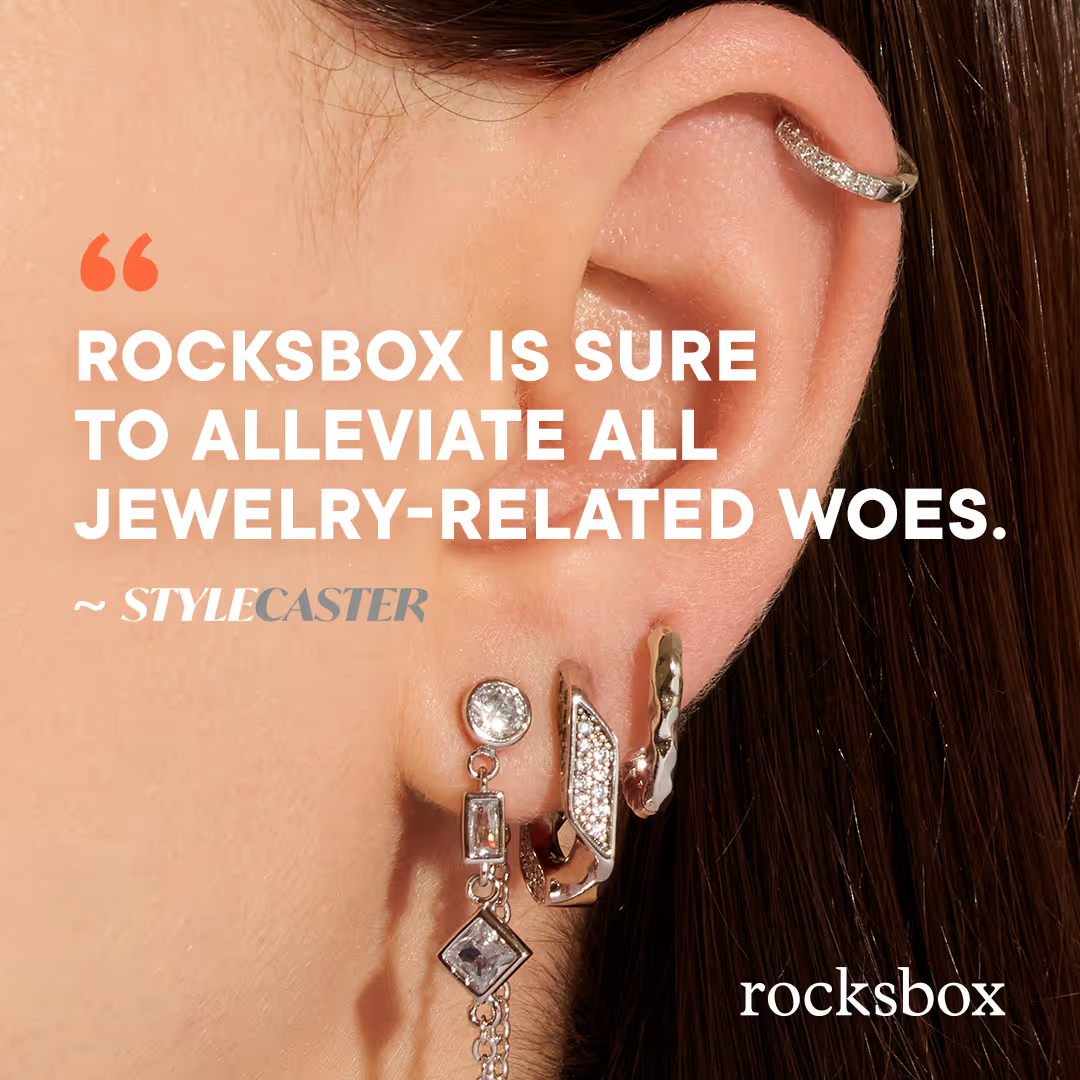
For Rocksbox, an image of jewelry combined with a press quote made for a powerful image. Once we found the win in August, we scaled it with a Halloween theme in October, resulting in huge performance.


How you can try this: Combine an image of your product with a press or customer quote. Once you find a winner, scale it with elements that tie into the season or by testing different quotes or images.
This combination of a product shot, customer testimonial and callout has worked in several iterations for Feetures — simply communicating a lot of information in one attractive ad.

How you can try this: Try adding a sticker-type callout with a benefit or offer and mix it with a product image and testimonial. Keep testing different variations until you find a winner.
This static image directly addresses a major problem for the target audience (50+ tabs open… I feel ya!) and demonstrates how it solves the problem. The copy provides social proof, and the headline shares an offer. Everything you need for a conversion.

How you can try this: Set up a core problem for your customers in the headline and use your image to show how you solve that problem.
Best Comparison Ad
This GIF animation ad uses one of our tried-and-true themes: vs. the competition. In this case, we compare many of the features of Outer outdoor furniture to the alternative brands. The ad quickly highlights Outer’s key selling features and answers many of the potential customer’s questions.
How you can try this: break your product down into key features and compare each of them to the similar features of a competitor.
Best Carousel Ad
Carousel ads found a home among top performers in 2022, and this one led the pack. It follows our top-performing “buyer decision questions” theme, which asks and answers the most important questions a customer might have before buying your product. This carousel ad answers the questions in the form of testimonials, adding social proof to the messaging.

How you can try this: Start a carousel ad with a question your buyer might have about your product and answer it in the following slides. Design your slides to be continuous so that users get a peek at what is next and are encouraged to scroll through them.
Ready for 2023
We’re expecting big things next year, including more UGC and TikTok ads. If you need help finding creative wins, we’d love to talk. Primer is here to help you grow, whether that’s by providing on-demand ad creative when you need it most or by partnering with you as your full-service growth solution. Schedule a call to learn more.


.avif)
.avif)
.avif)
.avif)
.avif)
.avif)
.avif)


